Riso
Dev Diary
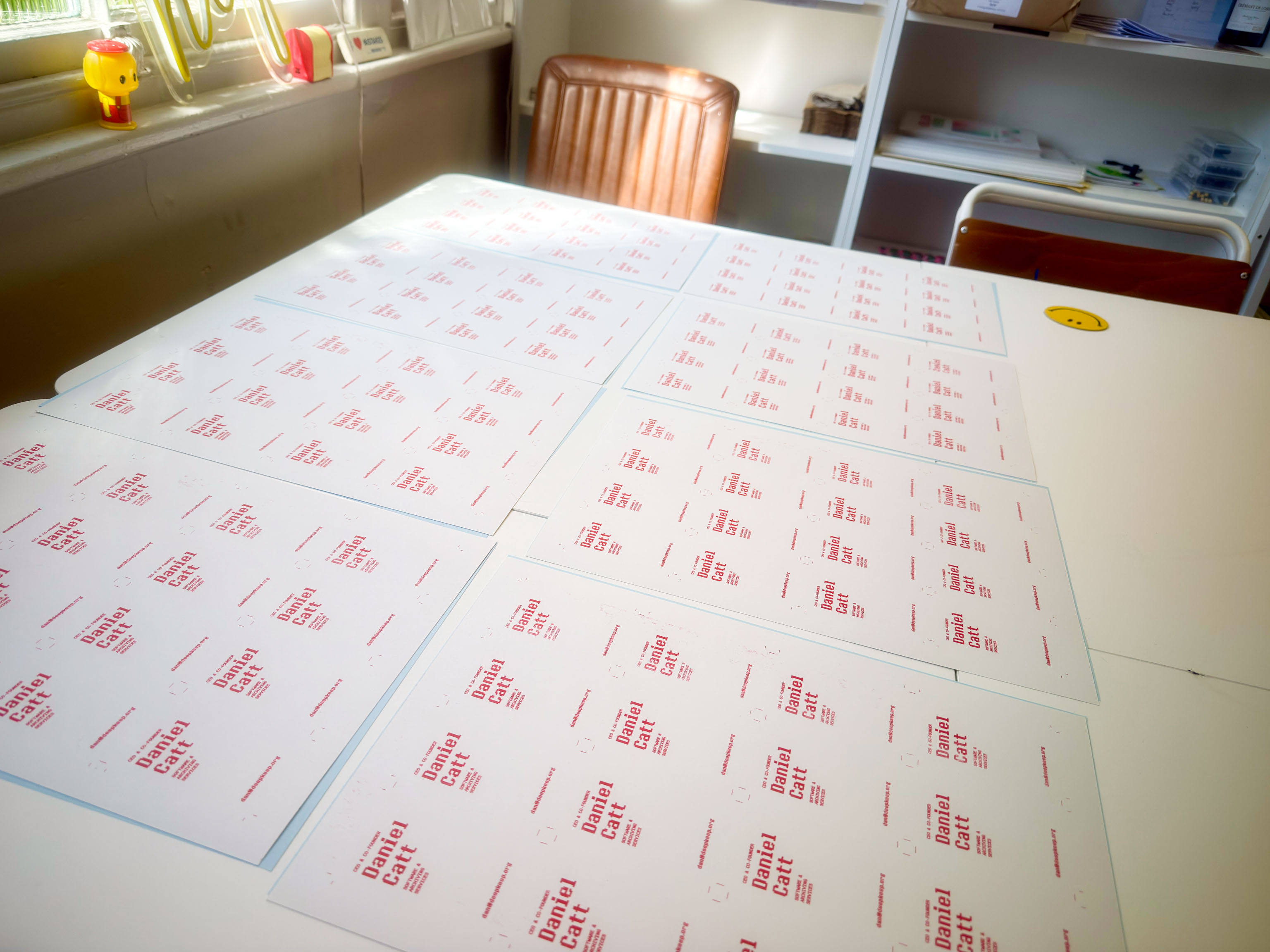
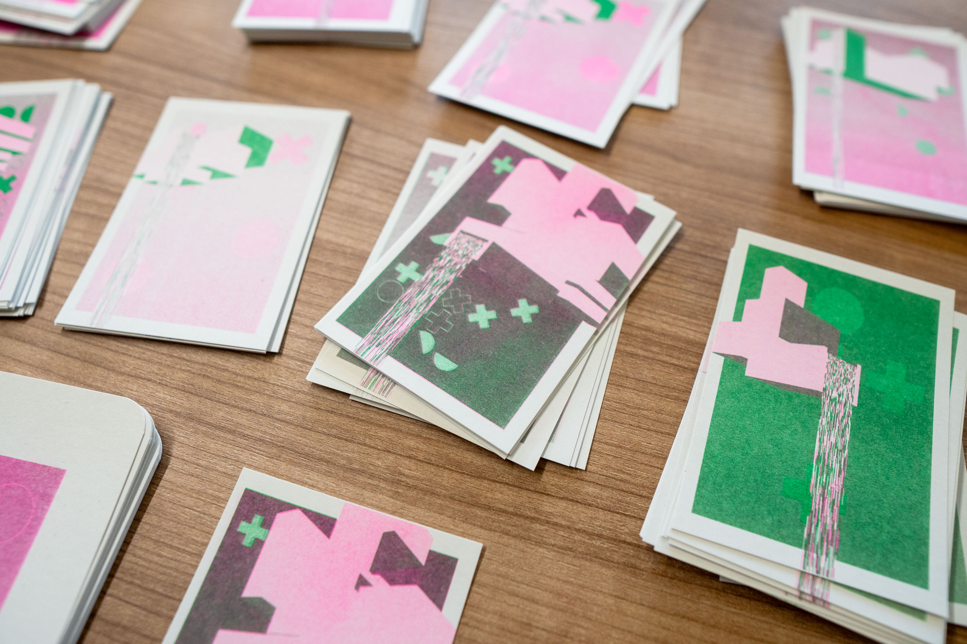
Cut the business card up back at my studio.
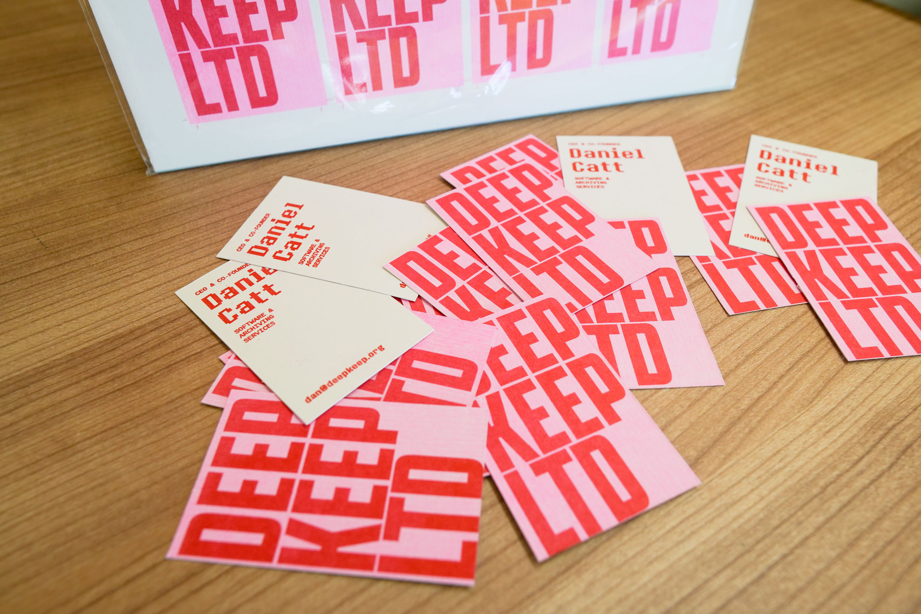
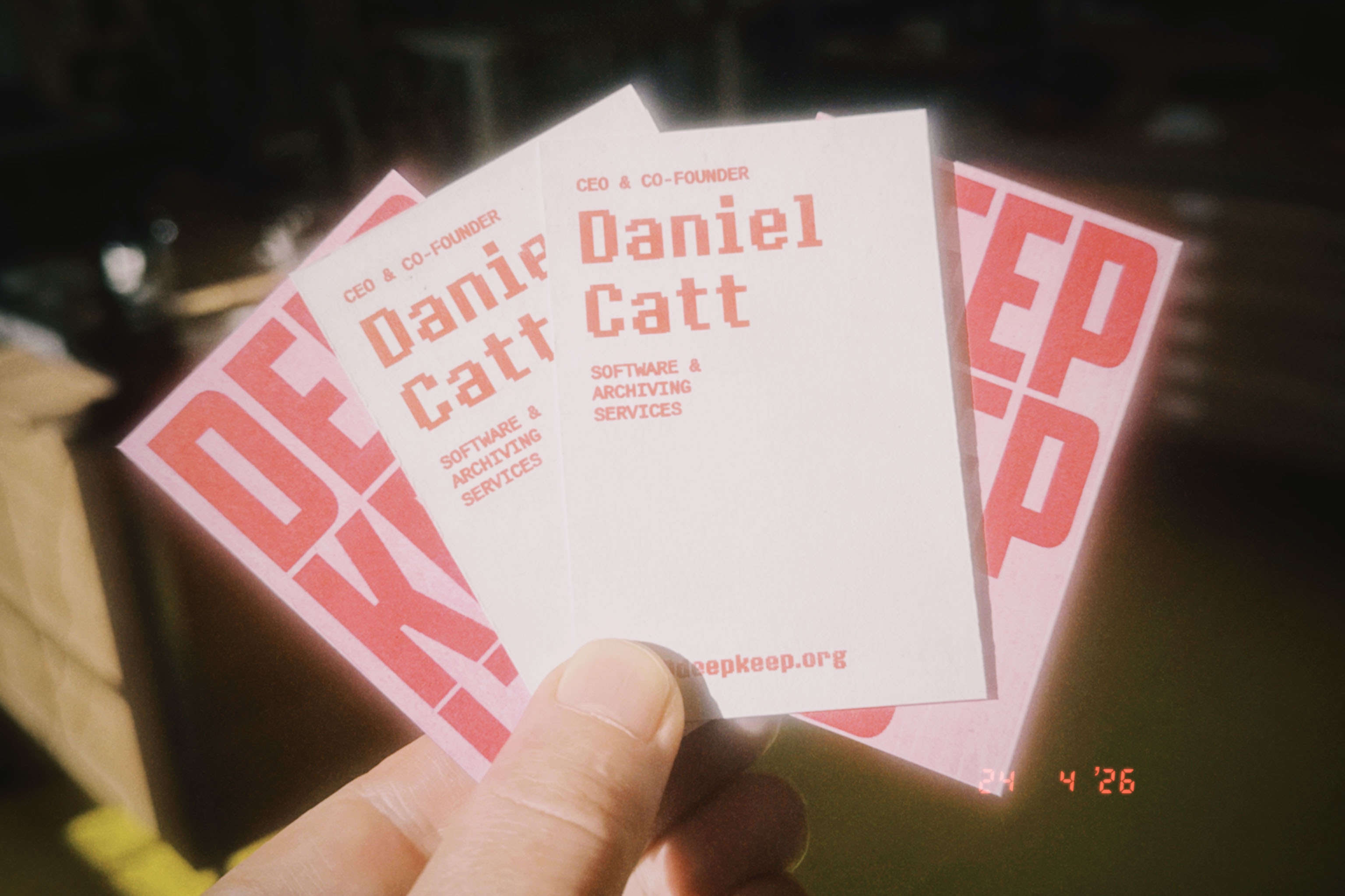
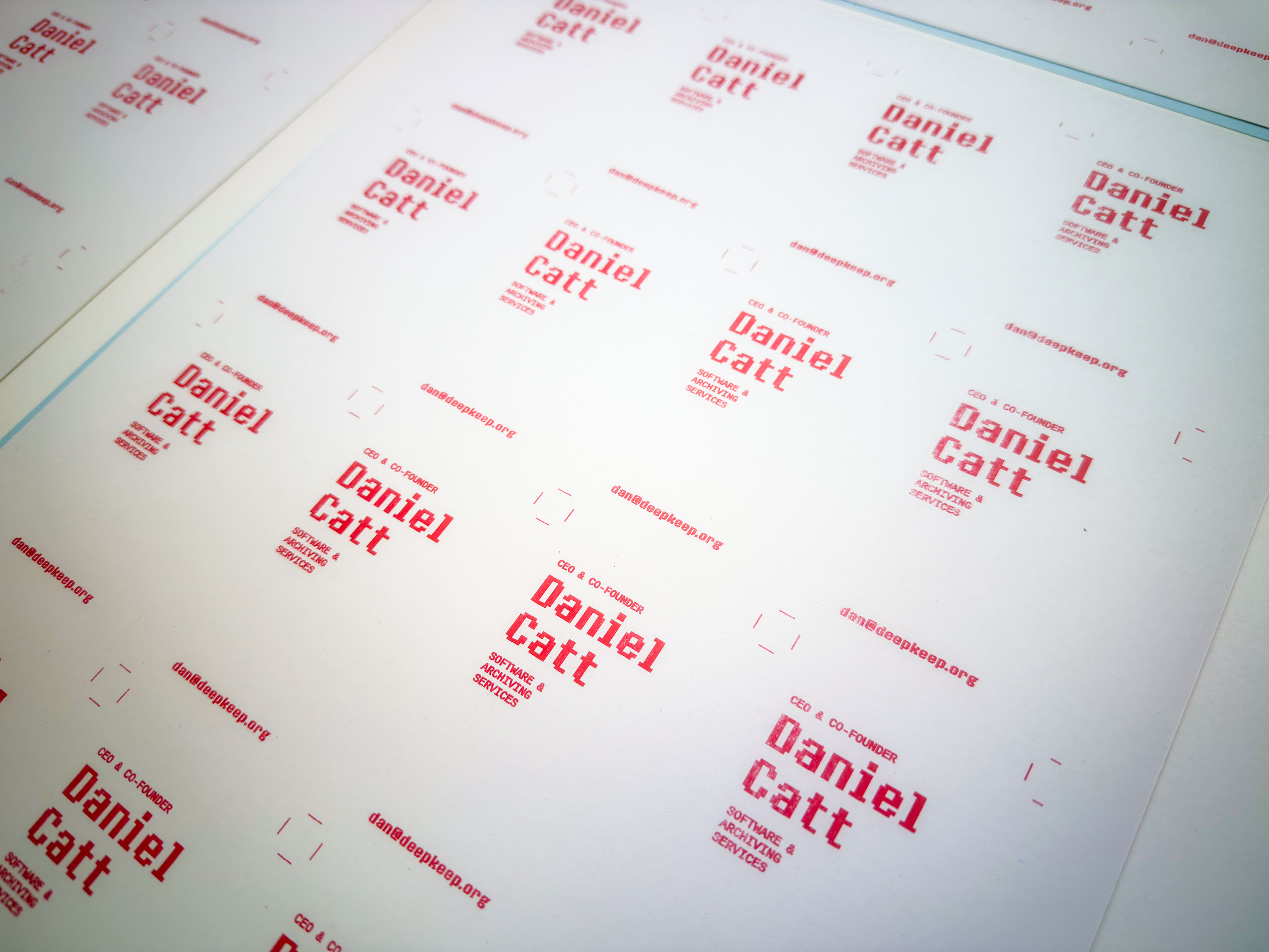
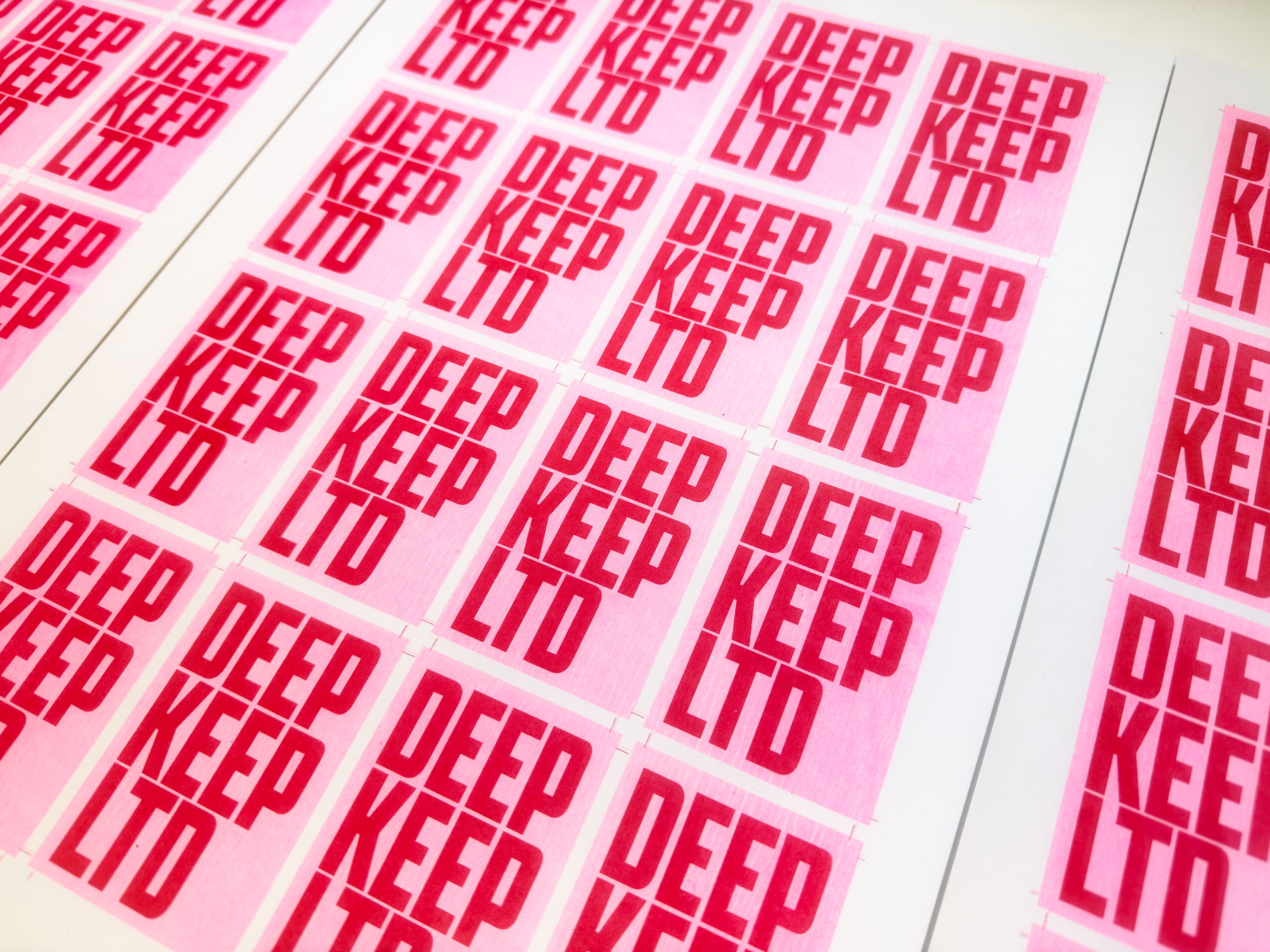
I have a new company, DEEP KEEP LTD - which is all about helping people to archive, well, stuff. Still early days, but needed a business card, and what better to use than the Riso printer?
Well, actually LOTS of things better to use 'cause Riso smudges like a mofo, but it was a heck of a lot of fun.
This should probably be in the Life and Studio section 😁
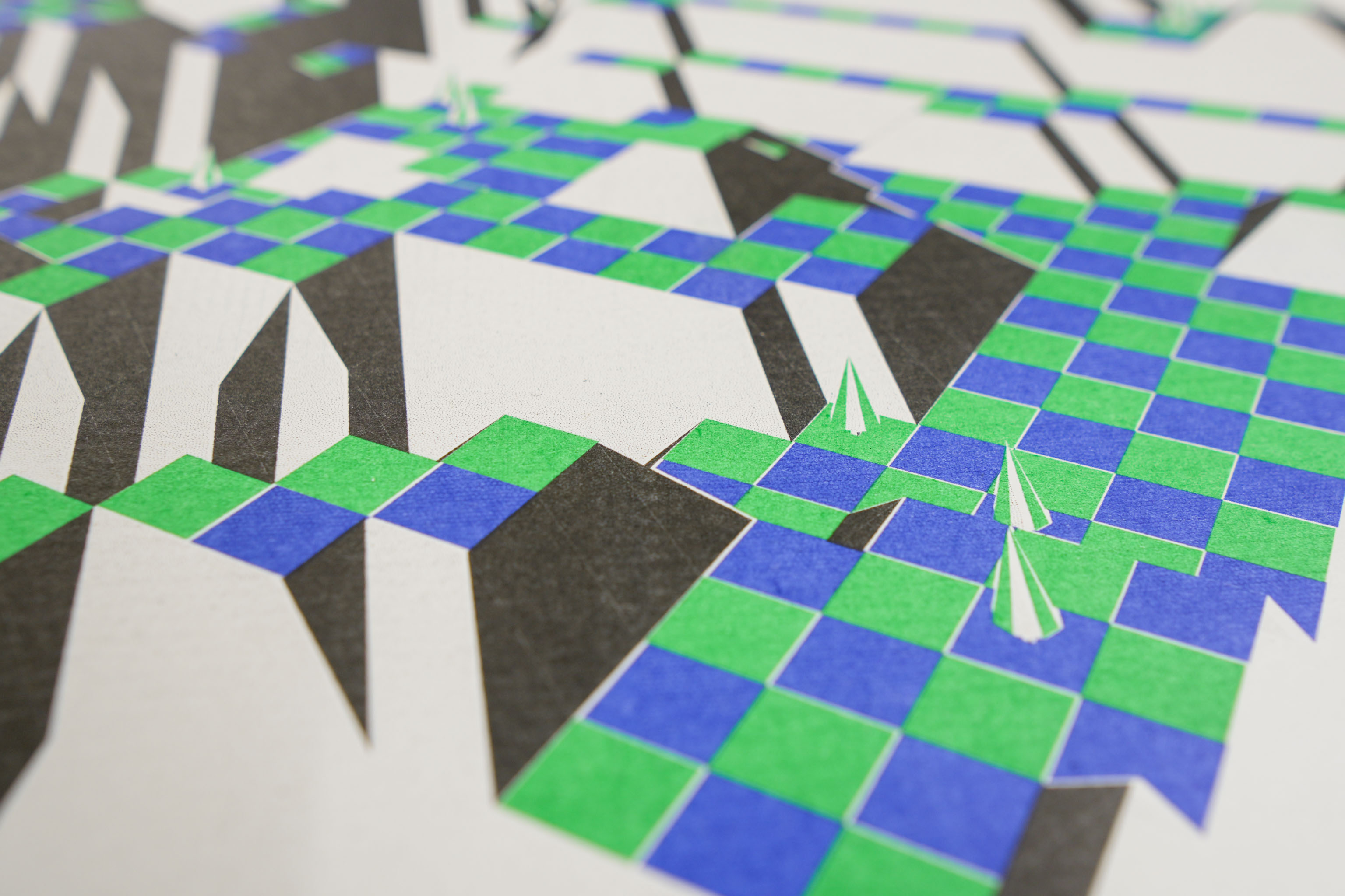
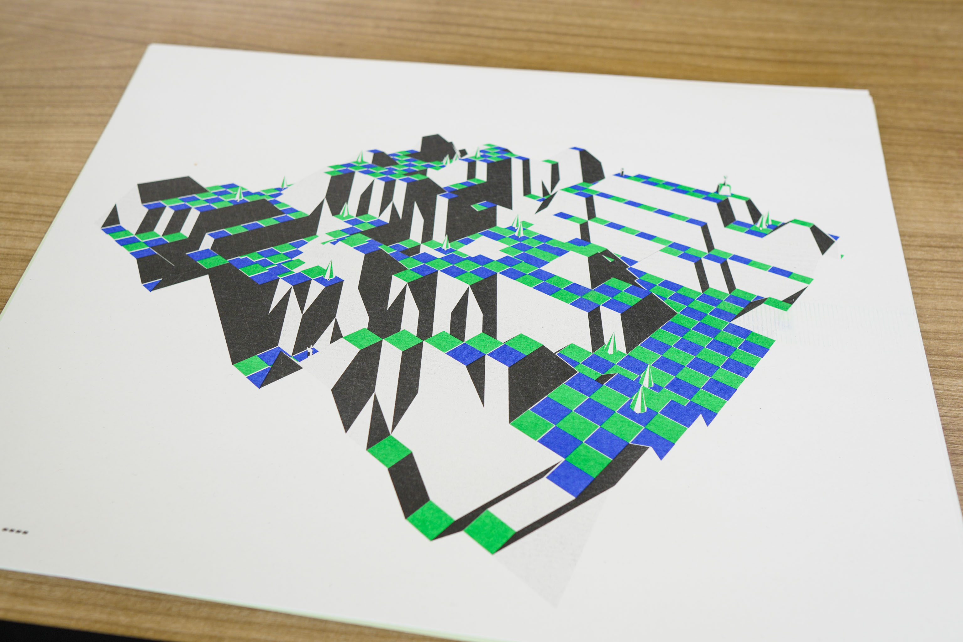
Did another print of a The Sentinel landscape. The enemies are still in the wrong place with this one. Alignment is still off on this one, which is very much a Riso thing.
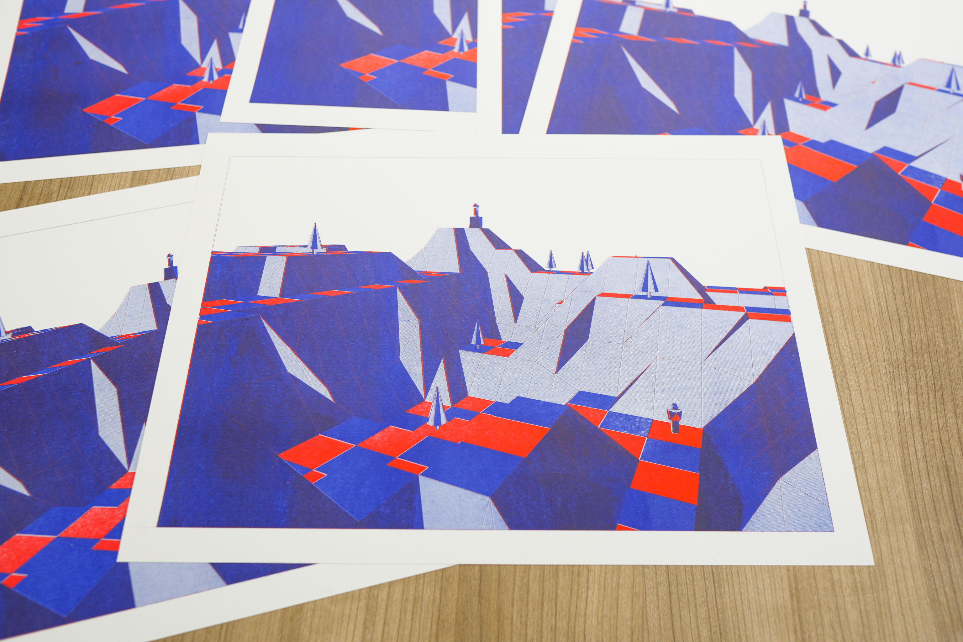
As I had the Sentinel landscape generator working I made it save out png views as well as the SVGs. Actually for fun it can create both PNG and SVG of the same view.
The tree and enemy algorithm is slightly wrong here, so while the landscape is correct, the placement of the objects is a bit off. I think I know what the problem is and will change it in a few days time when I get the chance.
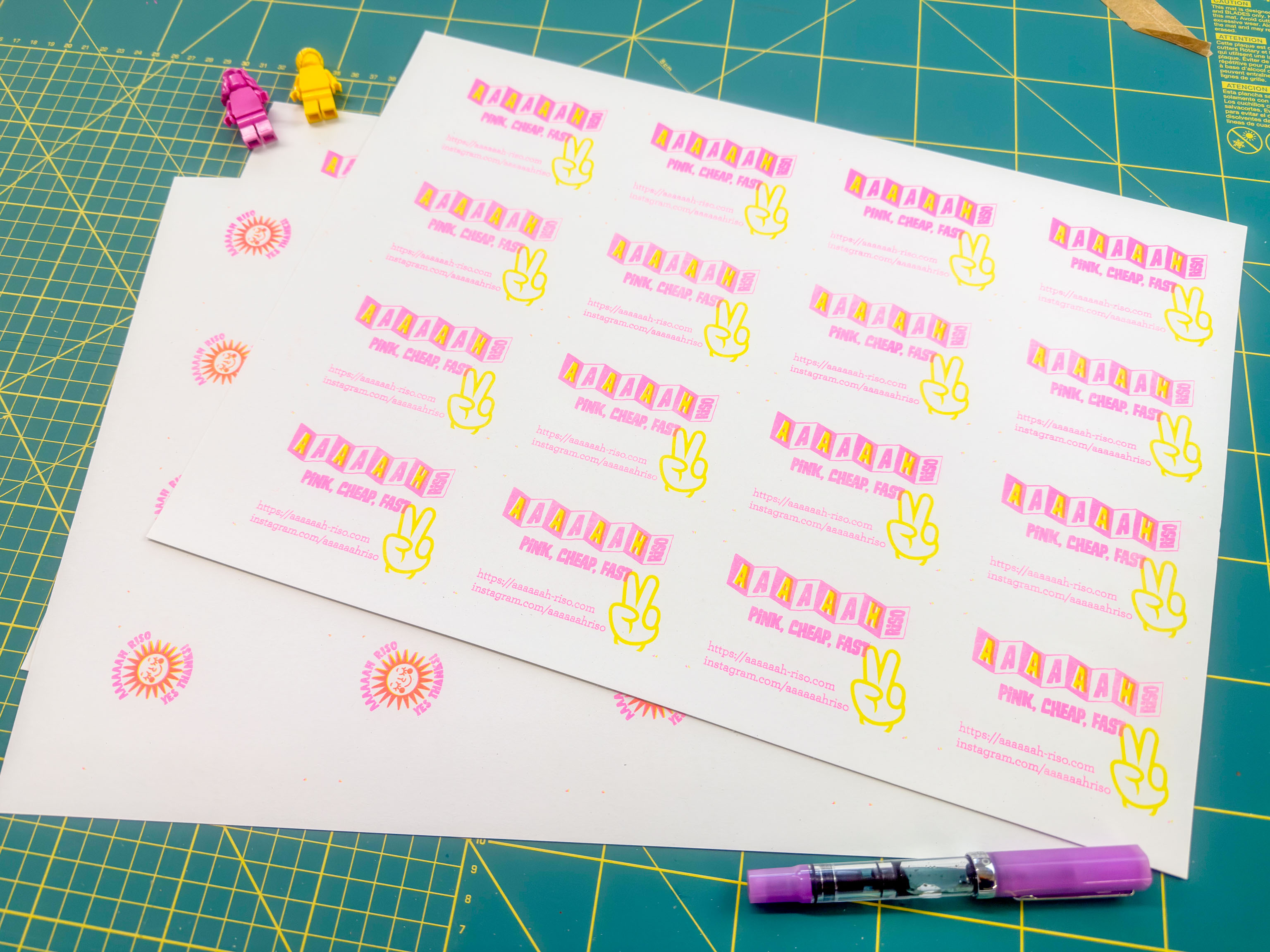
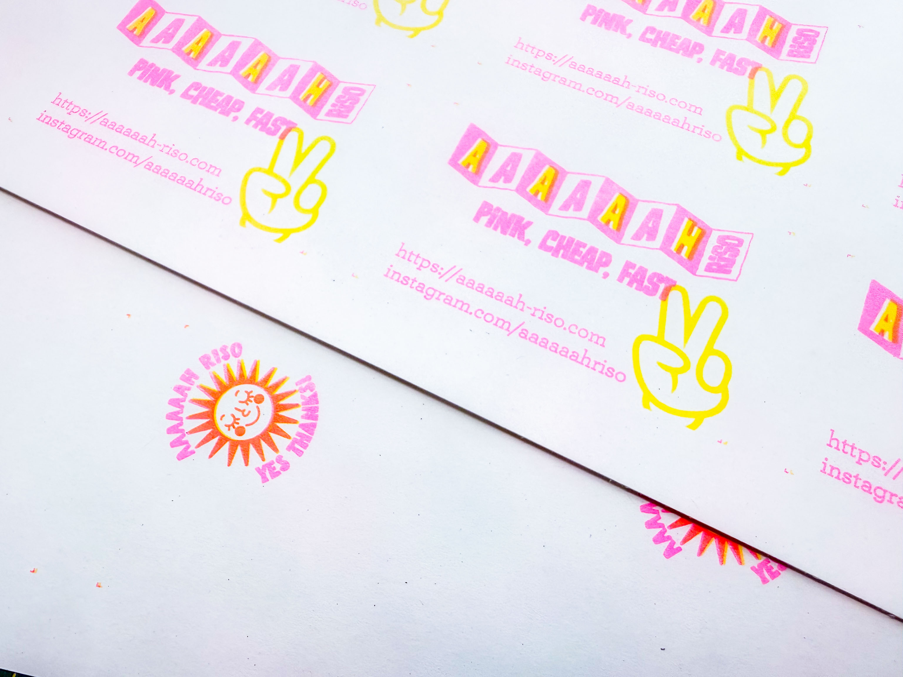
Had a go at making business cards for Aaaaaah Riso, which I like. I feel like I almost have the yellow skewing problem solved, but I guess only time will tell.
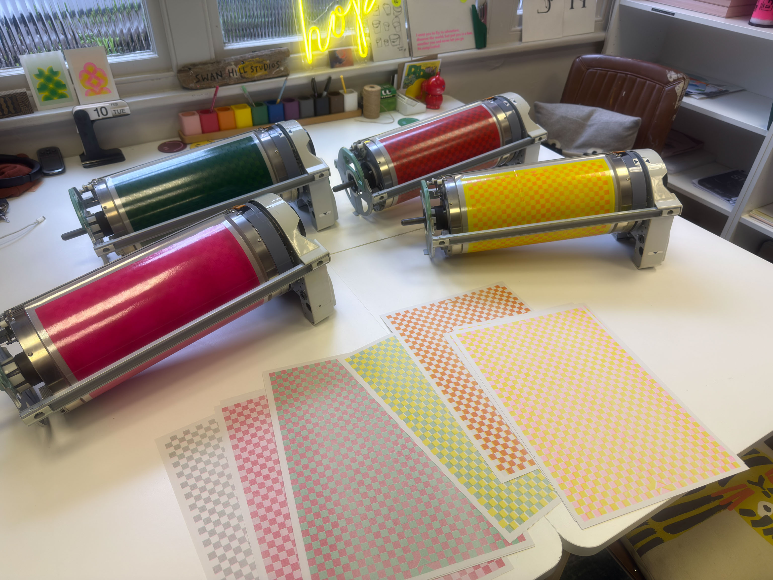
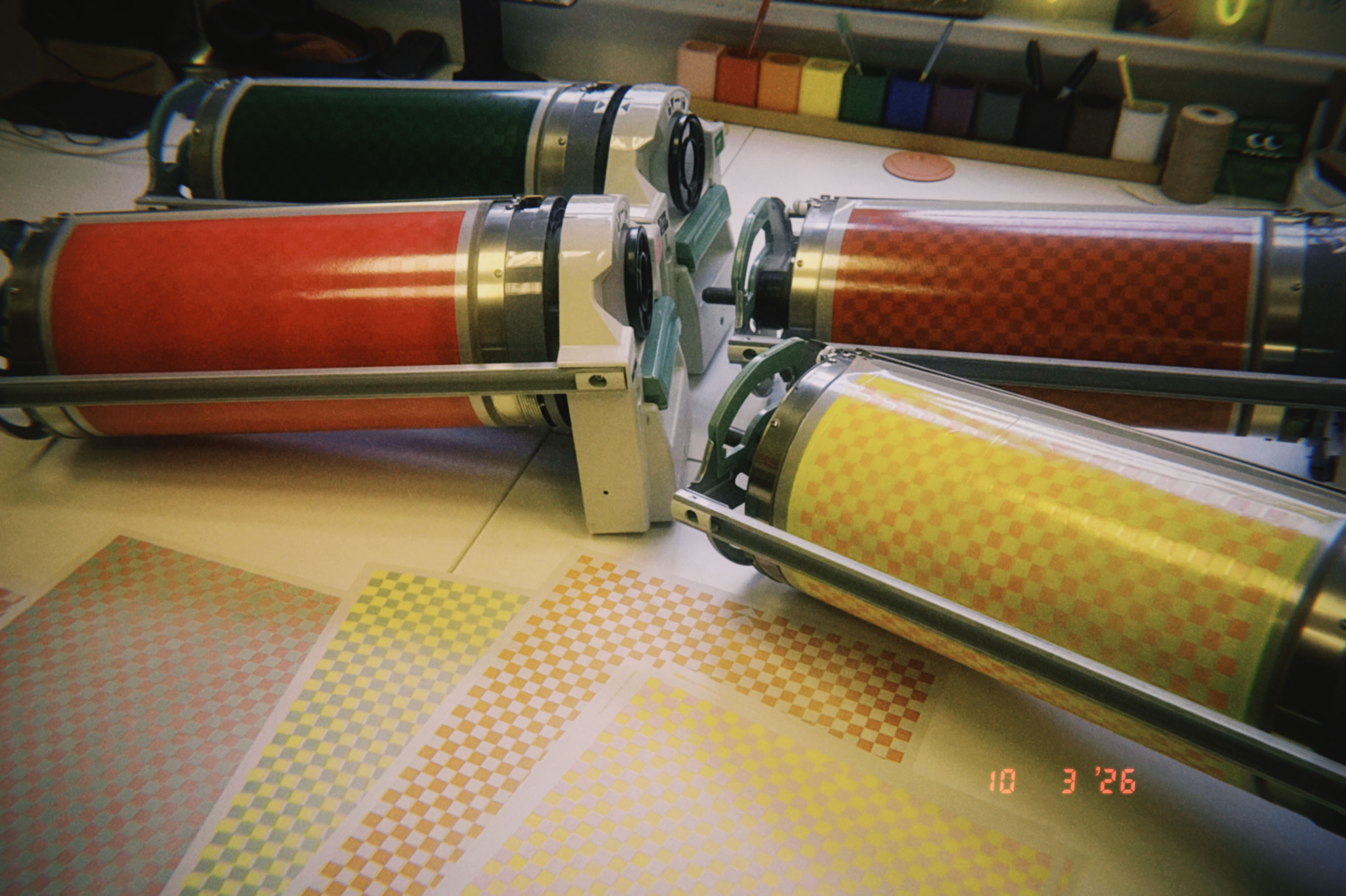
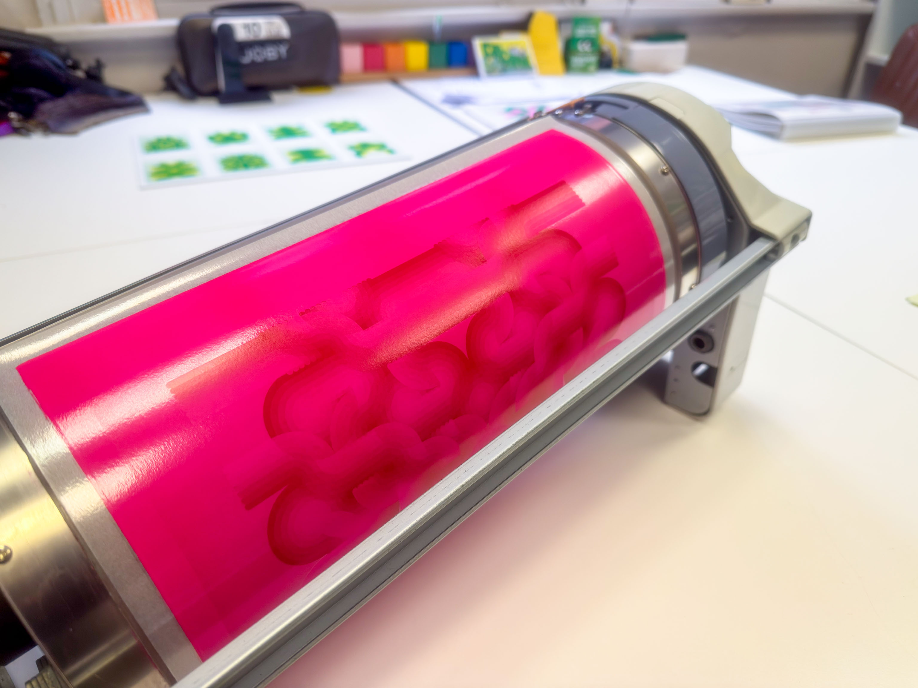
Back in the studio today. For the past few prints I've noticed there's been an alignment problem, and I thought it was the pink drum.
If the alignment was off a bit up, down, left or right I could easily adjust for that, but in this case it's skewed, which is harder to deal with.
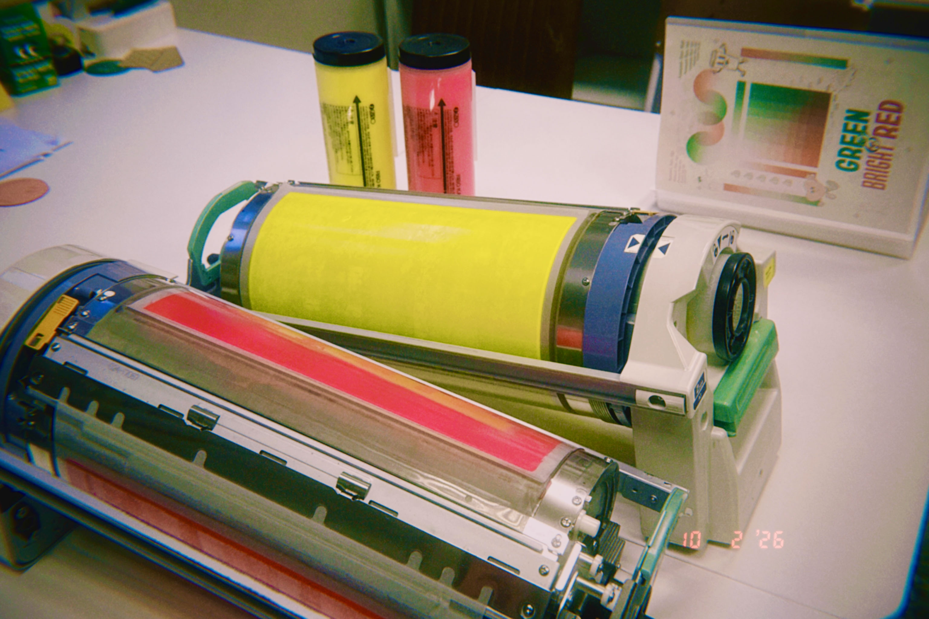
Today I make a checkerboard pattern and printed yellow, pink, red and green, each one with each other.
Turns out it's the yellow drum that prints slightly skew, that's good to know. I think I can now automate correcting for this by having some code rotate it in the opposite direction and we should be good.
However I have a sneaking suspicion that the amount it skews depends on how much ink is used in the design. When I've used a couple of very fine lines I haven't noticed any skewing, or hardly any at all.
But a couple of designs that have had more yellow ink the skewing seems to also be more.
I guess the next experiment is to use various amounts of coverage and see if the amount of skewing increases too.
I need to get my shop back online. No, wait.
I would like to get my shop back online. I took it down because it was too much to maintain it and Shopify was charging me monthly while I wasn't using it. Seemed like a waste of money.
Shopify uses Stripe to take payments behind the scene, so essentially it's a very good but over engineered (for what I need) wrapper around Stripe.
Meanwhile I've just built Stripe into a couple of services for people and it was super simple, if you just want to do super simple stuff.
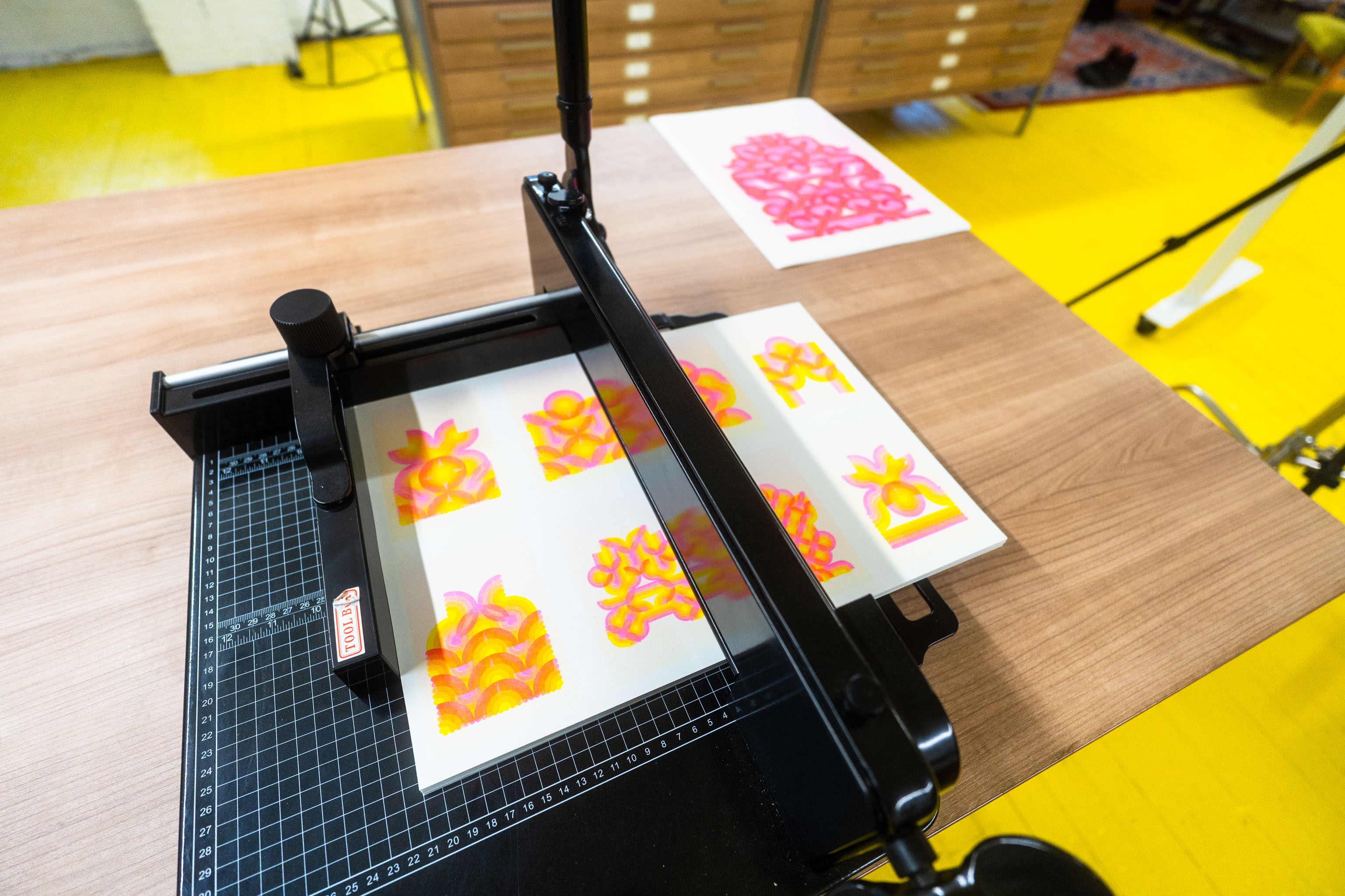
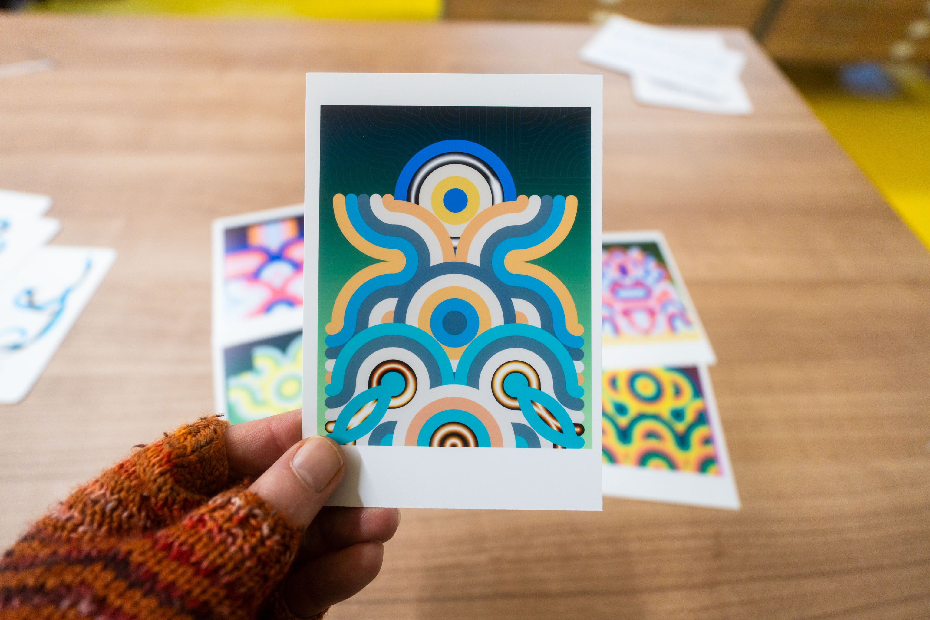
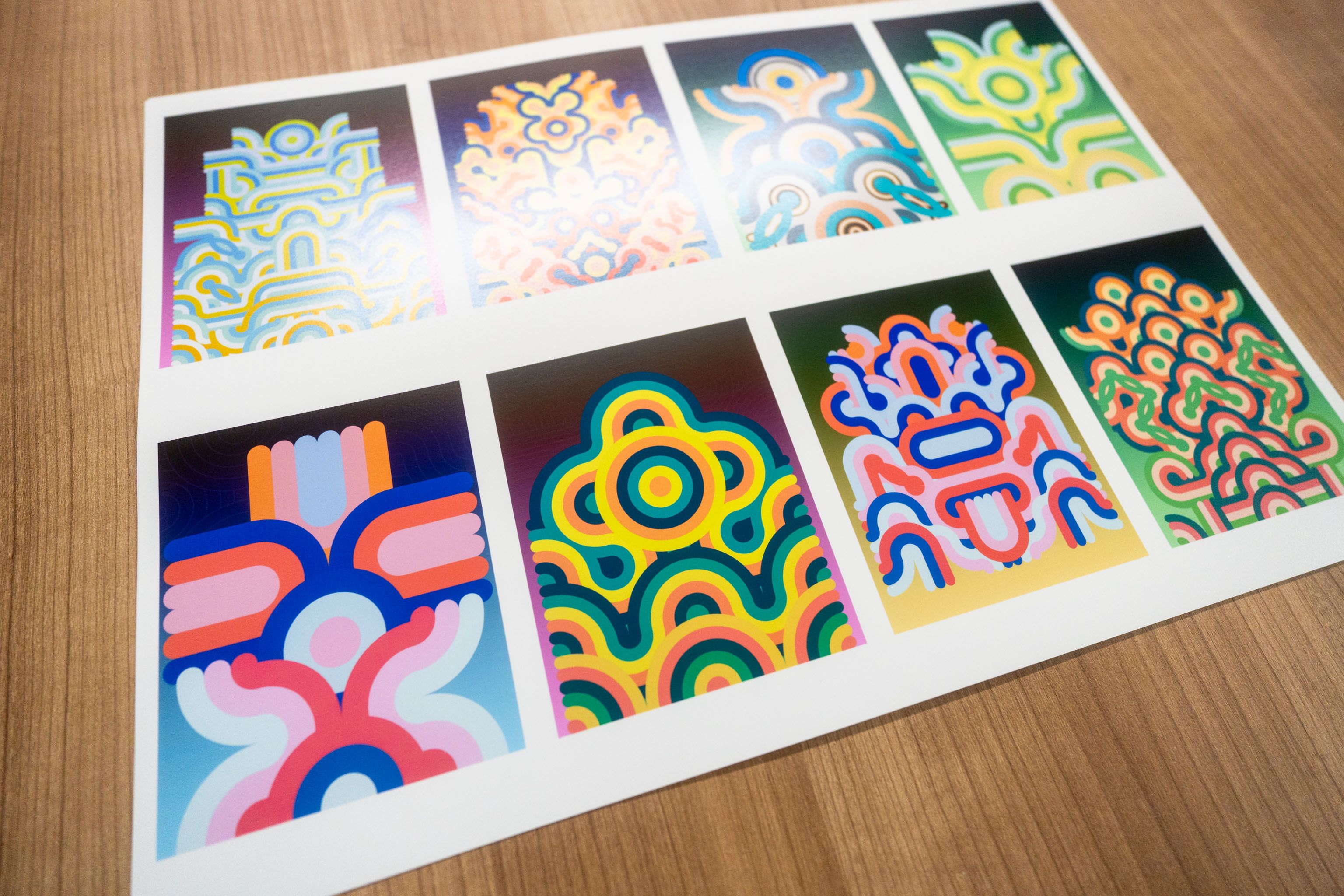
When I printed the Riso designs for the Patreon people, they were postcard and A5 size. But I wanted to see what an A3 Riso print of the design would look like. And with a Riso printer all the work is in the setting up, if you're printing one thing you may as well print 10, or 20, or 50, or 200.
I printed 10.
But now I have 10 Riso prints. So I figured I may use this as a test product to get the minimal version of the shop up and running. One item, no cart needed, one simple Stripe link, done.
After that I can move up to having a cart, but for the moment I'm just taking photos.
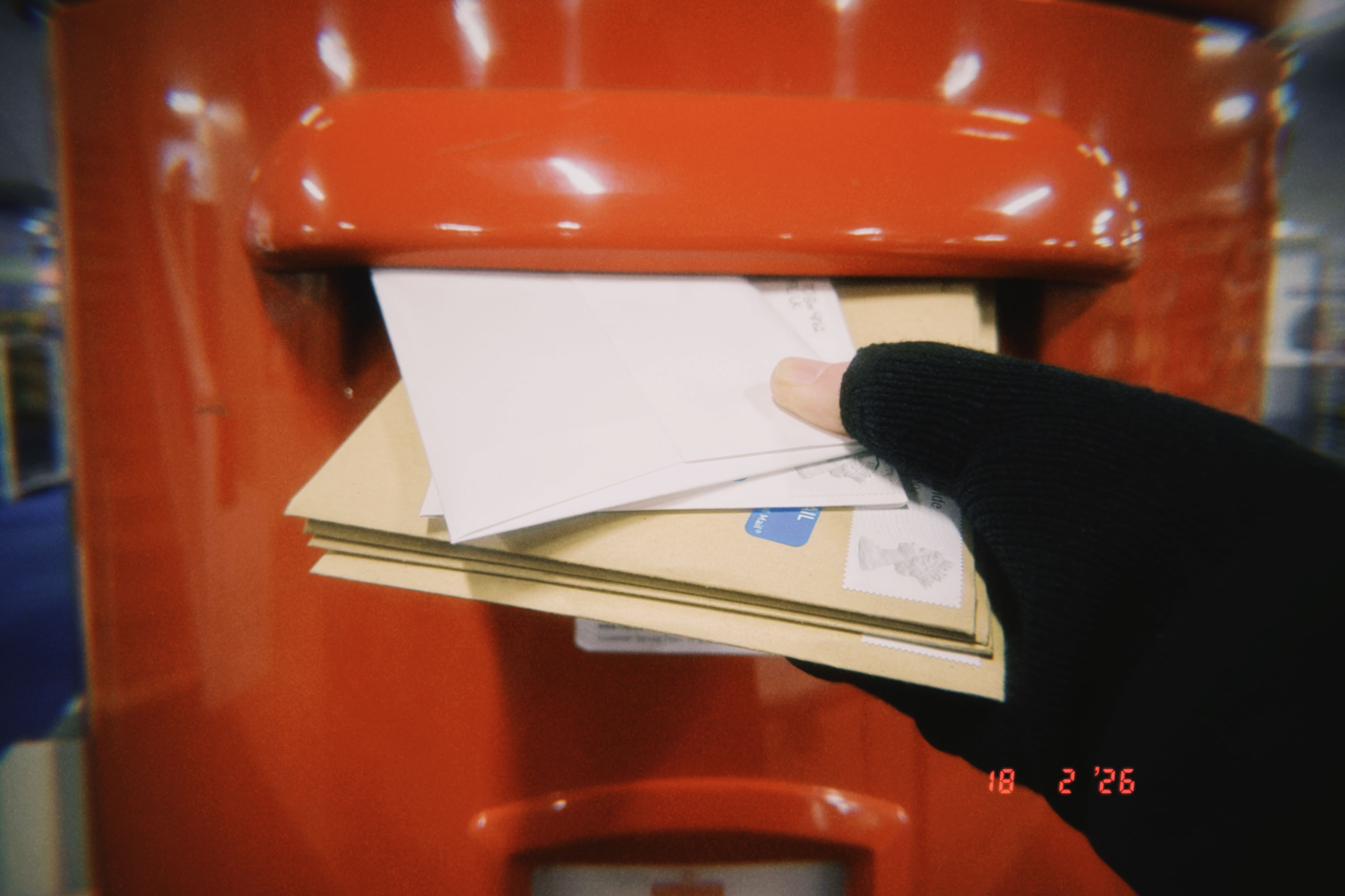
Did some normal prints too, then packaged them all up and popped them in the postbox, all done for this month!
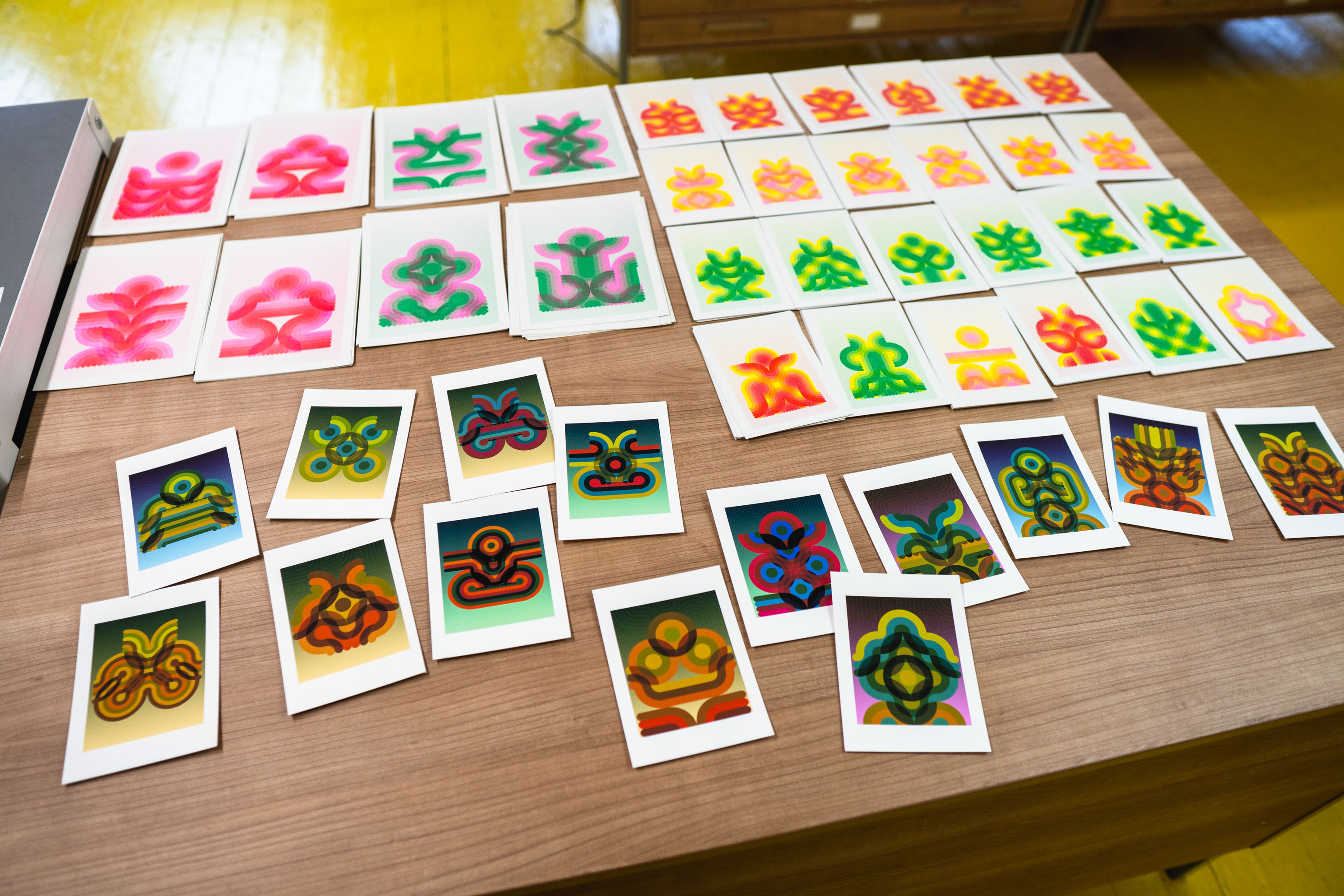
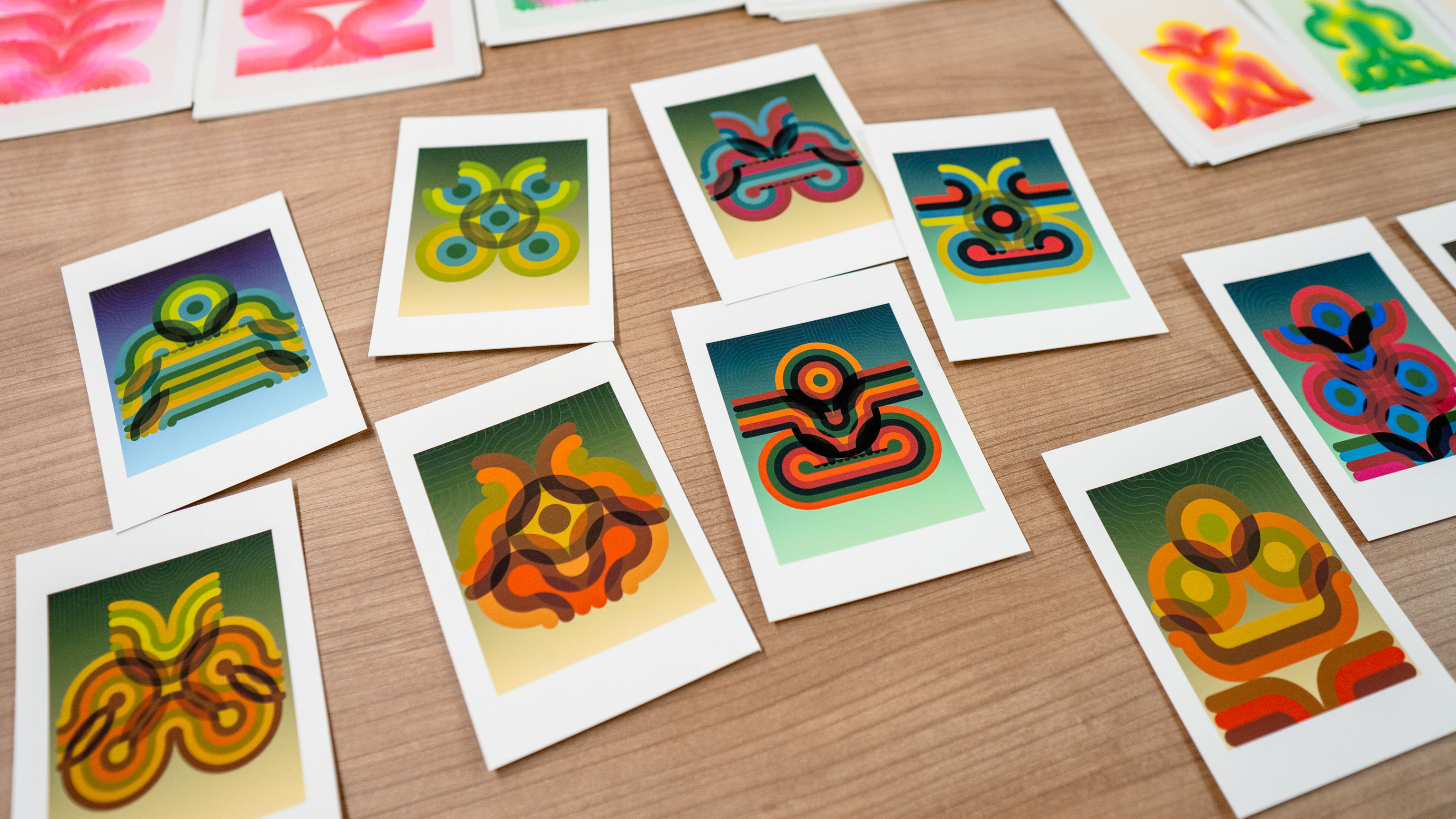
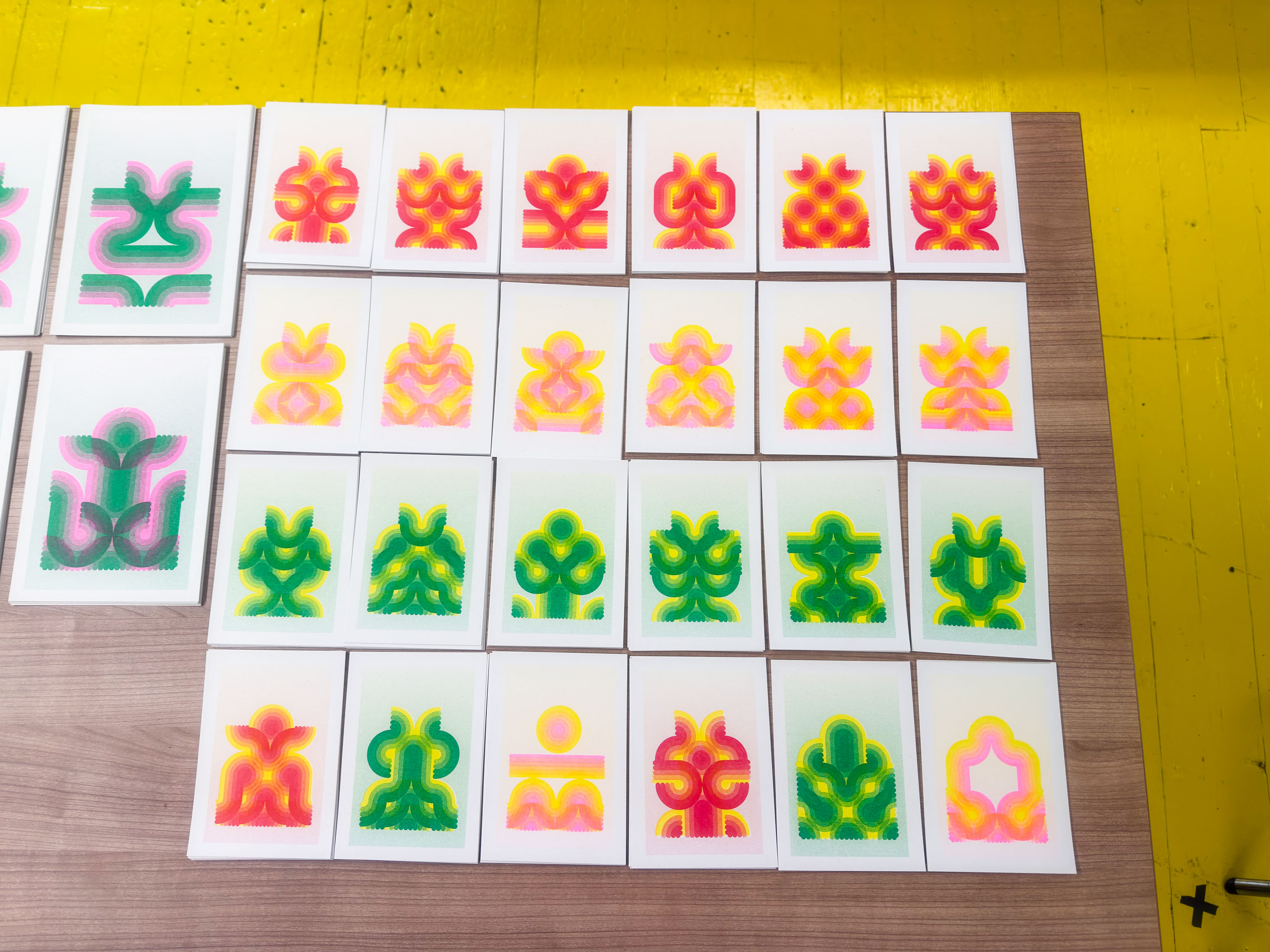
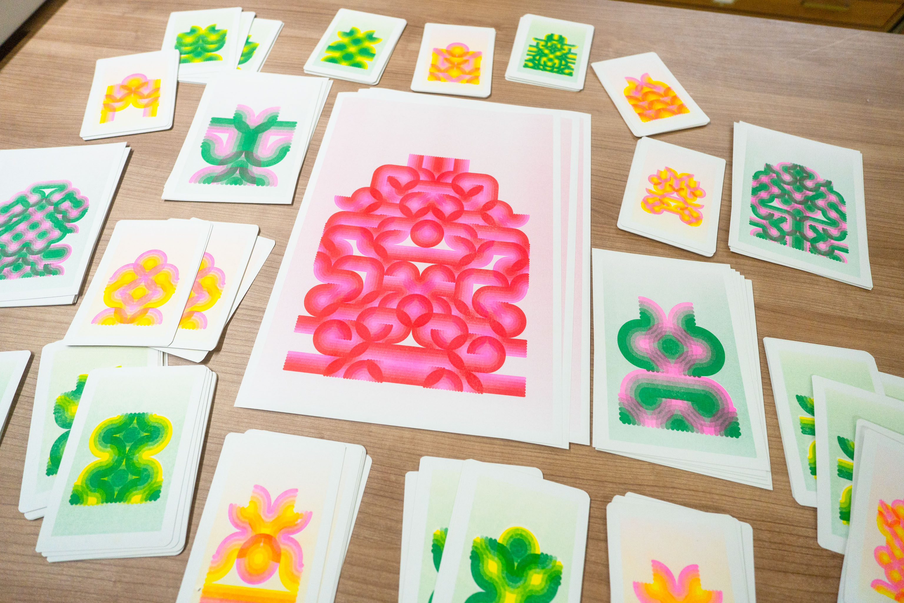
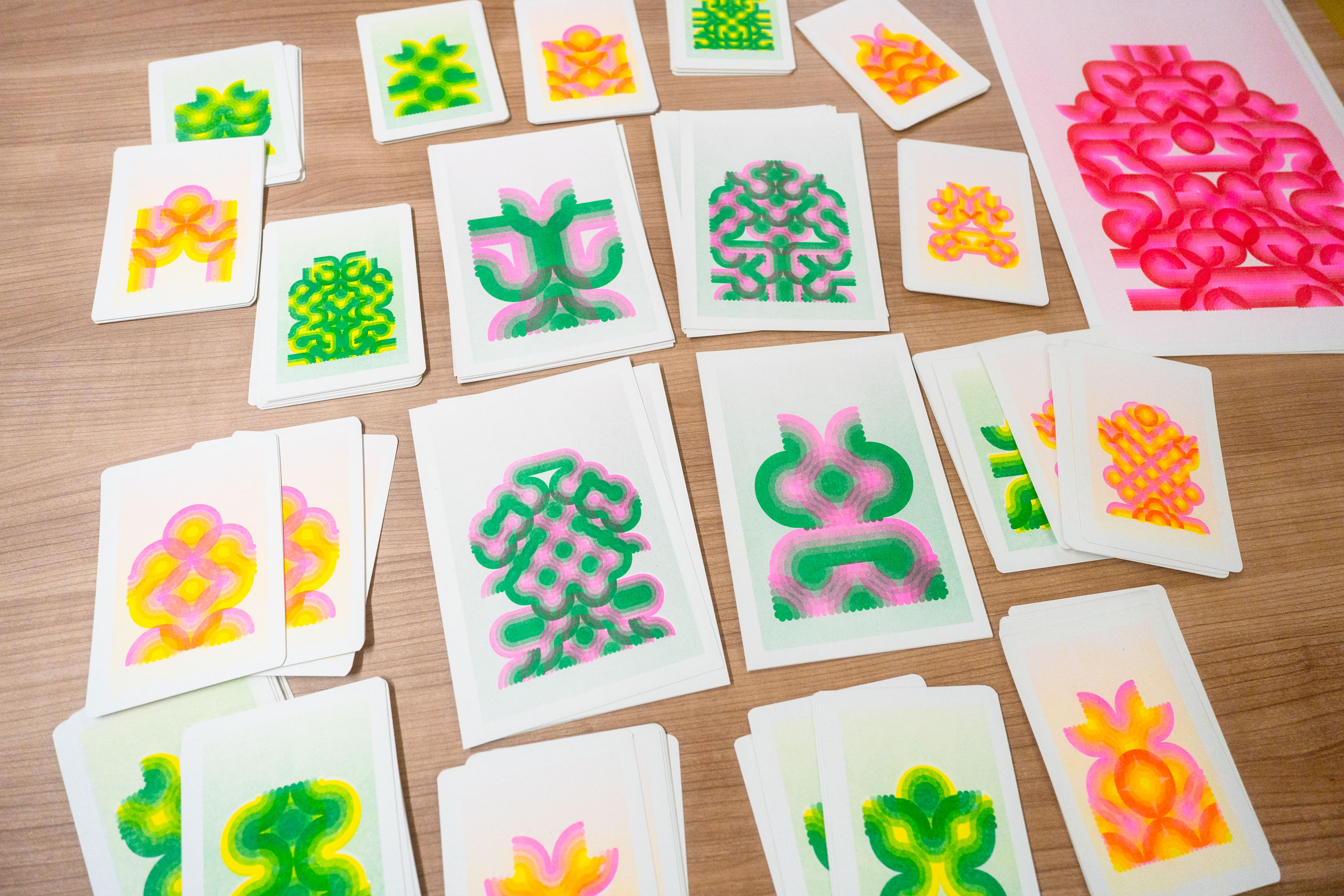
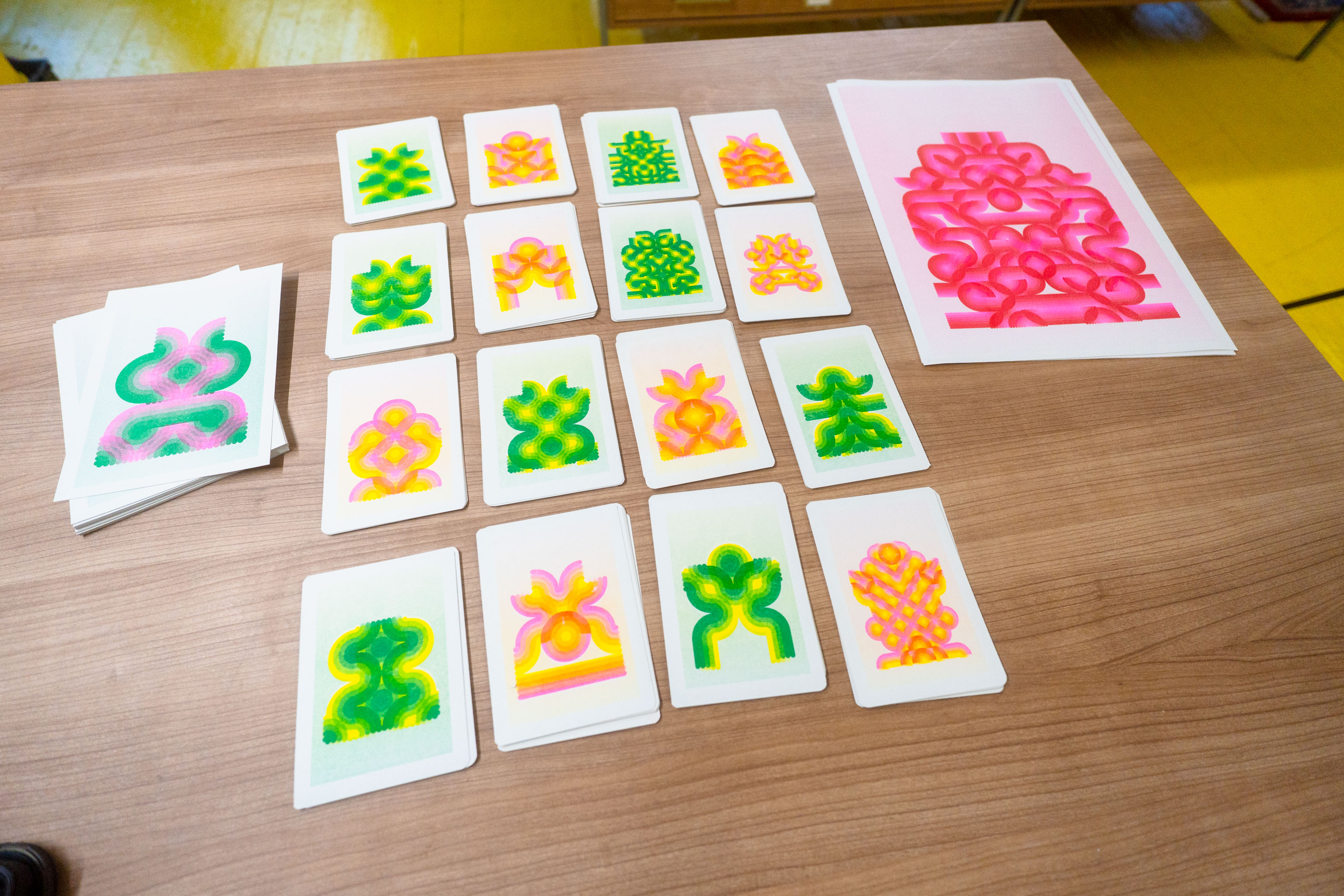
Printed off the final sets of postcards at the Riso studio this morning. Three sets of eight prints, each are Yellow + something.
Yellow + Red.
Yellow + Green.
Yellow + Pink.
The Patreon supporters will get three postcards, one selected out of each set, and the slightly higher level gets the A5 ones.
Worked on the Riso code until I got to here, a generator that spits out two files, one for each colour. The machine works a bit like screen printing, you need to have a design for each drum. The design gets "burnt" onto the drum, and then we send a bunch of paper through.
So I did some test prints in various colour pairs, then cut them up into postcards (and some A5).
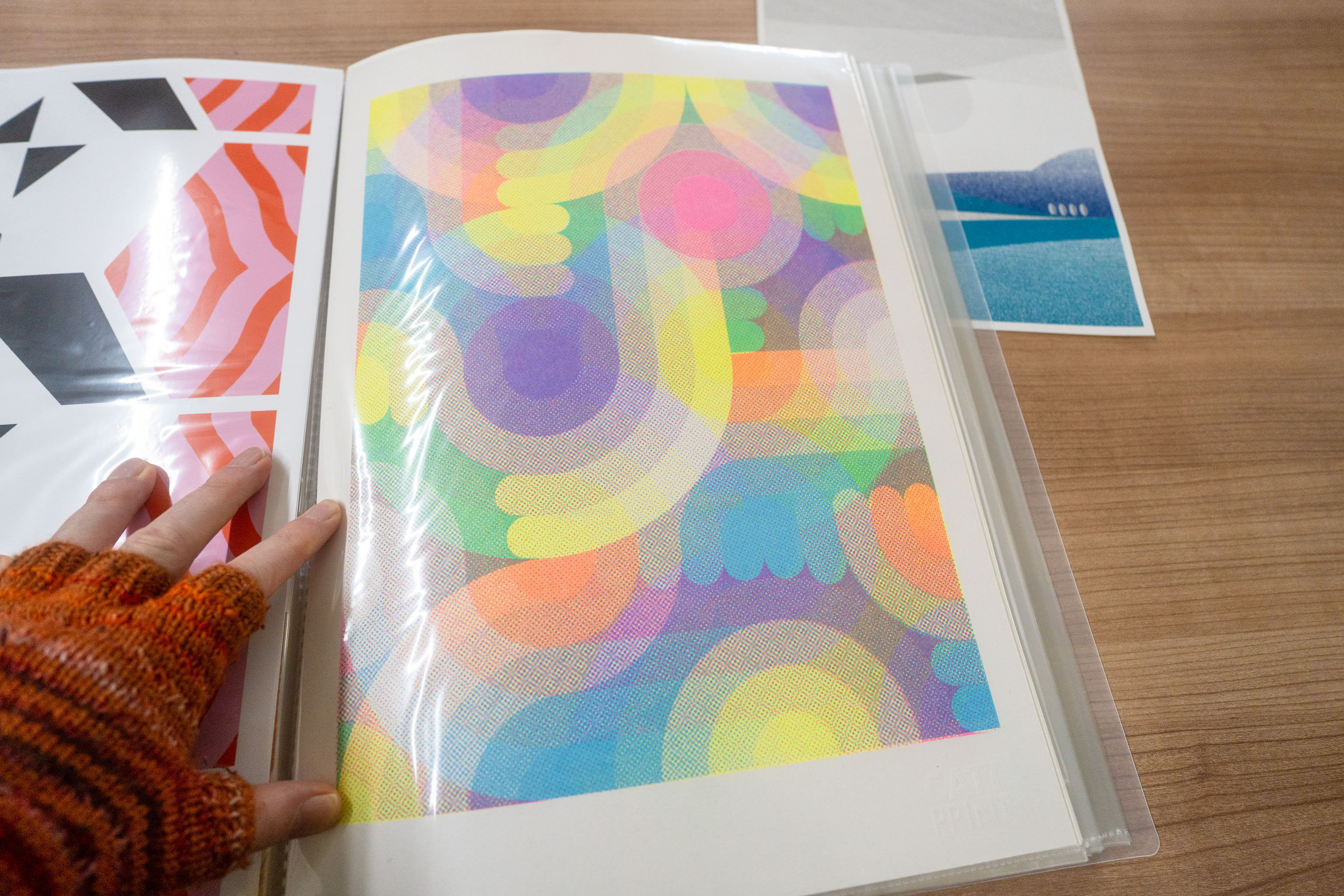
I swear I'm not sure where to put half these photos. This month, for the monthly Patreon post out I'm going to work with the 80s Pop Roxy design, but uh, as a Riso print.
One day I swear this will all get easier when projects are either well defined, or they all melt into a single thing, although I have no idea what that'll be.
While I'm still working on the Drawing Machines 101 introduction videos I'm not creating any actual pen plots as side-effects/artefacts from that, which is what I plan on posting off. So each month until I get to that point I need to do something extra.
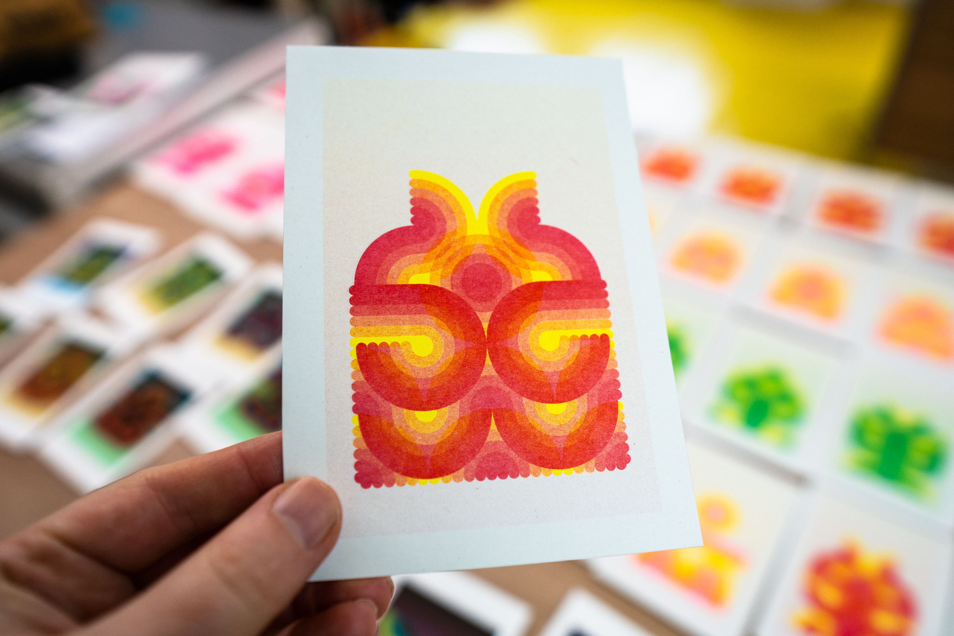
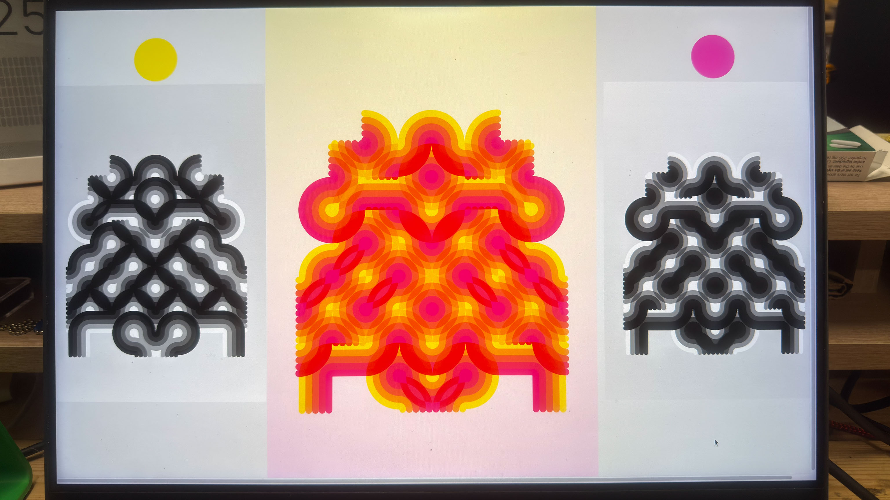
When I was working on 80s Pop there was a bug in the code. BUT, it was a very appealing bug, so I took a snapshot, tucked it away, and then fixed it.
The bug lent itself very well to print format, rather than digital, and I took one of the outputs and sent it off to get Riso printed. Photo included below. The final digital versions look like the postcards I've just printed, also shown below.
Now I'm digging out the "bugged" code, and going to repurpose it for the Riso printer.
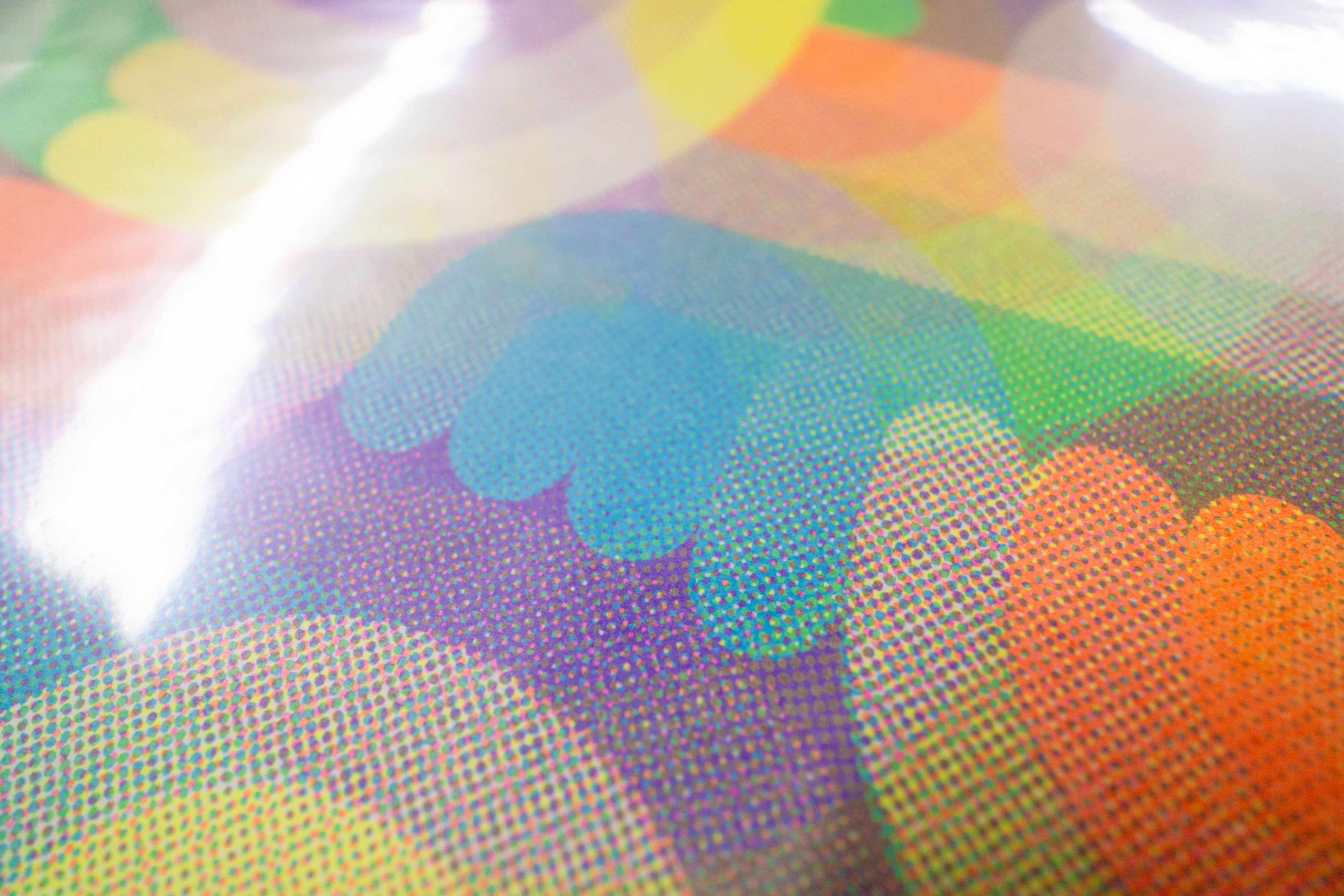
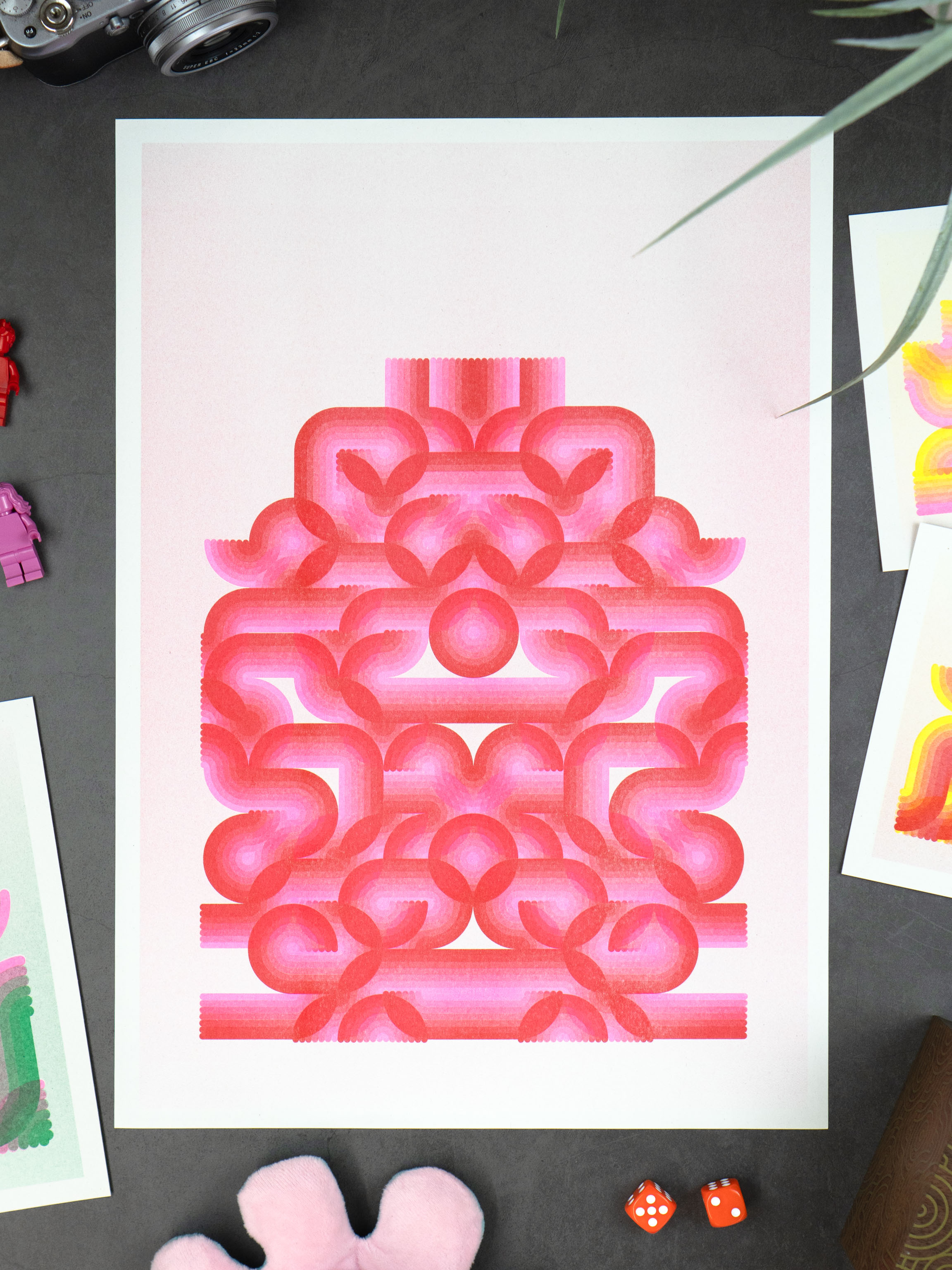
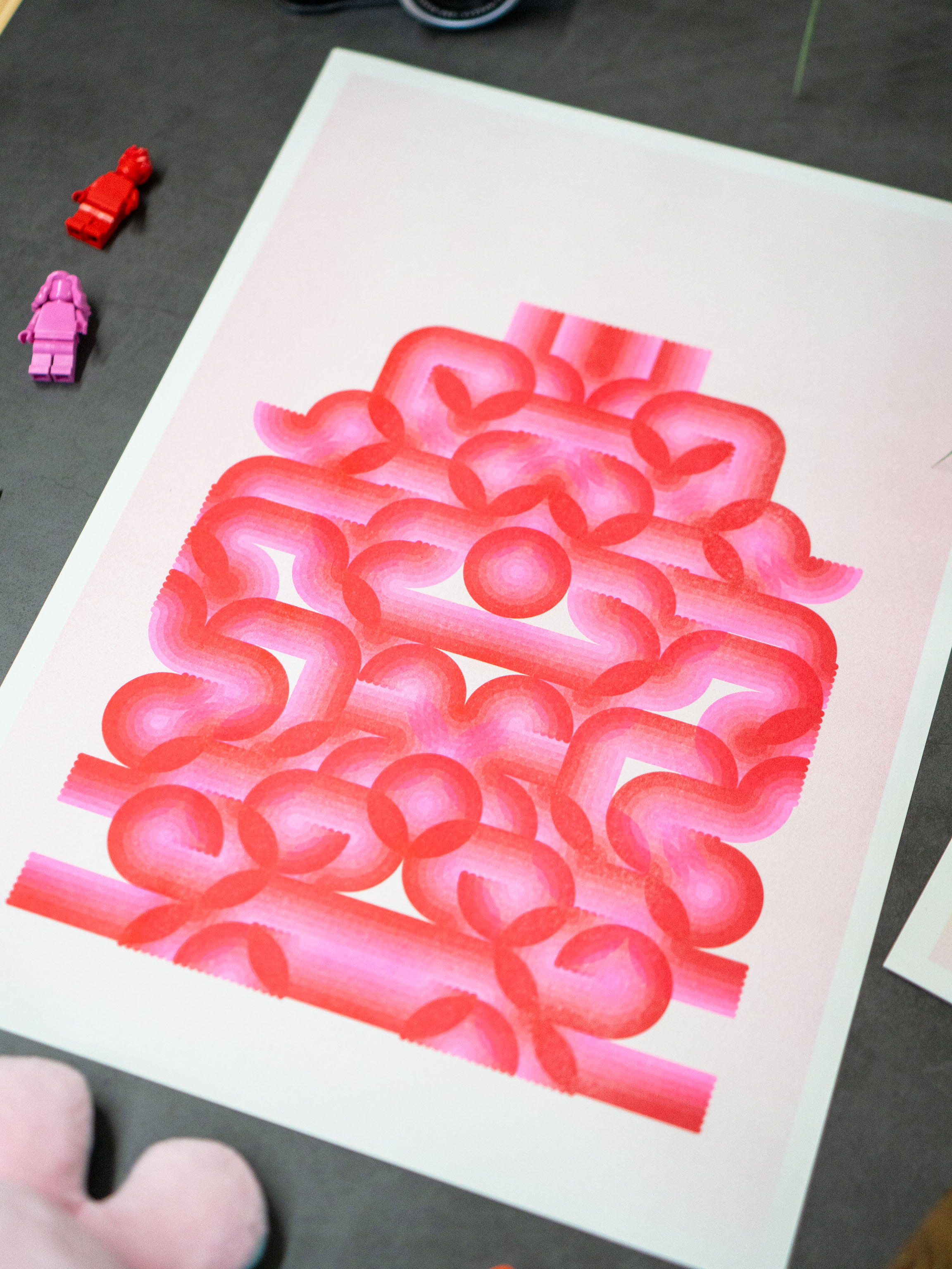
I swear the pink "pops" a lot more than this.
I'm doing a photo 365 project, were you take a post one photo a day for the whole year. It's worse than it sounds.
For some reason I decided to make it even more terrible by limiting myself to using a camera app on the phone that simulates old cameras, and narrowed it down to one filter that adds the date to the photo. Basically an 80s camera I think.
I did this so I couldn't cheat and use a photo from a different day as the dates were baked in.
There were a few different fake cameras that had this feature and I narrowed it down to too as the others had far too much extras weirdness going on. Over all this camera had slightly duller colours, but the other one overdid the glow, so we've ended up here.
Turns out this is less about Riso than cameras.
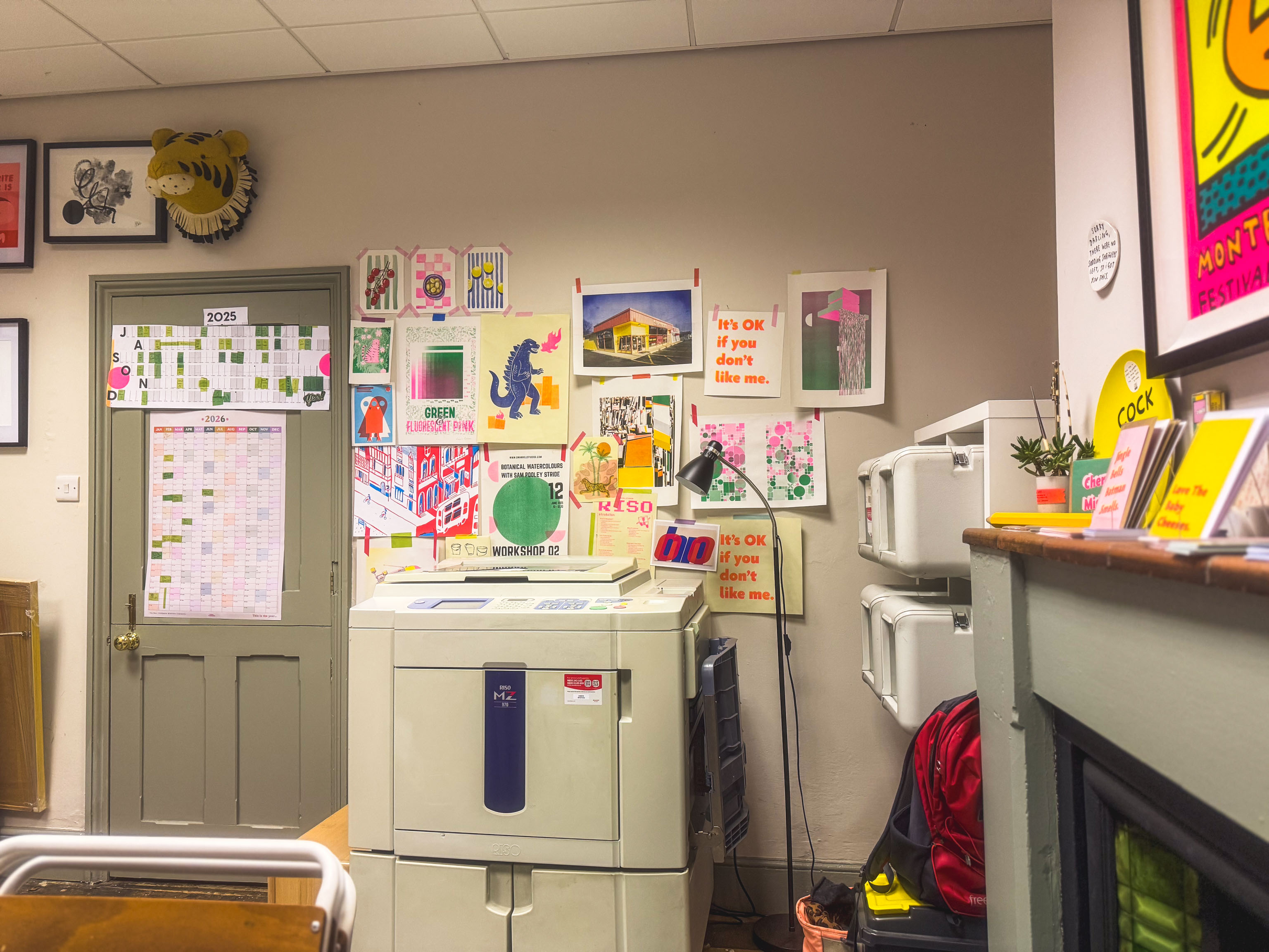
What's going on here is I'm with Becky who's going to be running some Riso workshops and I'm on hand as the "technician" to make sure the machine is working okay.
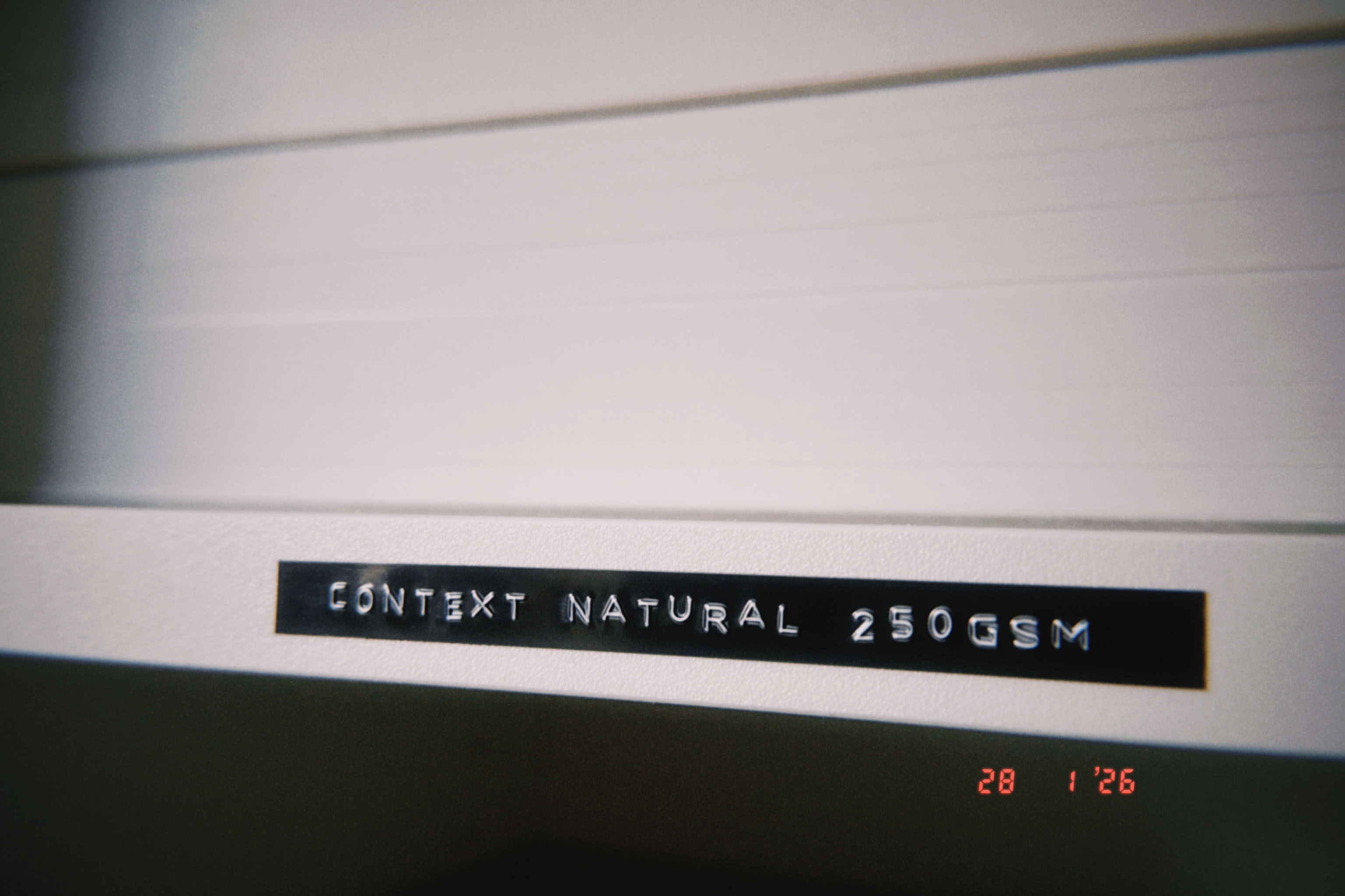
Had a chance to organise the Riso studio a bit, grabbed myself a label maker and labelled up the paper we have. Now I can see what our stock levels are a bit better.
Next thing to do is...
a) get more people using it
b) so we can make more money
c) and
d) spend it all on buying even more paper
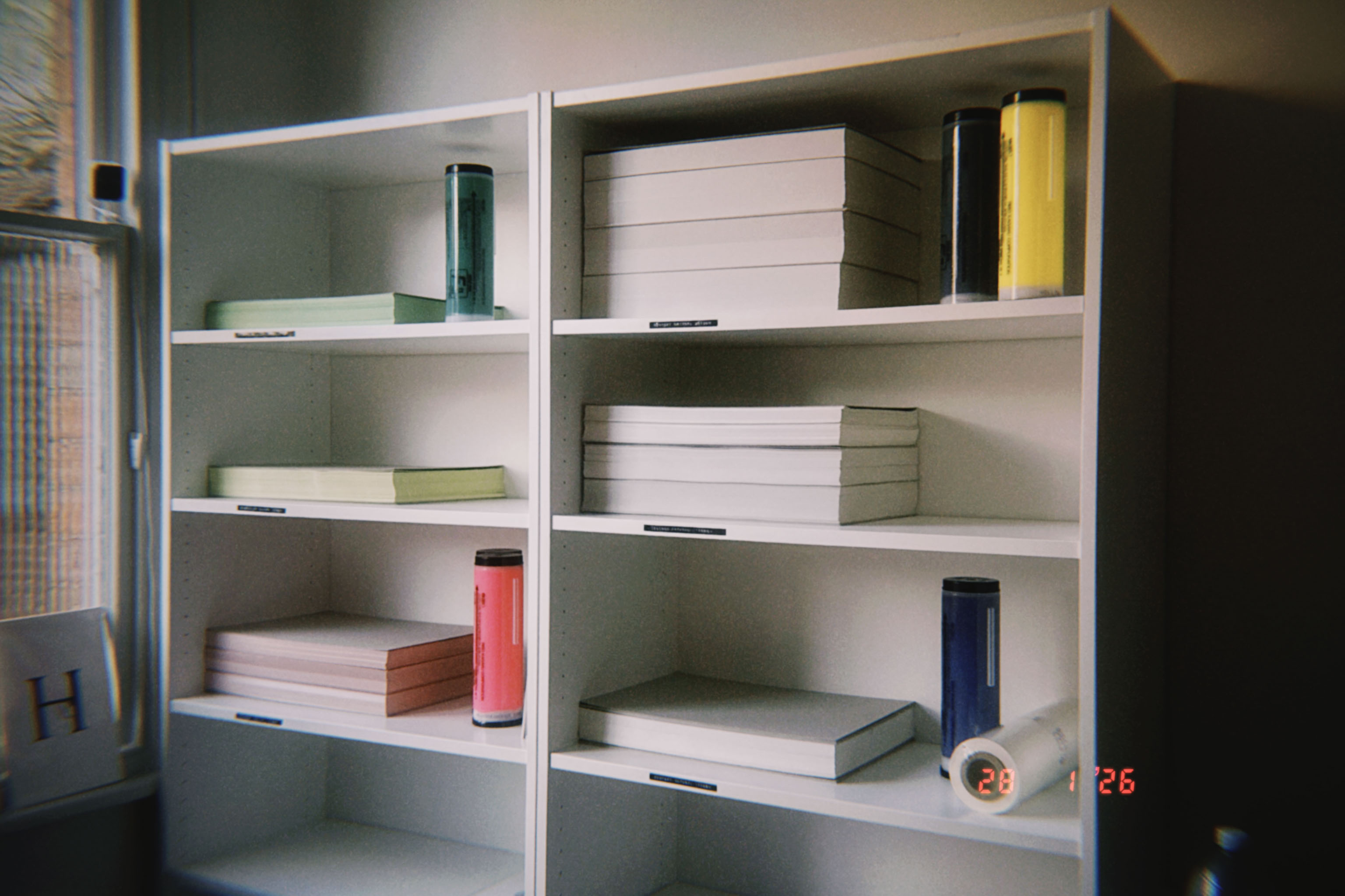
Tidied up the Riso studio a bit and put some shelves up to hold all the stuff.
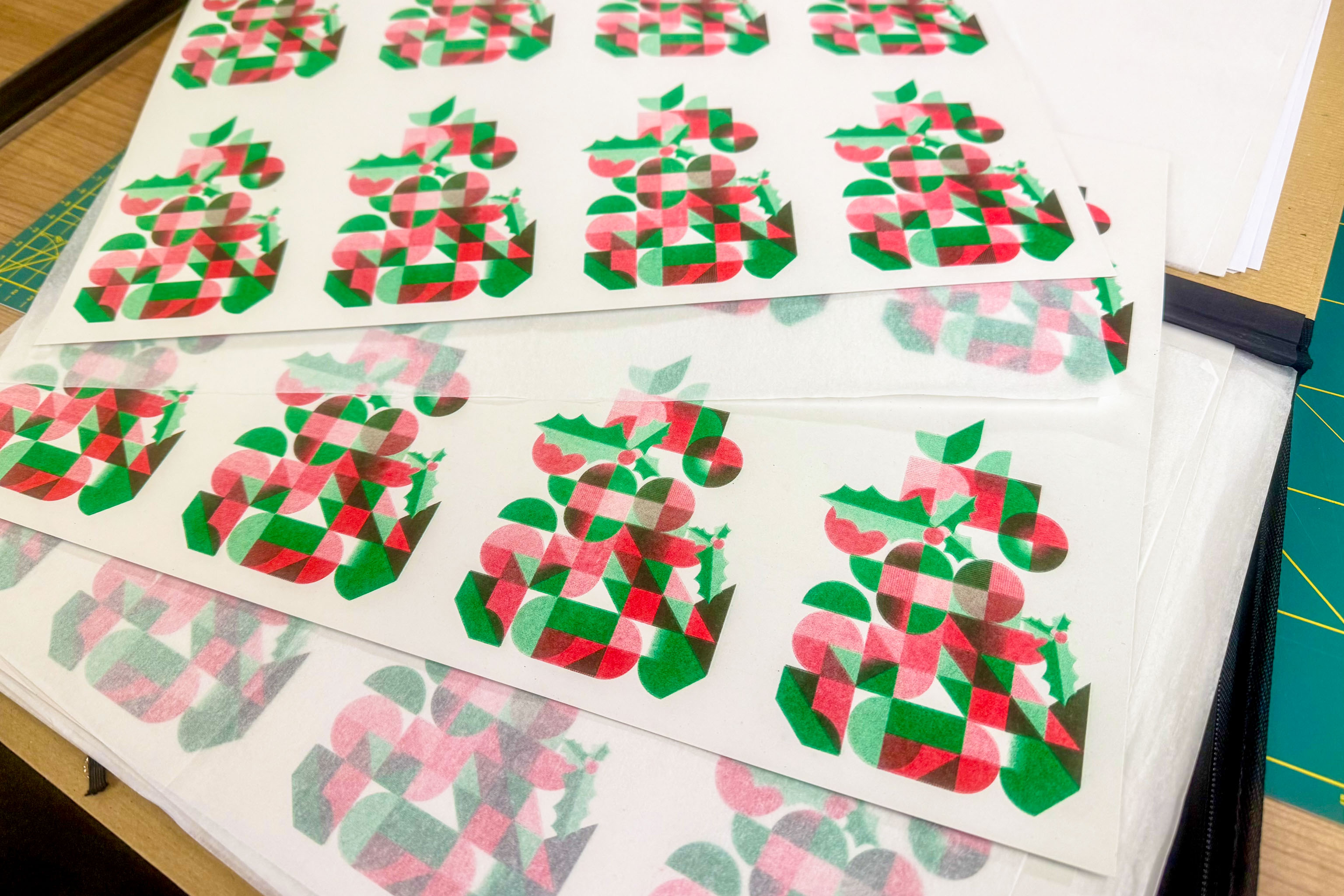
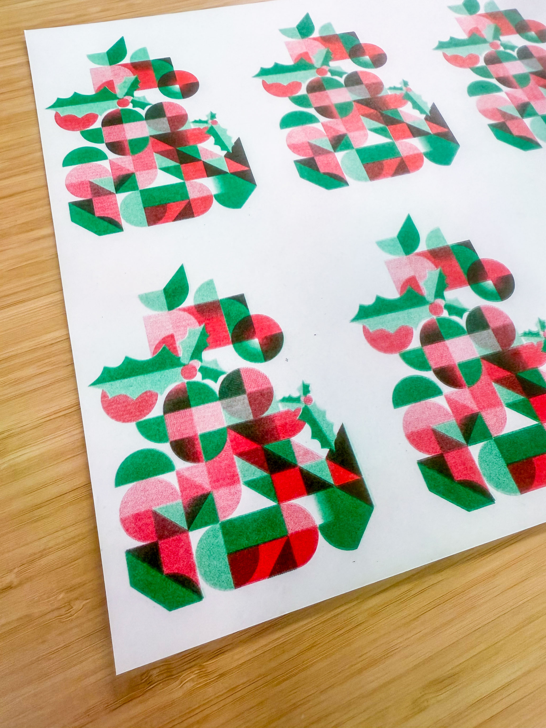
Made some code based geometric abstract Christmas tree riso cards to send to people. Turned out pretty well.
Had to help a couple of people use the Riso machine, and as I hadn't used it myself for a couple of weeks I wanted to make sure it was still working okay, as they don't like to stand doing nothing for too long.
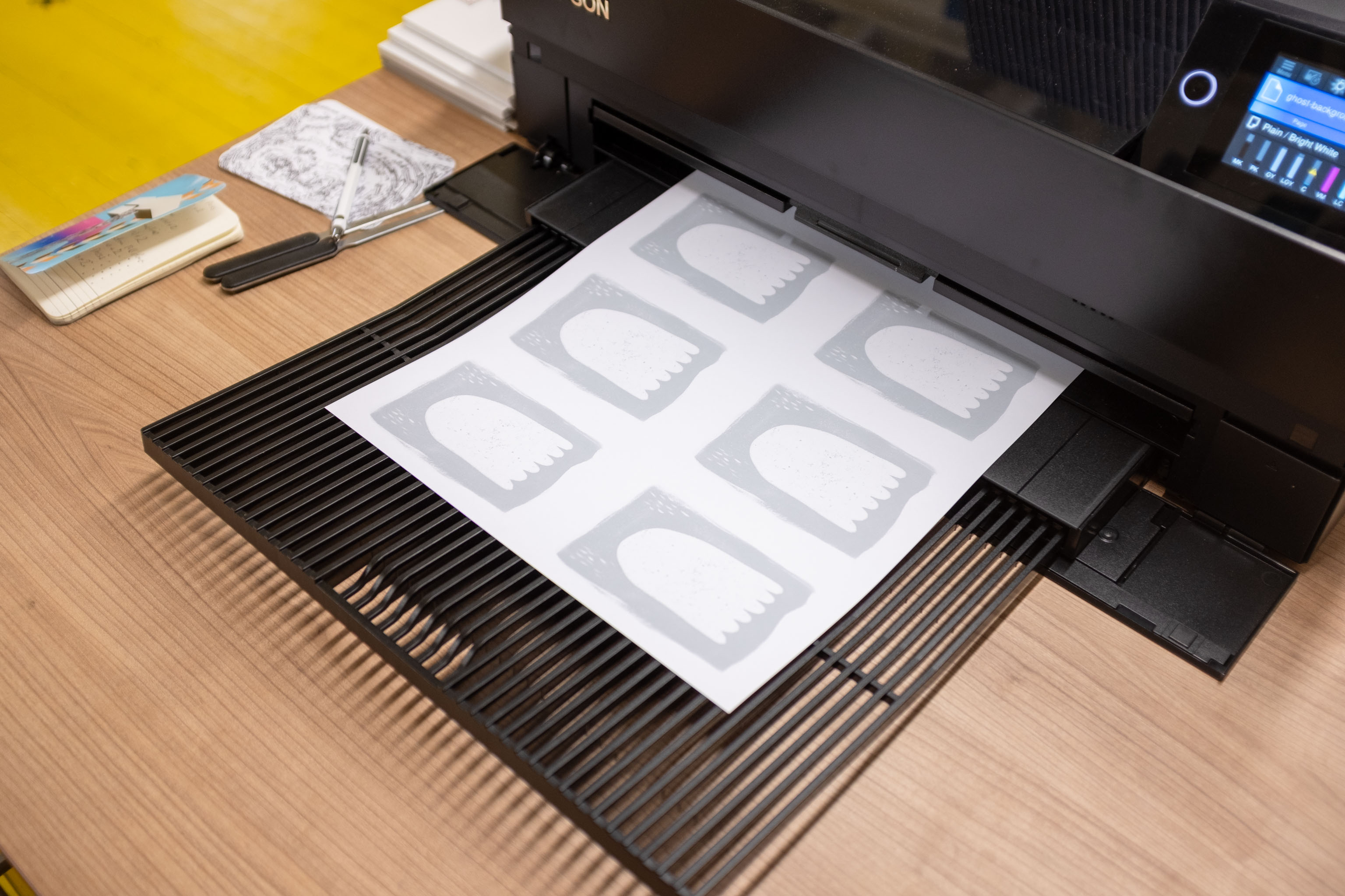
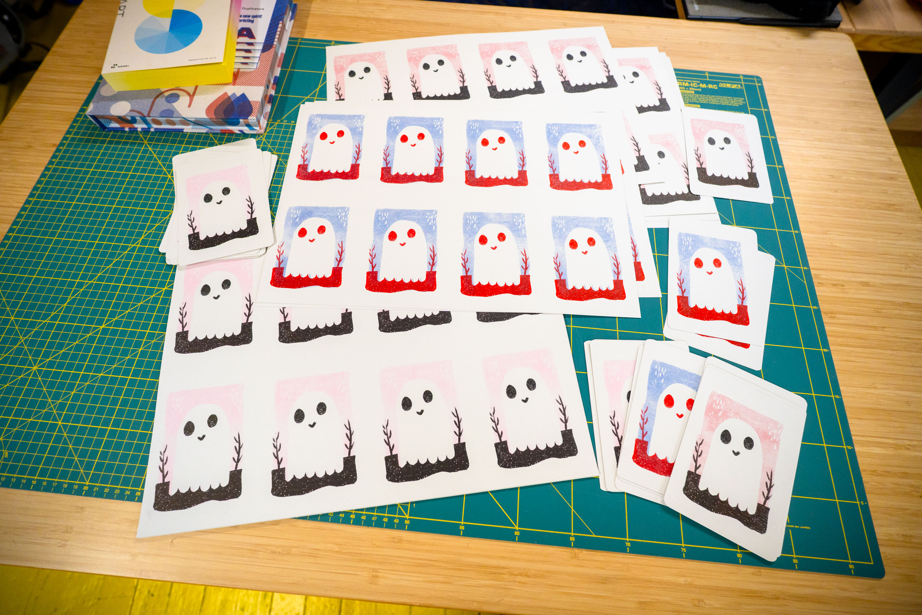
Quickly sketched a ghost, and printed out two greyscale masters to use. They came out pretty well, but boy do I have a lot of ghost postcards now.

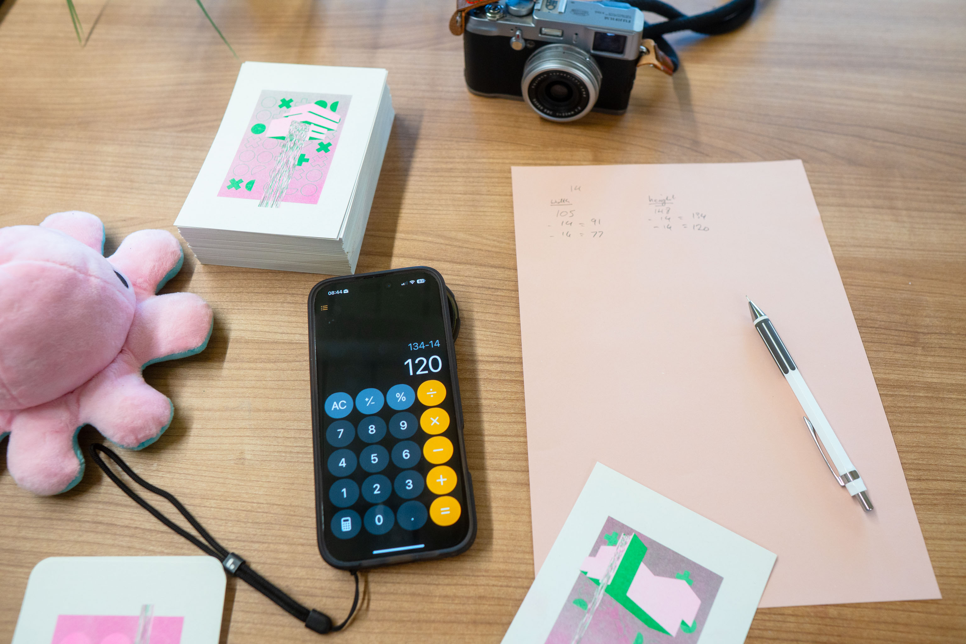
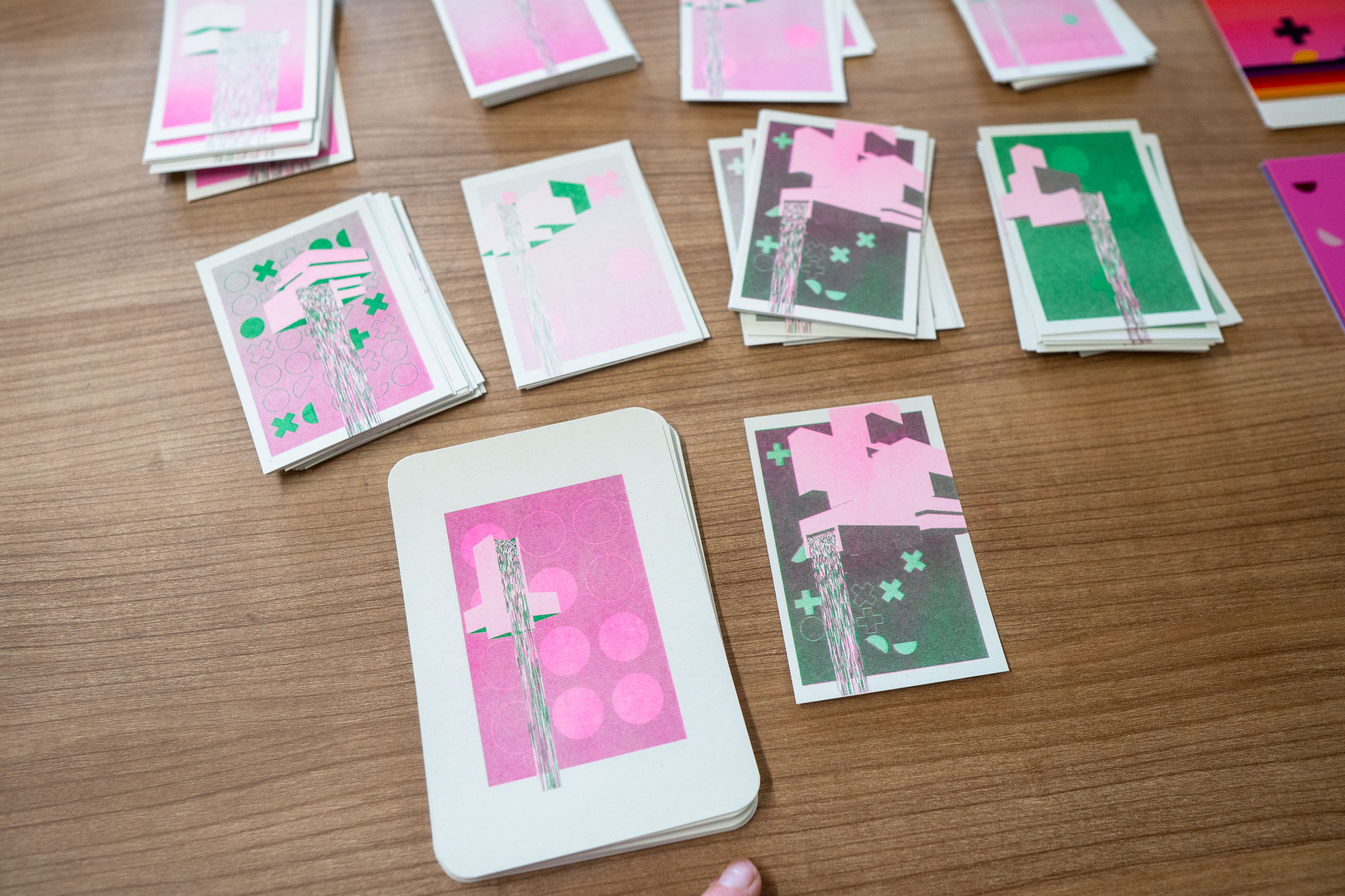
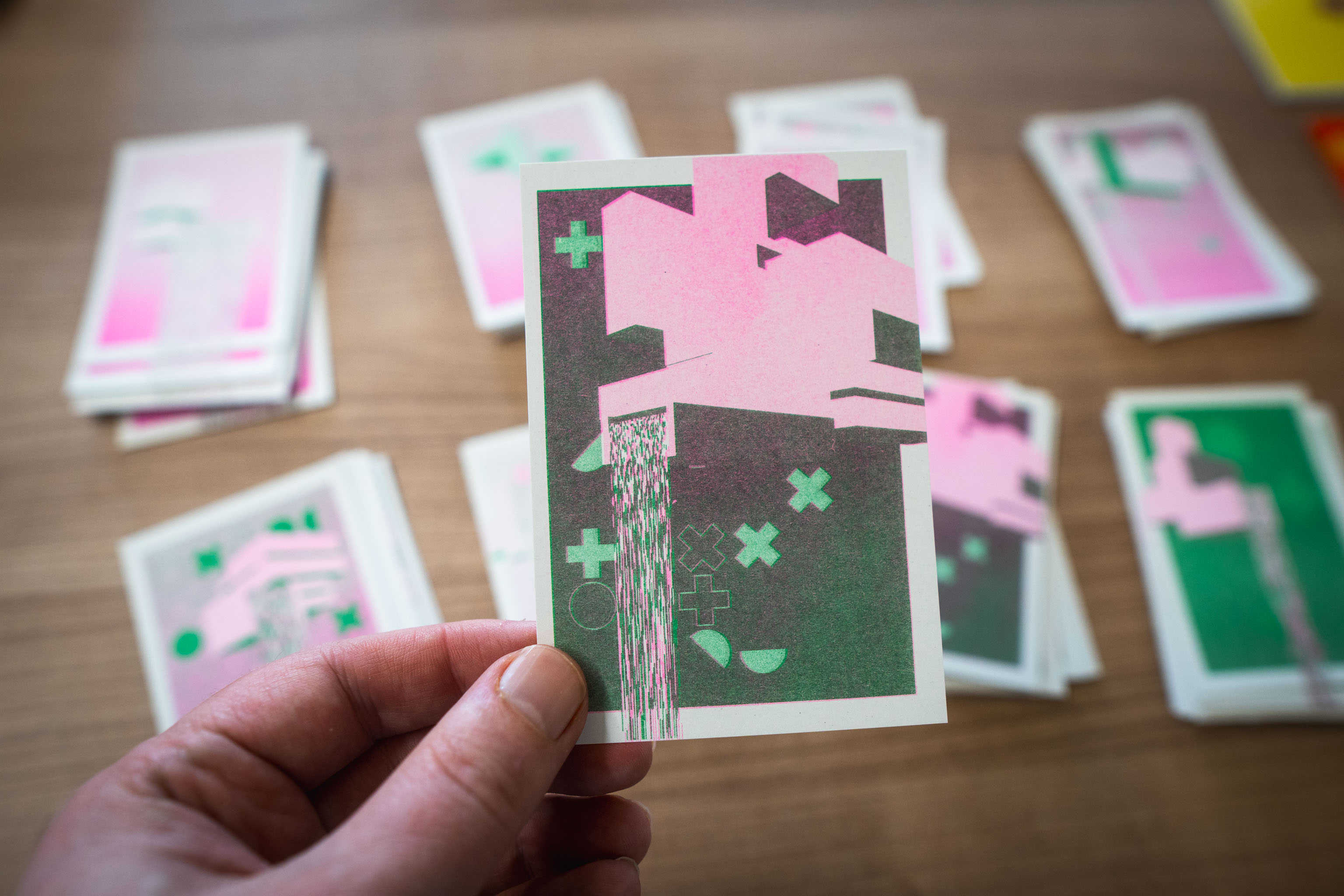
I've been working on my FALLiNGWATER project, writing code that allows me to spit out files for the Riso printer. So most of that I'm posting over there.
But, I printed some the other day where I ended up making the margin too big, the design looked a bit too small in the middle of the card. One of the problems is the design has an inbuilt margin anyway, which some of the element extend beyond. And I was kinda adding an extra margin beyond where those elements end, basically a in-design margin + another margin, and it was too much. For other things it would have made sense, but not here.
Anyway, I calculated that I wanted to take 14mm off each side, as I measure the margin to be 20mm, and what I really want is a 6mm margin.
Turns out I'd already through that and the design had the build in 6mm margin, which is where I mistakenly measured from; I should have done 6mm plus another 6mm, i.e. I wanted to move down from the 20mm margin I had to a 12mm margin, so I should have cut off 8mm, not 14.
So after all that, I'd accidentally trimmed down to the original design size, a bit too small. Definitely NOT postcards, but actually kinda cute, so I guess I have small cards to give away to people now.
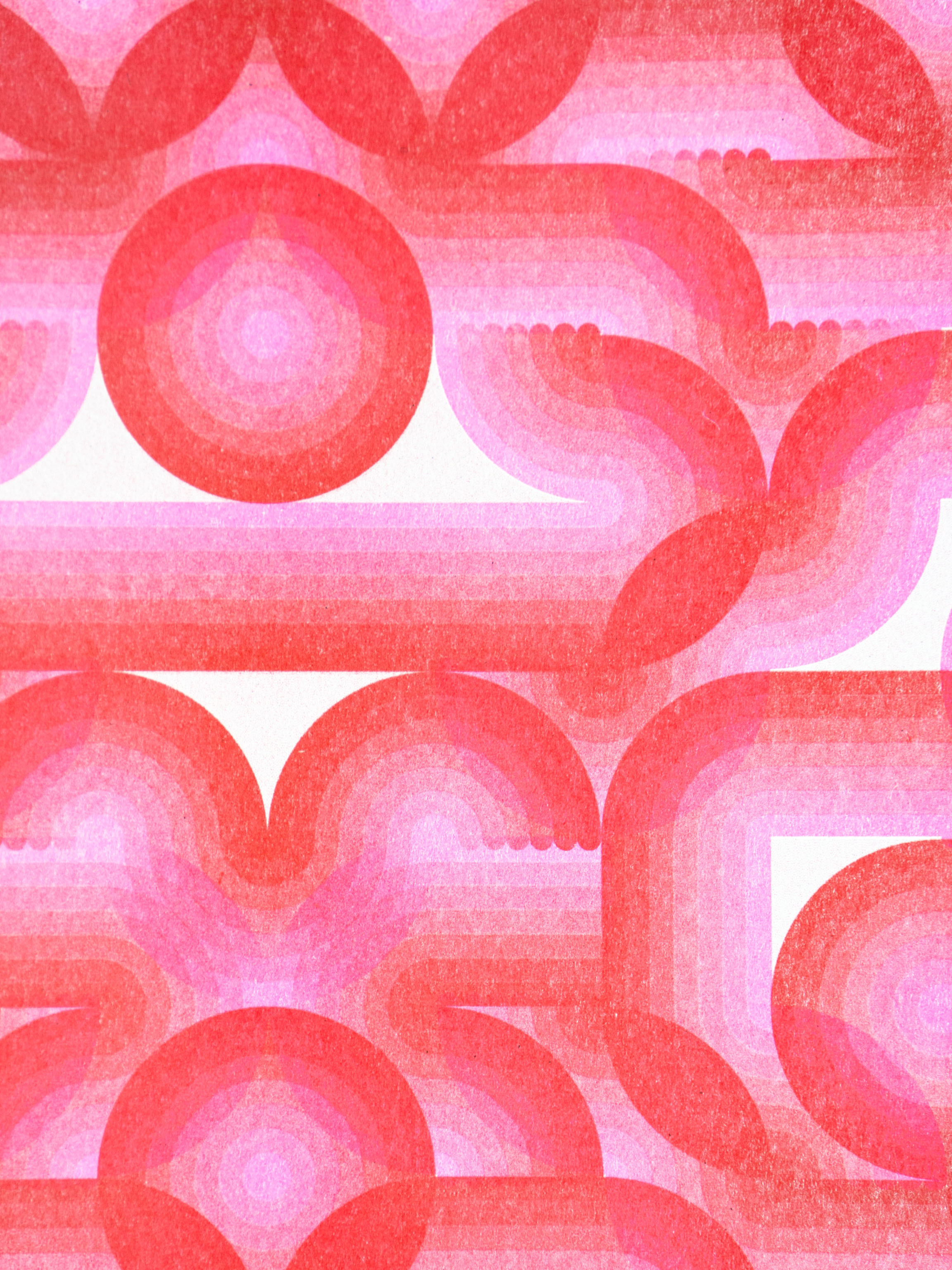
One of the other "Floodland" prints I printed out just to get a sense of the design at larger than screen size.
In what looks like a very professional as though I'm going to sell them way (I'm not), I printed out some tiger cards on the Riso printer. Four to an A3 sheet of 250gsm paper, which I guess you'd actually call card.
I happened to have these kraft envelopes and some cello bags to put them in, so I did. Mainly to stop them from smudging, but also because the cards have a tendency to pop open in the draw and get damaged when I open it.
Next stop is to send them off to people, yay!

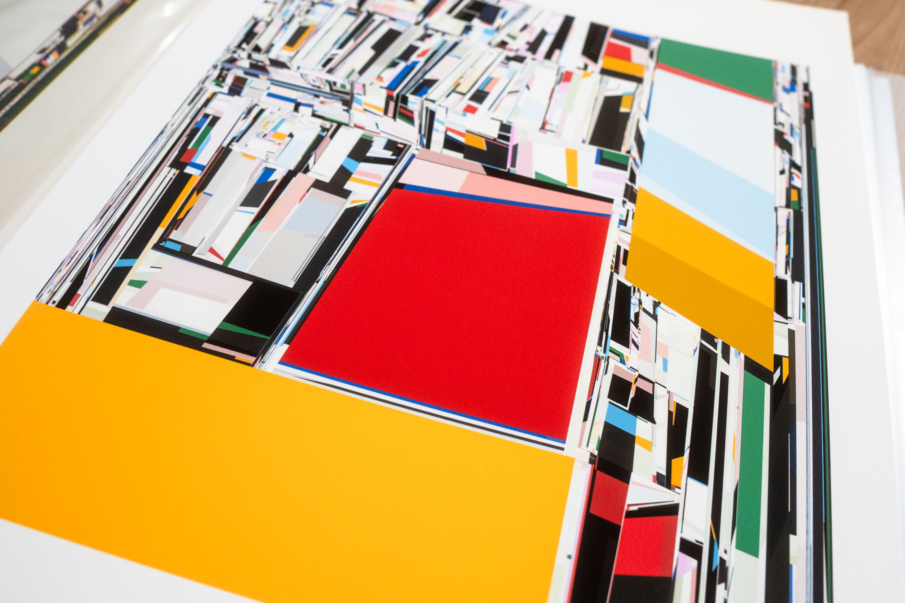
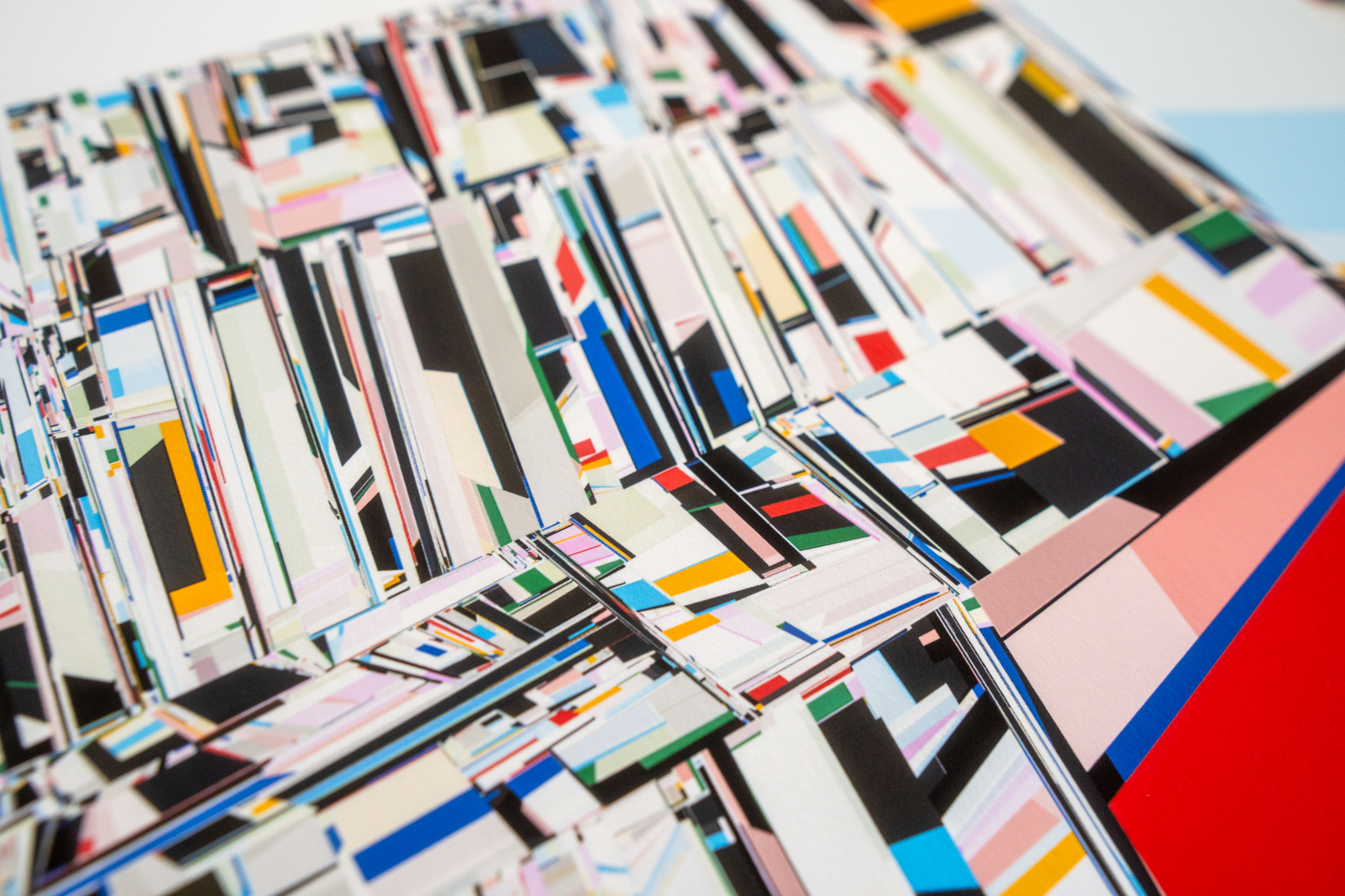
Again, not quite sure where this one belongs, at the moment it's a new generative art project that mainly lives in the laptop and on screen, so most of it is happening there. However I did a test print (or two), and then took the same output and sent it to the riso machine with some tasty halftone.
I kinda like the weird riso-ness of code created art.