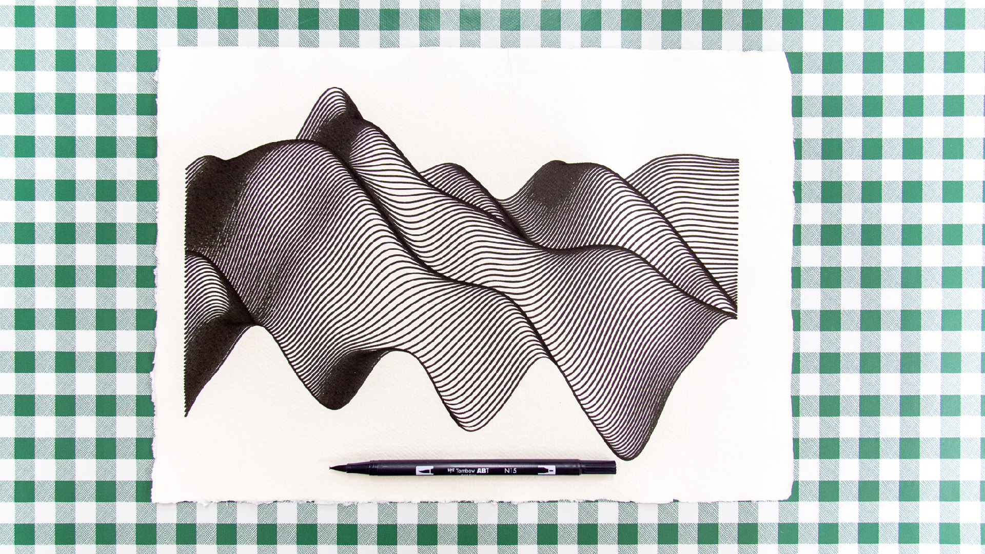
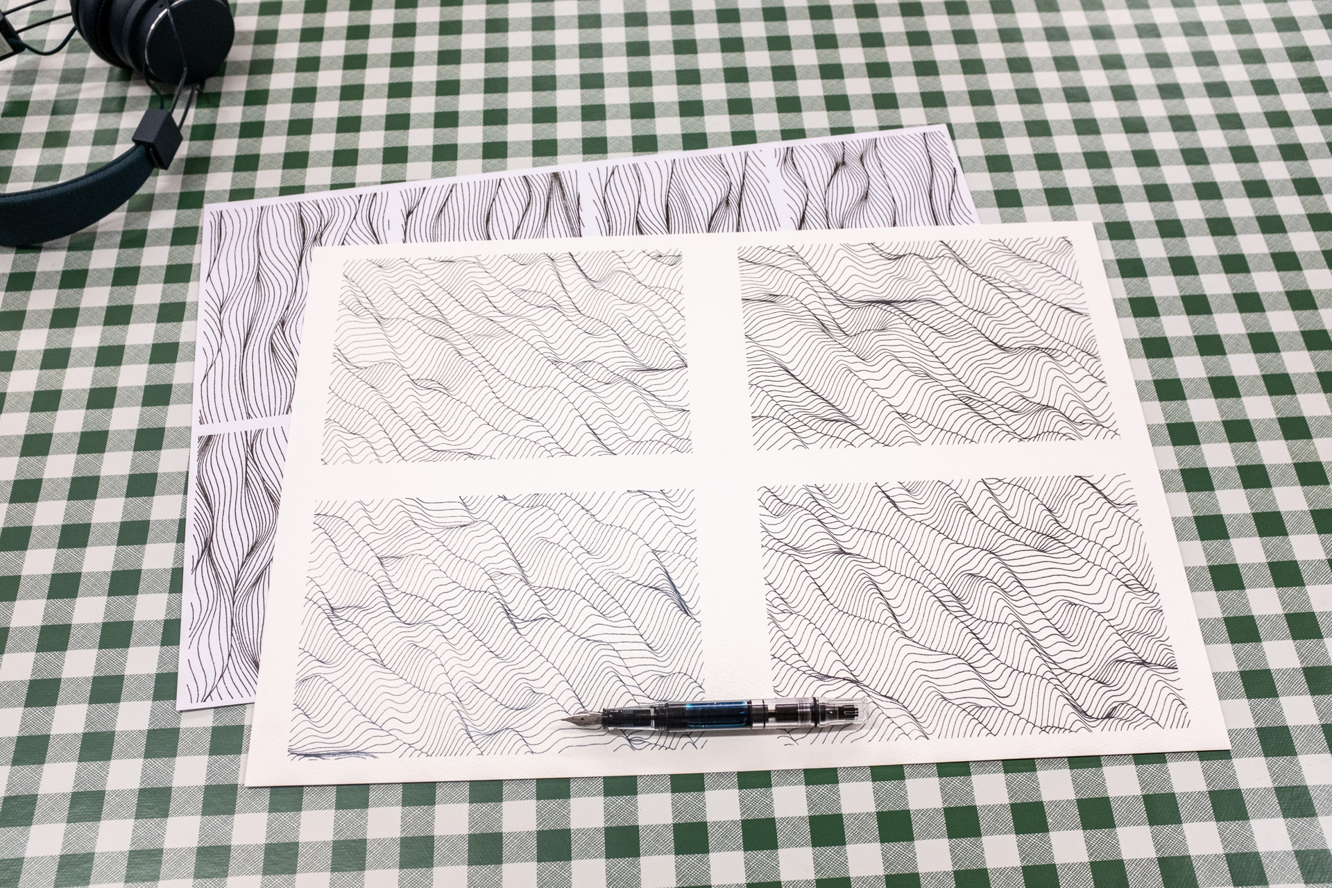
Plotting Perlin Landscapes
The other day I posted some photos of a pen plot to Instagram, Twitter & Facebook, and I had several people ask me for more information about how it worked, and my process/workflow/tool-chain. Well here it is, I'm going to break everything down into three parts, so you can just jump to the bit you want.
- How I produced the pen plot (so you can too), in meticulous over the top detail.
- Instructions on how to use the tool I've posted online.
- Notes about maths, Perlin noise and hidden line removal.
🌊 🌊 🌊
🌊 🌊 🌊 🌊 🌊
1. How I produced the pen plot (so you can too), in meticulous over the top detail.
Some people like to know how other artists go about doing what they do and some of the thinking behind each choice they made. Well, this section is for you then, at the end of this you'll hopefully be able to repeat the plot I've done, and your own variations.
Step 1. Make an SVG file of a landscape.
I wrote myself a tool; what I like to think of as a blank page sketchbook, a javascript template which I always start with and then add more code to, to make a sketch.
Warning: The code/page I'm about to link to was written for my own use, it's full of bugs,
missing features and
it's very easy to crash your browser, and this won't work on your mobile. The general advice is to keep the
values low, turn "removeHidden" off, turn "autoRedraw" on.
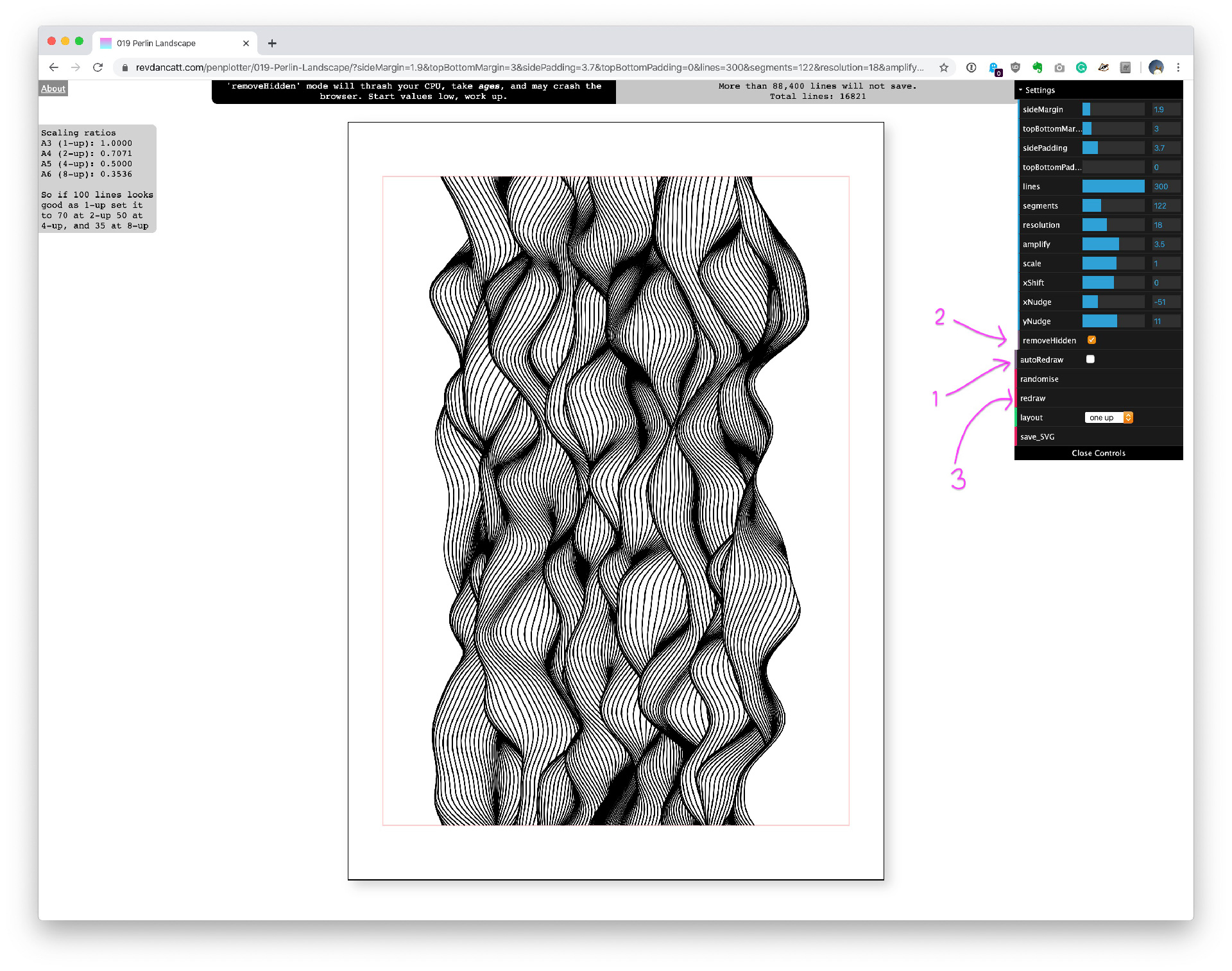
The Perlin Landscape sketch looks like this revdancatt.com/penplotter/019-Perlin-Landscape.
When you are there first turn "autoRedraw" off, turn "removeHidden" on, then hit "redraw"
and wait 8-15 seconds.
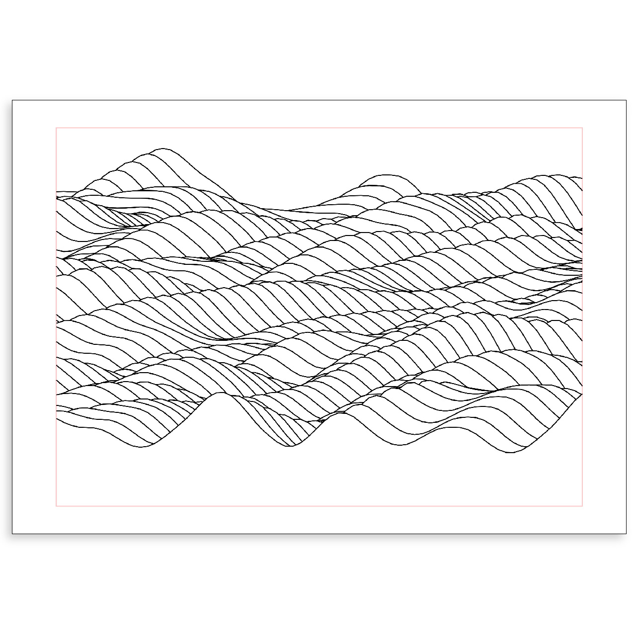
It'll look like nothing is happening, but after a while, you should see something like this:
If you don't like the waves or see missing lines (my code is buggy) click the "randomise" button and wait another 8-15 seconds.
Should you want to play with the other values I suggest turning "removeHidden"
back off,
and "autoRedraw" back on.
Full instructions are further down the page.
When you have a design you like, hit the "save_SVG" file, and a "perlinLandscape_[...].svg" file will download.
I'll get onto how I plot that in a moment.
📄 🧲 🖋
Equipment
This is the pens and paper I used, and how I use them. I know using pen and paper seems obvious, but this is the "meticulous over the top detail" section.
📄 📄 📄 📄 📄
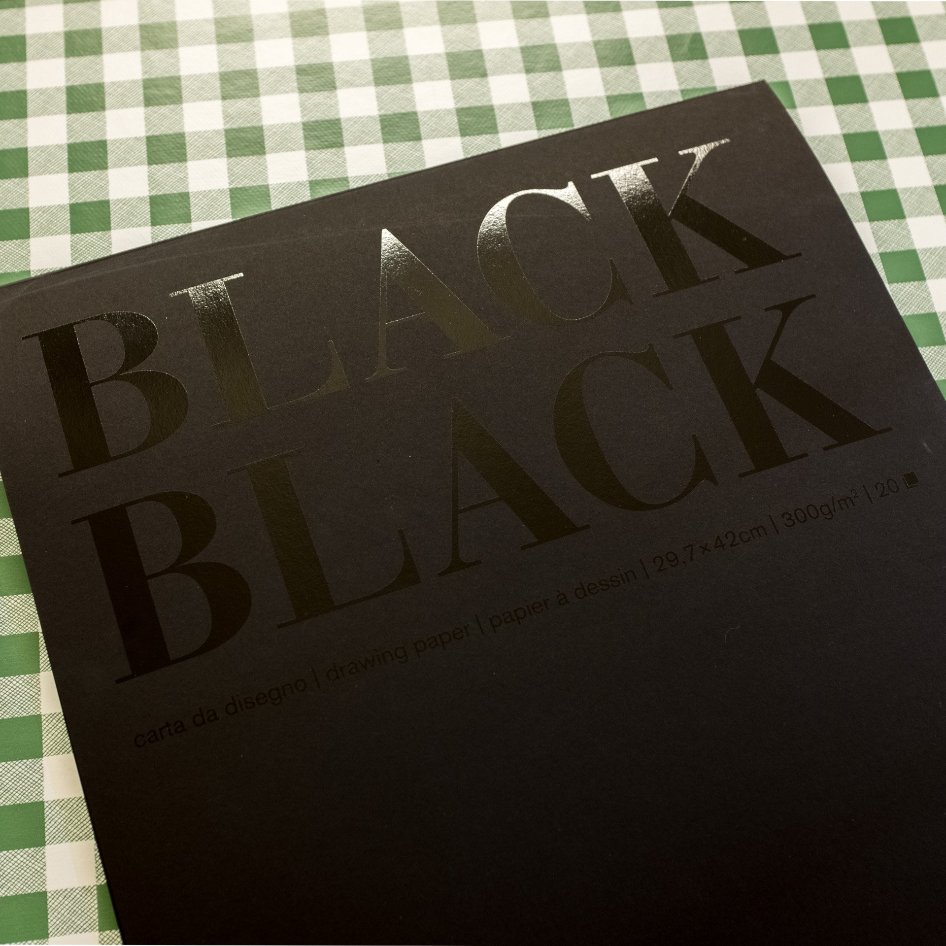
Paper: Fabriano Black Black, A3, 300gsm.
Fabriano Black Black is ECF-bleached cellulose, light-resistant & acid-free, hot pressed, very smooth fine-grained paper, with a matt finish and very very deep black.
You can buy single sheets, but I buy mine in a pad of 20 sheets to make storage easier. (Amazon UK).
You don't have to use this paper obviously, but I've found this paper to be the best. The ink doesn't feather, and the ink absorption while still there isn't as bad as other black paper I've used.
In short, I do test plots on cheaper black paper, but then my final plots on this paper.
🧲 🧲 🧲 🧲 🧲
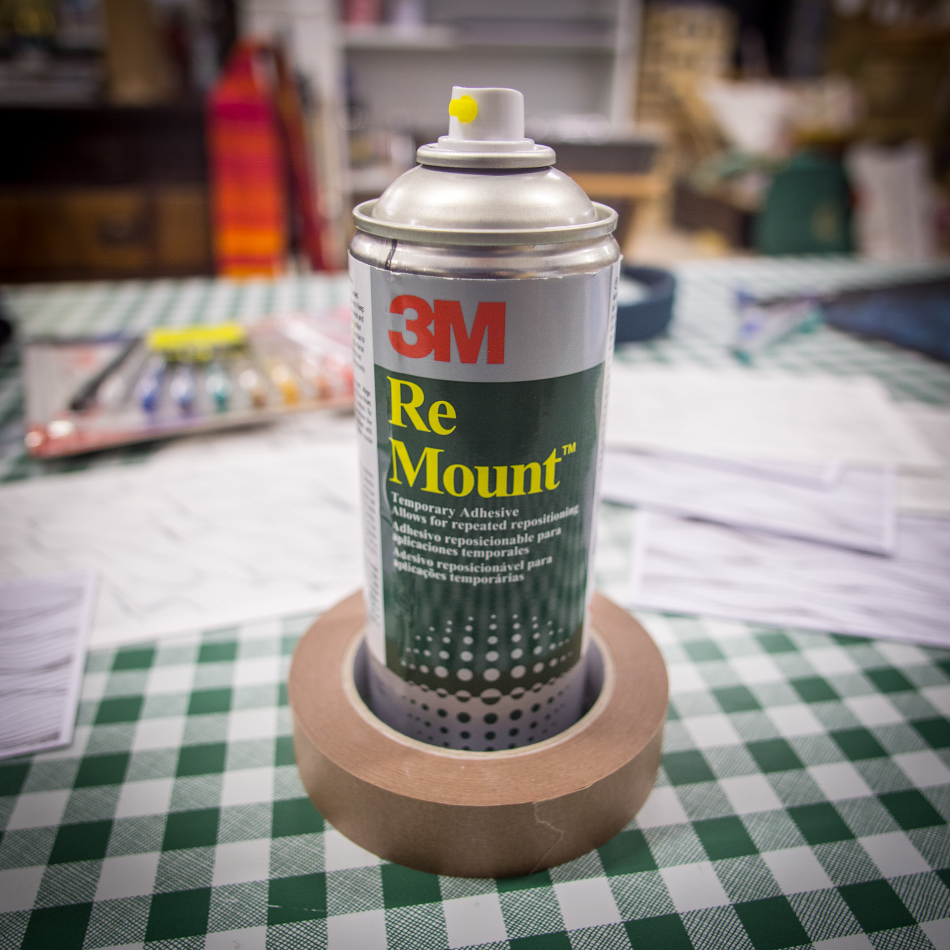
Spray Mount and Mounting Tape: 3M ReMount Removable Repositionable Spray Adhesive and Framers Masking Tape.
Because my art studio is on the cold side, and I don't store my paper in super dry storage, I think it absorbs a small amount of moisture and tends to curve off the resting surface slightly when I'm plotting. For that reason, I have to take steps to make sure the paper is laying super flat.
If it's a final piece and I want to be super sure I spray the back with 3M repositionable spray, which is a temporary adhesive and then lay it down on the cutting mat carefully pressing it flat.
When the plot is finished the back of the paper will still be slightly sticky, if you let it hang to dry for a couple of days the adhesive will "dust off". Alternatively, you can stick a very thin piece of (acid-free) paper to the back before mounting.
You can also periodically spray directly onto the surface that you lay the paper on to keep it suitably "tacky", washing it with soapy water when it gets too covered in fluff.
Note: Be careful when handling your paper, especially when pressing it down onto the mat. I've also seen people plant their hand on the middle of the paper while leaning over it to adjust bits and bobs. If you press your hand onto the paper, you'll leave oils from your hand on it, and these oils can cause the ball in ballpoint & gel pens to skip and slide. The oil will also act as a resist to some inks. If you have an area in your plot which is patchy, there's a chance you've left oils on the paper.
Instead of adhesive spray, you can also use framers tape, which is acid-free and handy to keep around should you want to do a bit of framing. The tape will be too sticky when you first use it, so either be really careful when removing it from the paper, so it doesn't rip the surface off. Or remove the stickiness a bit by sticking it to your jeans/clothes a few times first.
Far smarter people than me us metal sheets as their surface and magnets to hold the paper down, I aspire to this one day.
Now you have your paper laying flat, you're almost ready to plot, time to break out the pens.
🖋 🖋 🖋 🖋 🖋
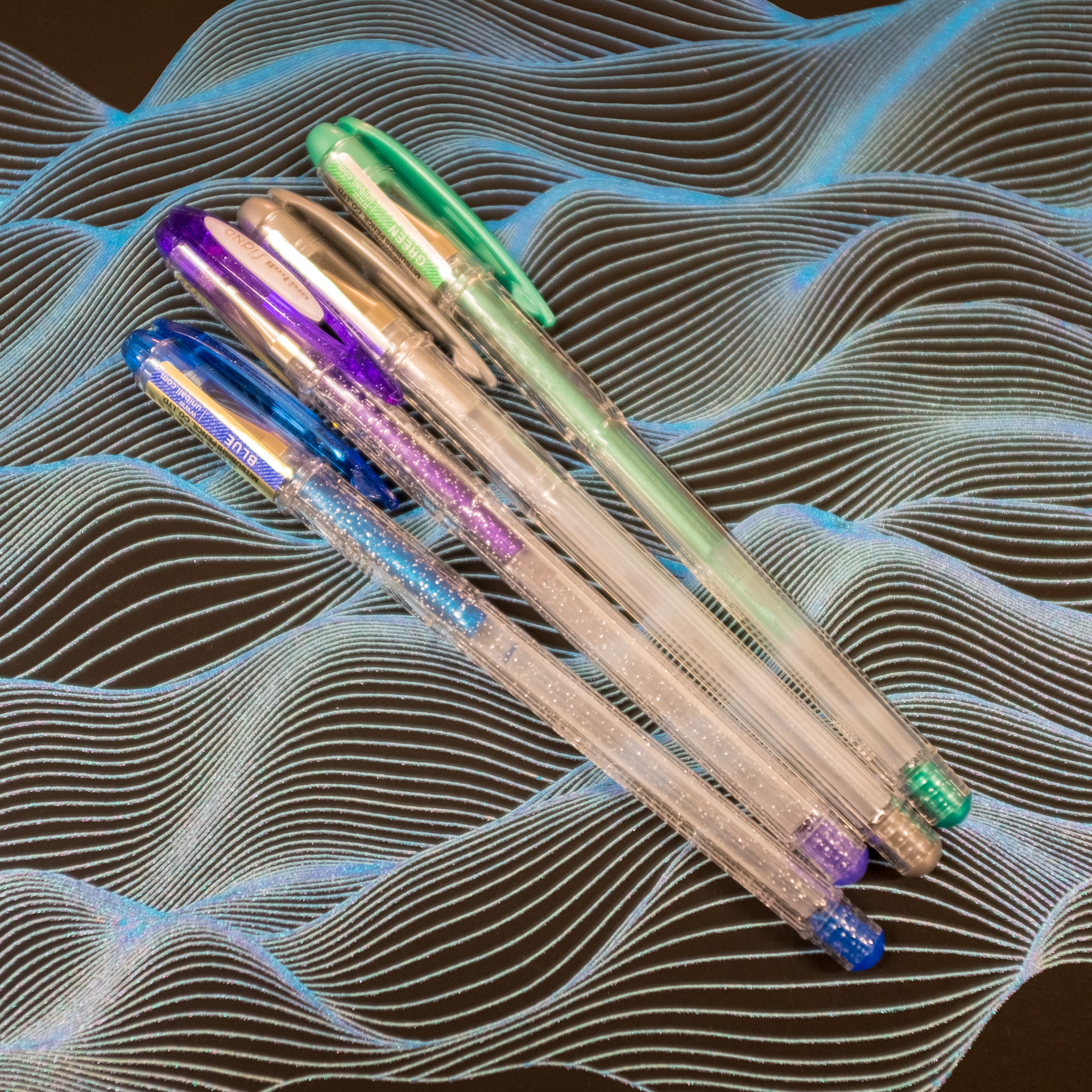
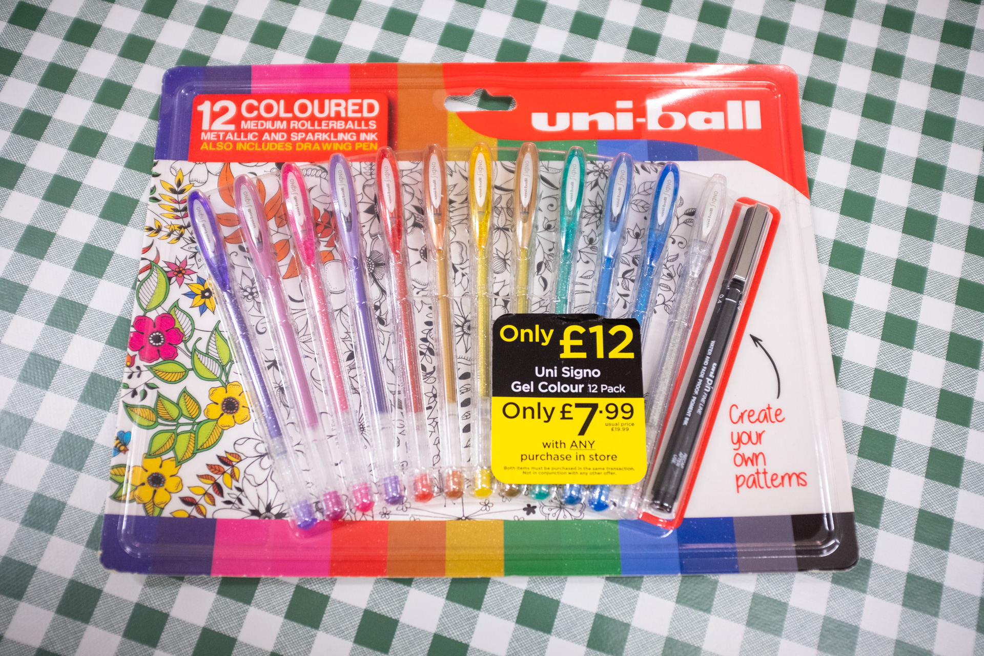
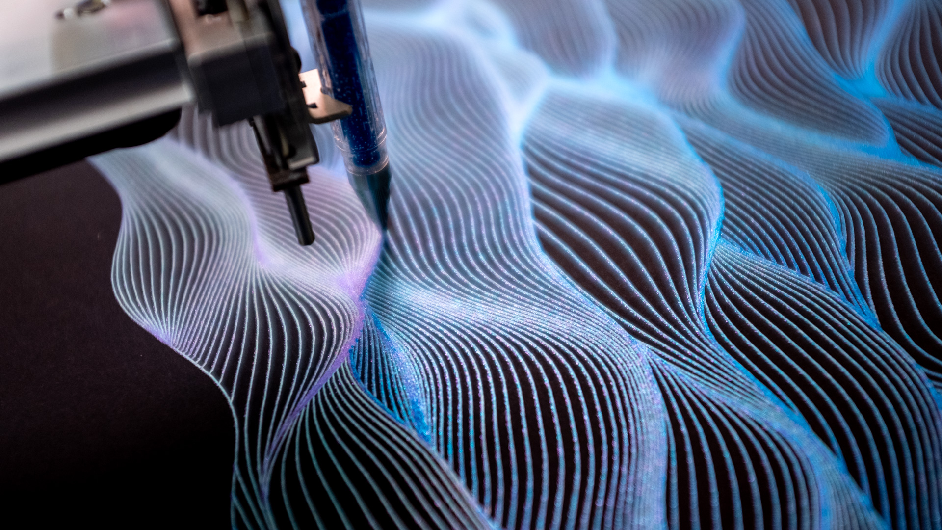
Pens: Uni-ball Signo UM-120NM 0.7 metallics (Amazon UK); silver and green. Uni-ball Signo UM-120SP 0.7 sparkling (Amazon UK); blue and blue.
Because I still haven't found a good off the shelf white ink that works well on black )I'll post how I make my own white fountain pen ink soon) I've instead settled for silver. The Uni-ball Signo UM-120NM (NM stands for Noble Metal) metallic silver is amazing (Amazon UK) on black, and while not white, is bright enough for excellent contrast. I'm not sure how easy they are to get in the US?
My local stationery shop had several 12-packs of these pens for sale in a special offer and the cheapest I'd seen them anywhere, so I grabbed them all. Just keep an eye out for when you can get your hands on them as cheaply as possible.
❤️ 🧡 💛 💚 💙 💜
This is how I use these pens...
When plotting just silver ink, I will always go over the design twice. I don't have an easy way to reverse the plot (for various dull reasons), but people suggest this is a cool thing to do.
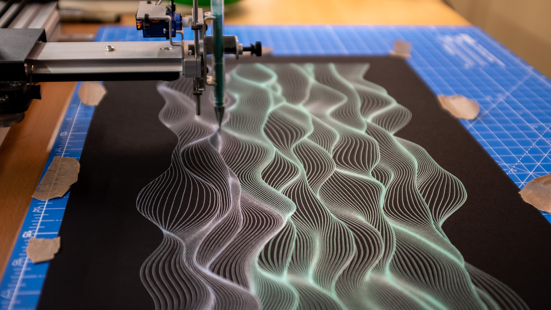
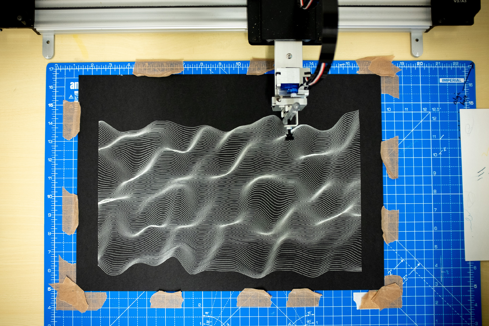
I don't use Illustrator, and I don't use InkScape for plotting, I use the command-line tool provided by Evil Mad Scientist called axicli. While I think you can repeat all these printing options in InkScape from this point onwards, I'm going to talk about how I plot with the CLI.
axicli file.svg --copies 2 --page_delay 30
The above command will plot the design twice, with 30 seconds in between finishing the first plot and starting to draw over it a second time.
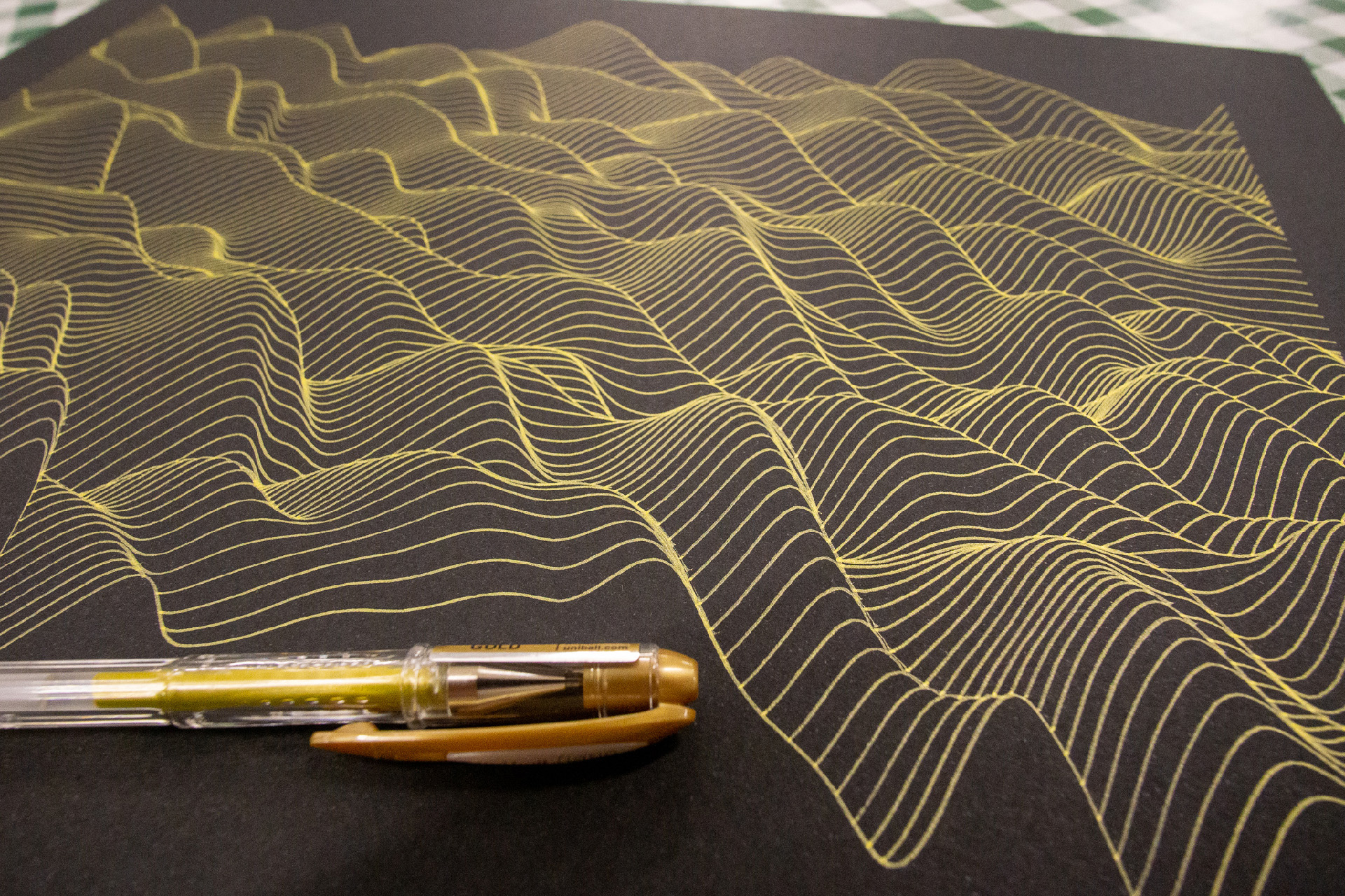
The first time you plot using coloured metallic ink with these pens the coloured pigment part of the ink will soak into the black paper, leaving just a silver colour behind, the actual colour won't stick properly until the second run. Meaning you may as well plot in silver first to get a base layer of ink down, then colour over that.
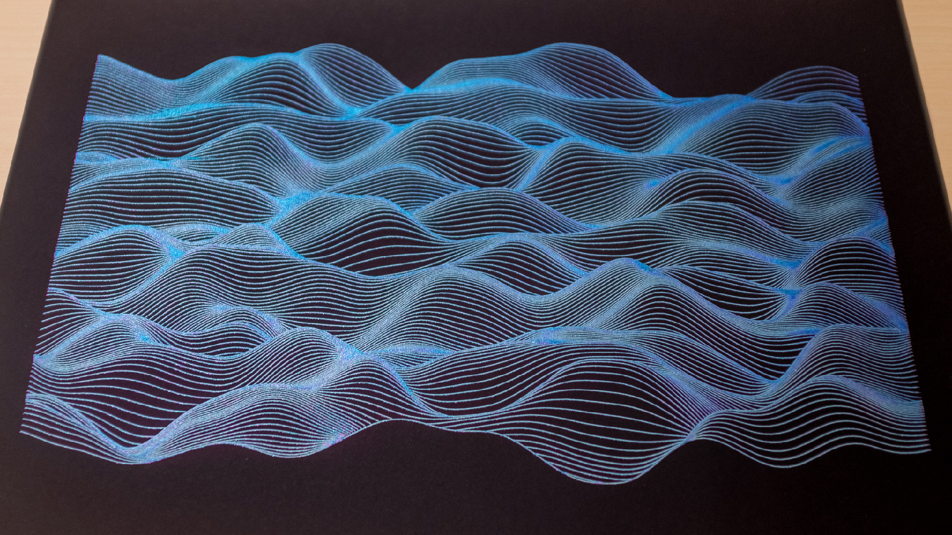
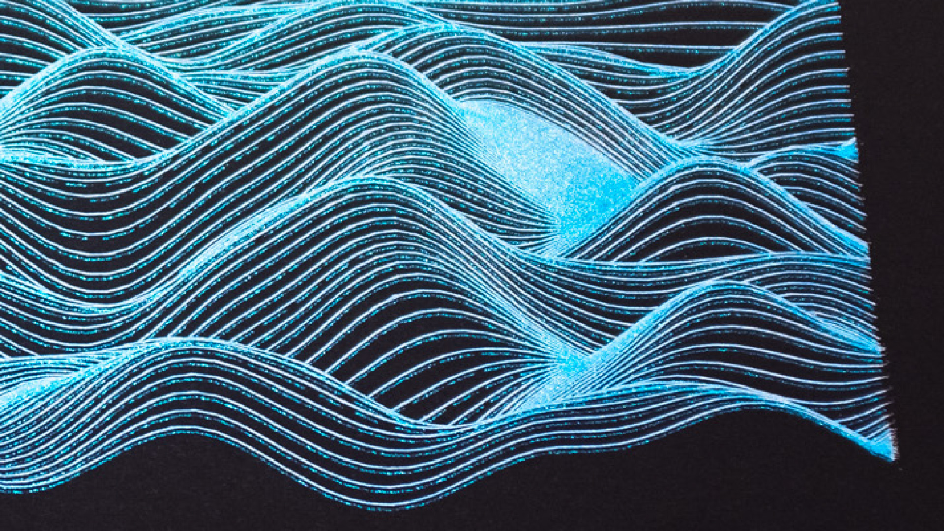
The overall effect of the plot I wanted was that of blue waves and water because I'm pretty literal like that. So the first plot I did was one layer silver metallic, one layer blue metallic, and then one layer blue sparkling over the top.
However, when I changed to the sparkling blue pen, I screwed up the alignment, and the sparkling ink was plotted offset.
And while I'm not against the offset result, I quite like it; it wasn't what I was looking for. Also, it turned out a bit too blue.
Which meant attempt number two, I did the following.
◼️ ◼️ ◼️
First layer: Silver ink to get a good base line down, run slowly, with speed set to 16 (the default is 25).
axicli file.svg -s 16 --const_speed
When using fibre tipped pens, the AxiDraw starts the line slowly to draw the ink out and start it
flowing,
then speeds up as it gets going to reduce the time of the overall plot. Ballpoint and gel pens seem to work
better
with constant speeds unless there's a particular effect you are trying to achieve. The --const_speed
allows us to set this.
🤍 🤍 🤍
Second layer: Green metallic, again run slowly (-s 16)
💚 💚 💚
Third layer: sparkling purple, run fast (-s 60). The reason for running this pen fast was that I wanted some purple but not too much. These sparkling pens tend to skip and slide a lot more than the metallics, by making it run fast I could control (to an extent) the amount of glitter going down.
💜 💜 💜
Fourth layer: Blue sparkles, but run much slower than the purple (-s 60).
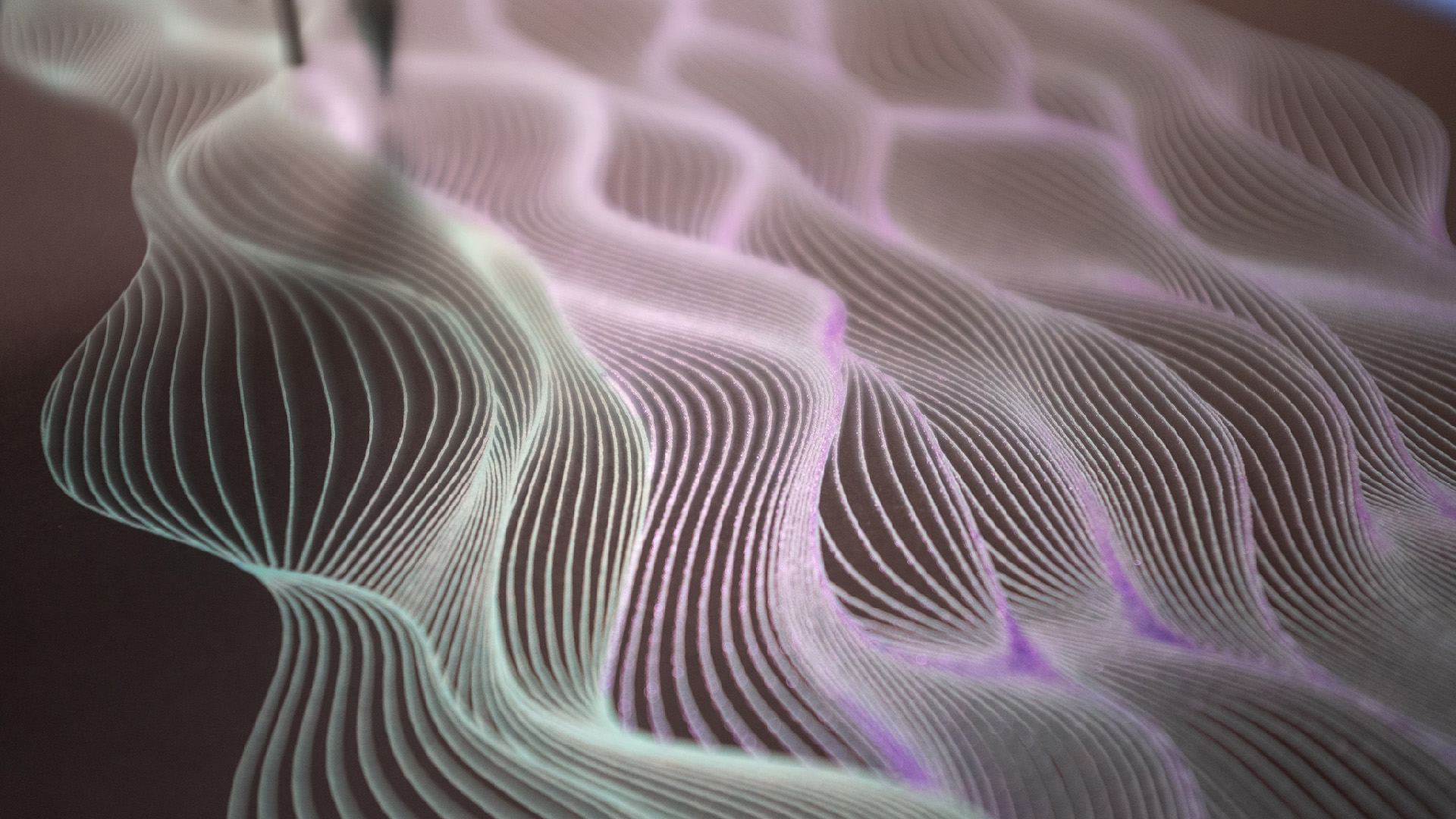
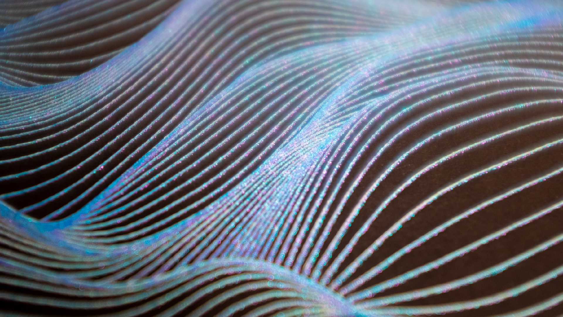
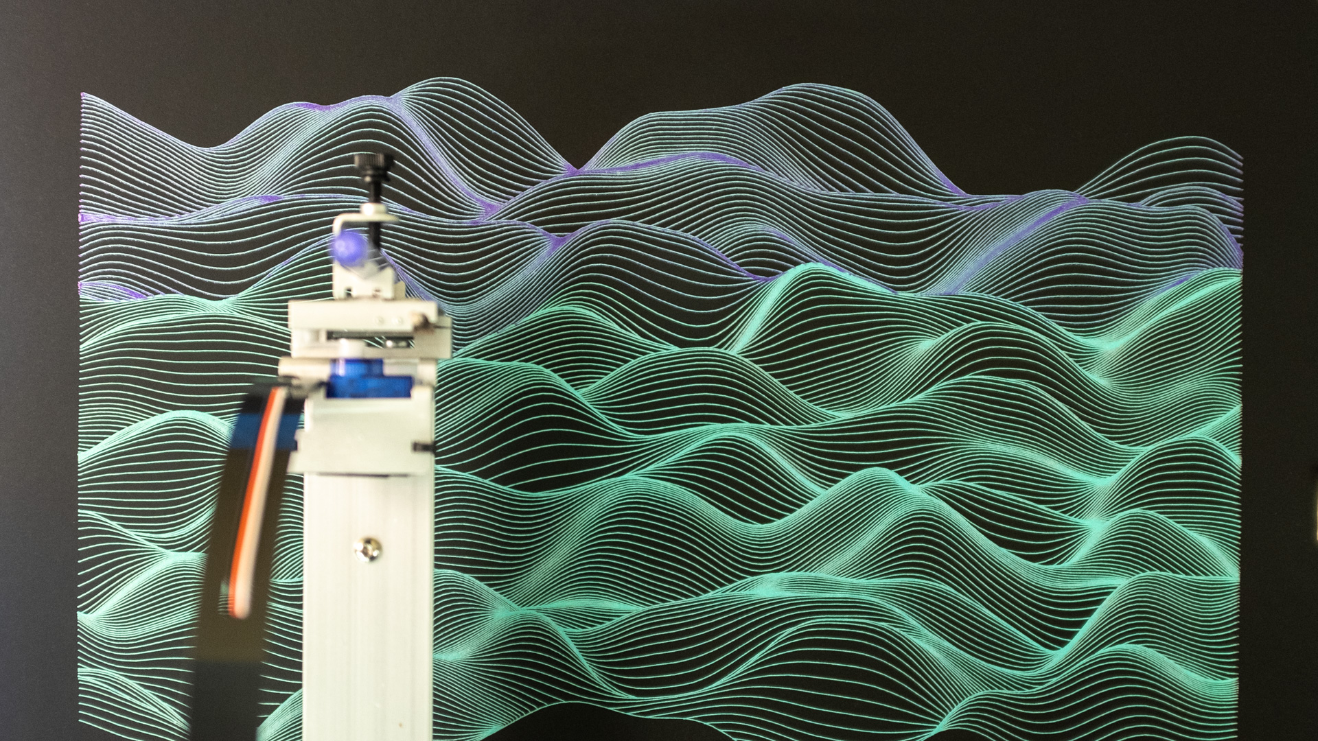
Which gives the overall effect of green-ish, with some purple sparkles and mainly blue sparkles. As you hold and move it in the light you can see the different colours come through, it is, even if I say so myself, pretty impressive.
💙 💙 💙
Some more notes about pens
My table is somehow sloping, I should sort it out, but so far it hasn't been a huge issue. But what it means is that as the AxiDraw arm extends, the pen gets closer to the paper.
Which means what I usually do is put the pen into place, remove the power from the AxiDraw, then move the arm, so the pen runs around the edge of the paper making sure it has full clearance of the surface — and then remembering to plug the power back in.
Which is fine when using just one pen, but when you have to switch pens, it's not always great, I'm pretty sure this is what caused my alignment problem in the first plot. When I changed pens, I removed the power & moved the arm again to check clearance, once I'd returned the pen to the home position I'd somehow screwed it up.
Instead, now I put the first pen in, check clearance, return the arm to home, and then find a small object that's just the right size that I can use it as a height guide when putting the other pens into the holder.
Also, as you put down more ink, the paper tends to distort, so check that it's still flat in between plots.
🖋
The final command I used in axicli was this...
axicli perlinLandscape_[long ass filename].svg -o progress.svg --model 2 --report_time
      --const_speed -s 16 --preview
Then knocked the --preview off the end when I was ready, and changing
the speed -s n for each layer.
⏱ ⏱ ⏱
tl;dr: Grab your svg file from here, choose your paper, put it into place and make sure it's lying flat. Select which pens you're going to use, plan the order and speed you are going to run them at, set the plotter away, try not to knock it.
A few hours later you'll have your own unique wavey plot, keep hitting that randomise button for a new one each time.
📖 📖 📖 📖 📖
2. Instructions on how to use the tool I've posted online
Again, fair warning, the tool I'm posting was designed for just me to use for my sketches. So it's not a javascript library you can just grab and use, although feel free to root around in the code if you wish, there be dragons. It also has no error catching, and if overloaded will cause your browser to hang.
With that in mind, but in the spirit of openness and sharing, I'm going to be posting my sketches online and writing about them. The single previous post so far is Plotting Perlin Spirals (and not circles), at some point I'll collect them all together on one page.
"But wait!" You may say. "Doesn't that mean people can just plot all the designs you come up with, meaning you won't be able to sell your own?" You could also (reasonably) ask.
Well yes and no, there's whole arguments around that, but here it's mainly going back to artists being interested in how other artists work. I like seeing how other people build their tools and produce the work they do, so I figured someone else might find this interesting or useful.
Anyway, on to the tool.
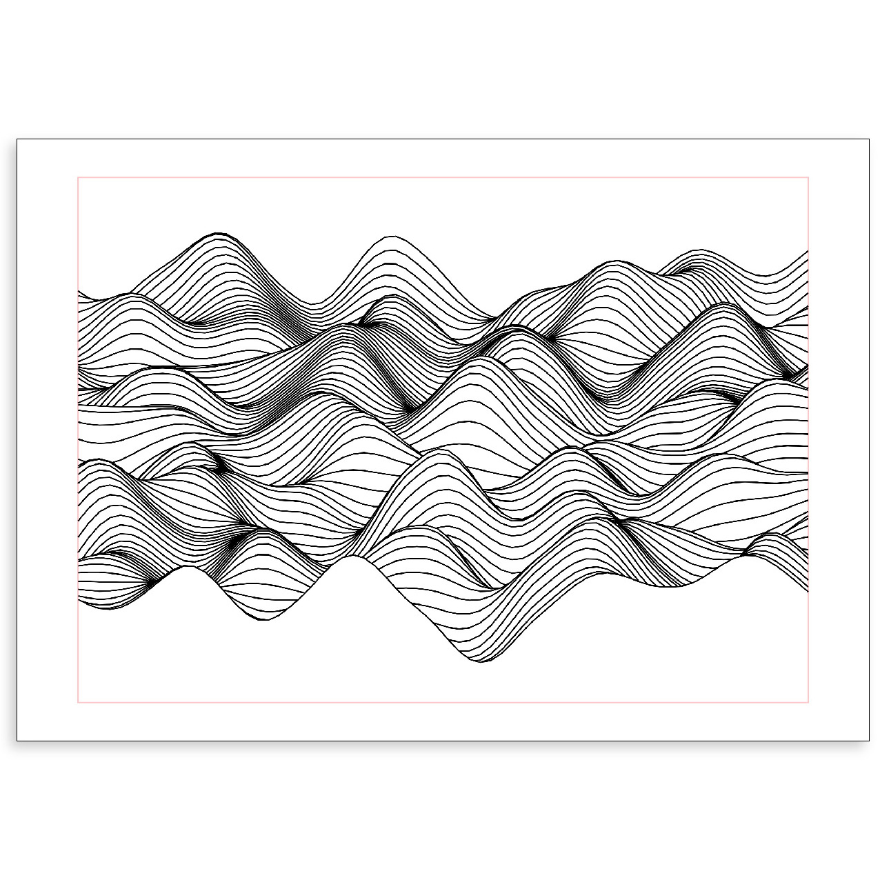
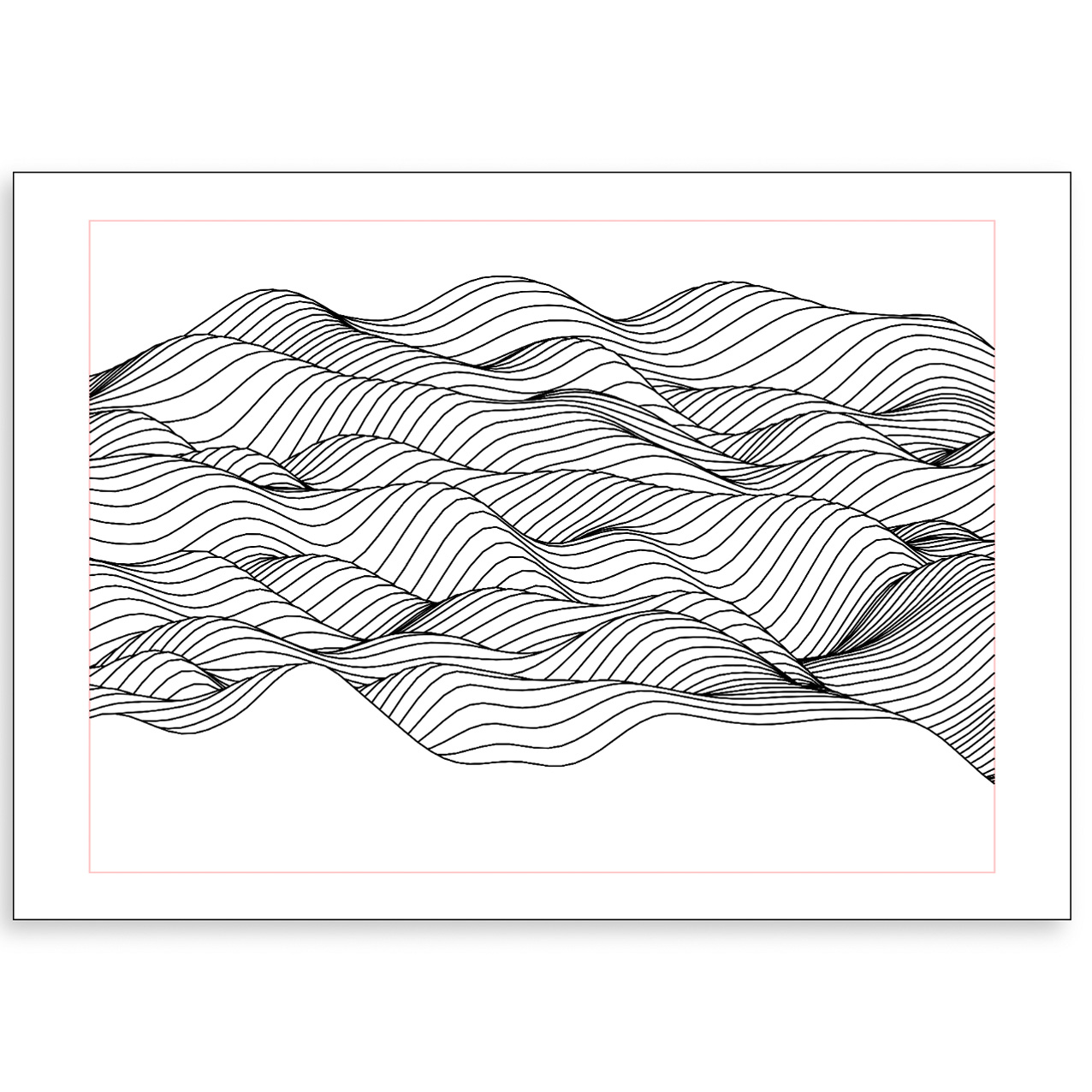
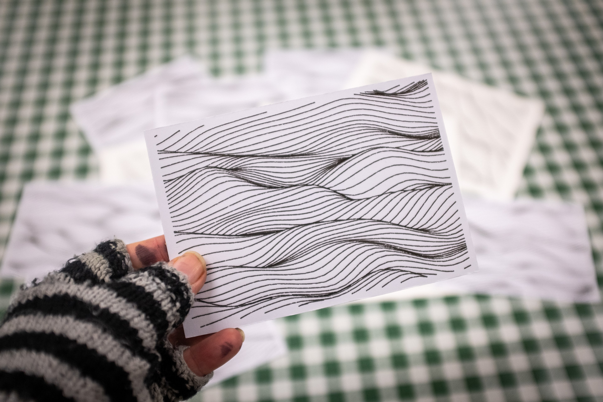
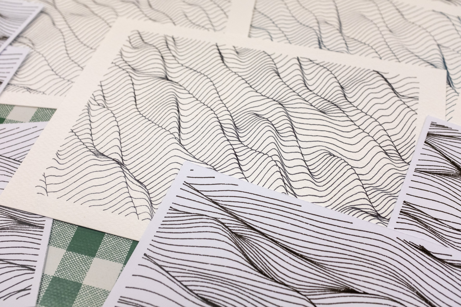
This sketch is based around a thing called Perlin noise (more below), which is a method of generating random numbers that have smoother transitions from one point to the next one. This can be used a huge number of ways, but one of the more obvious is to create lines like this, that looks somewhat like landscapes. The settings in the tool allow you to explore a range of results with that wavy/landscape area. The randomness means that each plot will be unique, but the overall output will be similar. Below are some other plots generated with the tool.
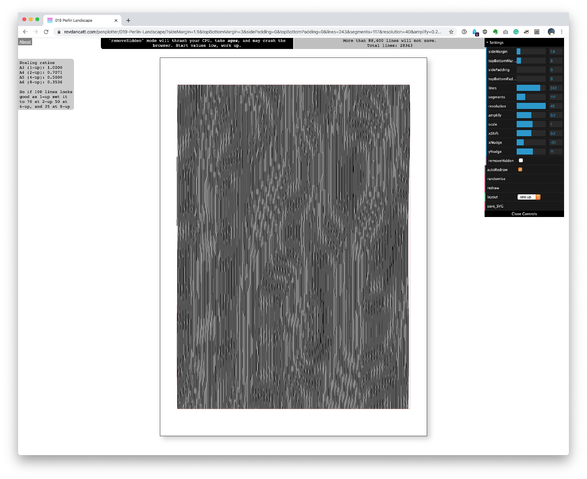
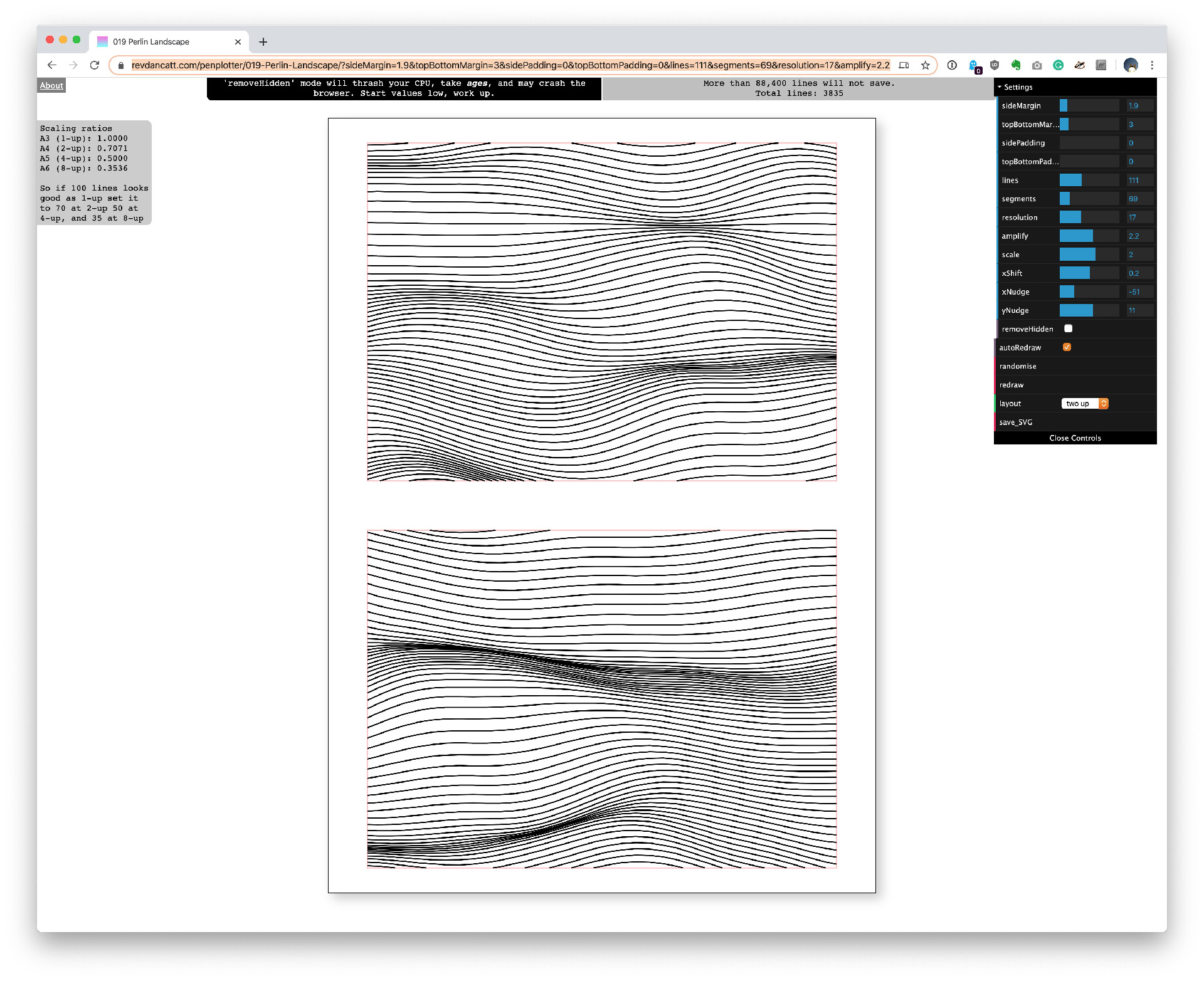
To get started with the tool, I suggest turning "removeHidden" off, lower a bunch
of
values, and then turn
"autoRedraw" on, so you're starting somewhere like this
At the top-right of the screen, it will tell you how many lines are used. There is a limit of 88,400 lines before
the "save_SVG" function will fail (my even scrappier Node-based version doesn't
have that limit, but I still
prefer
working in the browser). Running the remove hidden option tends to bring that number back down, so you can push
what
you're doing over the limit, and then see what the removed version clocks in at.
Pushing lots of lines may hang your browser, depending on your machine. So I'd also suggest starting low and working up.
Ok, onto the settings.
📝 📝 📝
sideMargin and topBottomMargin.
This is the
border beyond which the lines will
be
cropped. You can in theory set these both to zero, and the plotter will plot to the very edge of the paper,
although
I really don't like doing that, and it's not recommended.
The red box shows the margin, that box won't get plotted.
A quick note about margins
If you are plotting designs to sell or mount, I suggest setting your plot area based on the visible area within your mount/frame, rather than the size of the paper.
By which I mean it's tempting to write your code/do your design, with an even border all the way around the edge. However if you are using standard size mounts and frames (here in the UK a standard mount for an A3 sheet is 500x400mm, I think in the US it's 16x20 inches), and you cut an even border all the way around (i.e. 7cm) when your design is placed into the viewport, one set of your design's edges will be closer to the side of the viewport than the other, and it'll look odd.
To get your design centred in a mount, you need to work out what your print margins should be, based on the mount size not the paper size.
The default margins I've set here; 1.9cm & 3cm, are for standard UK A3 paper in a 500x400mm mount, although you may want to double-check that.
🖼 🖼 🖼
sidePadding and topBottomPadding
Does pretty much what you'd expect. Most of my design sketches fit perfectly into the margins, but this design has a wavy amplitude which means I need the headroom for those waves, hence the padding.
📝
Lines
Yup, the number of lines to use, the more you use, the more likely you are to crash the browser. You can in theory work out the density of your lines, based on the margins.
If my paper size is A3 (29.7cm wide), the side margins are 1.9cm, and the initial padding is 5cm, the remaining area the lines will start in is... *does maths* 29.7 - ((1.9+5) * 2) = 15.9cm. So with lines set to 120, you'll have 120/15.9 = 7.5 lines per 1cm. Then you can factor that in with your pen nib width to work out how likely you are to tear up your paper with too much ink.
📝
Segments and resolution
The curves plotted here aren't actually curves, they're lots of straight lines joined together. Given enough segments you can't tell, reduce the segments too far and you'll see the lines. You can get away with surprisingly few segments before people notice.
Now, because I'm a terrible person, the segments rather than having no effect on the design other than to cram more segments along a line, do actually change the end result. To counter this a bit, I added resolution which also affects the number of kinks in the lines. As you reduce segments (to get the final number of lines under the printable amount), you can also decrease the resolution to get more kinks back into the design.
You can also play with the amplify value to get some good interference patterns, here's another example.
📝
Amplify
Amplify, segments and resolution is where you'll be doing a lot of your fine-tuning. In short amplify is how peeky the peeks will be.
📝
Scale
Useful when you don't want to see the edges of the landscape, you just want to fill a space with curvy lines, much like this, shown in a "two-up" design.
📝
xShift
Although it's not obvious, the nature of Perlin Noise in the way I've used it here, will often give hills and valleys that bulge in a fairly symmetrical way. xShift slides the offsets over to one side as it moves down the lines. Easier to show in an image than explain.
Shifted to the left, middle and right.
📝
xNudge and yNudge
These don't really make a huge amount of difference to your final design (they're a hangover from a previous sketch). These two things move you around the Perlin Noise space, you can see it easier on this design, if you adjust the x & y nudge you'll see the "landscape" scroll around.
📝
removeHidden
The one that makes the landscape look 3D, but also chews up the
CPU and kills
the
browser. I advise you to turn the autoRedraw off before turning this on. Because
my code
is buggy, sometimes not
all
lines are removed, when that happens, I just hit the redraw or randomise button and hope for the best.
📝
autoRedraw
Easy to understand this one! Useful to turn on when you're exploring the landscape space, before you get to a final setting that you may want to have hidden lines turned on for.
📝
randomise
Each time the tool starts, it'll "seed" the random number generator, so taking everything into account, everyone should get a different result. However not all results are what you want, the peaks may line up too much, one of the curves could look too straight for your tastes, well, smashing that randomise button is the way to go. All the other settings stay the same; it just forces it to pick a new starting "seed".
📝
redraw
Useful when you don't want autoRedraw on and want to see the
effect of what
you've
just done.
📝
layout.
I like doing plots at A3 size; there's something about having a plot be BIG that's fun. Most of us only have access to an A4 printer, so being able to create something bigger is nice. But, there are times when I want smaller designs.
I could just change my code to draw a smaller design, but what I've done instead/as-well-as, is drop 1-up, 2-up, 4-up and 8-up layouts in there — giving me A3, 2xA4, 4xA5 and 8xA6 results. Each layout has its own random seed so that each one will be different.
Unless I've written a sketch that isn't based on randomness, in which case I can produce eight identical postcards in one go, which is nice.
A quick note about ratios: If a design had 200 lines in the A3 version, and then you switched to an A4 version, you'd have the same number of lines drawn into a smaller space, and even more tightly packed at A5. To help with this, I've written some ratios down on the page on the left...
      Scaling ratios

      A3 (1-up): 1.0000

      A4 (2-up): 0.7071

      A5 (4-up): 0.5000

      A6 (8-up): 0.3536
If your original design has 200 lines at A3, then you'd use 140 at A4, 100 at A5 and 70 at A6, to maintain the same density although my maths could be totally out on that.
📝
save_SVG
This one will attempt to write an SVG file and download it. This function will fail if you have over around 88,400 lines, give or take a couple of hundred.
As slightly annoying as it is, the filename includes the values used to generate it. While you won't be able to get the exact same design again by plugging the values back in, it does allow you to get back to a similar design space.
📝 📝 📝
Final notes on the tool
Moving lines
You may have noticed that the lines move around over time, which is, probably, annoying because you can't just lock in a design and have it stay still as you make small adjustments. On other sketches I've made this a toggle, I just haven't gotten around to it here.
The reason for the movement is when I need to show the tool to someone, I've found they instantly understand what's going on when they see it moving than when they are static. So it's a purely performative function that makes the tool slightly less usable, but I'm happy with that payoff.
Also on the performance side, the output isn't optimised for plotting (there are other tools to do that), but what it is generally trying to do is draw the lines roughly in the top-down order. It makes for very inefficient plotting, but much better time lapses.
📝
A4 & A5
The AxiDraw plotter I have is the A3 version. If you're thinking about getting one and you have space, this is the one I'd recommend because you're always going to want to print bigger than you currently can. Because I don't have the A4 or MiniKit version, I can't really test working on A4 or smaller natively. I know that sounds a bit odd because I can just print smaller, but it does make sense believe me.
Even though I can't properly test it, and even though there isn't the option in the UI, you can add a
pagesize=A4 or pagesize=A5 parameter to
the URL to force it into that mode, somewhat like
this and this.
In both those links I've set the layout to 8-up, because it's funny to think about how tiny the end results will
be!
📝
JavaScript
Why JavaScript you may be (rightly) wondering. Well, while I can, do, and have done things in processing, and also do more data-driven stuff for clients using Node, what I particularly like about doing it in JavaScript is two things.
First, I find it easy to debug. I can pop open the console, set breakpoints, jump into the code, change values, and all that stuff. Some of the system has been written to make that slightly more manageable too. I can also get good visual feedback as I debug by calling various functions directly and the like.
Second, it makes it easier to share, I can just point people at the website and then can quickly(ish) create their own SVG, and well, that's fun! I think.
📏 📐 📏 📐📏
3. Notes about maths, Perlin noise and hidden line removal
This final part is just, well, I dunno, more hard work for me, but some people may find it interesting.
I don't have that much to say about the maths part, other than there's an awful lot of it! As I've been generating more sketches (this landscape one is #19) I've needed to add more bits and bobs on. The code now has a bunch of stuff about scaling, rotating, duplicating, culling and so on, and there are more things I need to add when I have time.
But basically, everything involved comes down to loops, doing things again and again, if statements to work out if
something should happen or not. Random numbers to alter the chance of something happening, most often within those
loops, and some basic trigonometry for working with angles, mostly just sin
and a tiny smattering of cos. Those are the building blocks, but sometimes that's
not enough.
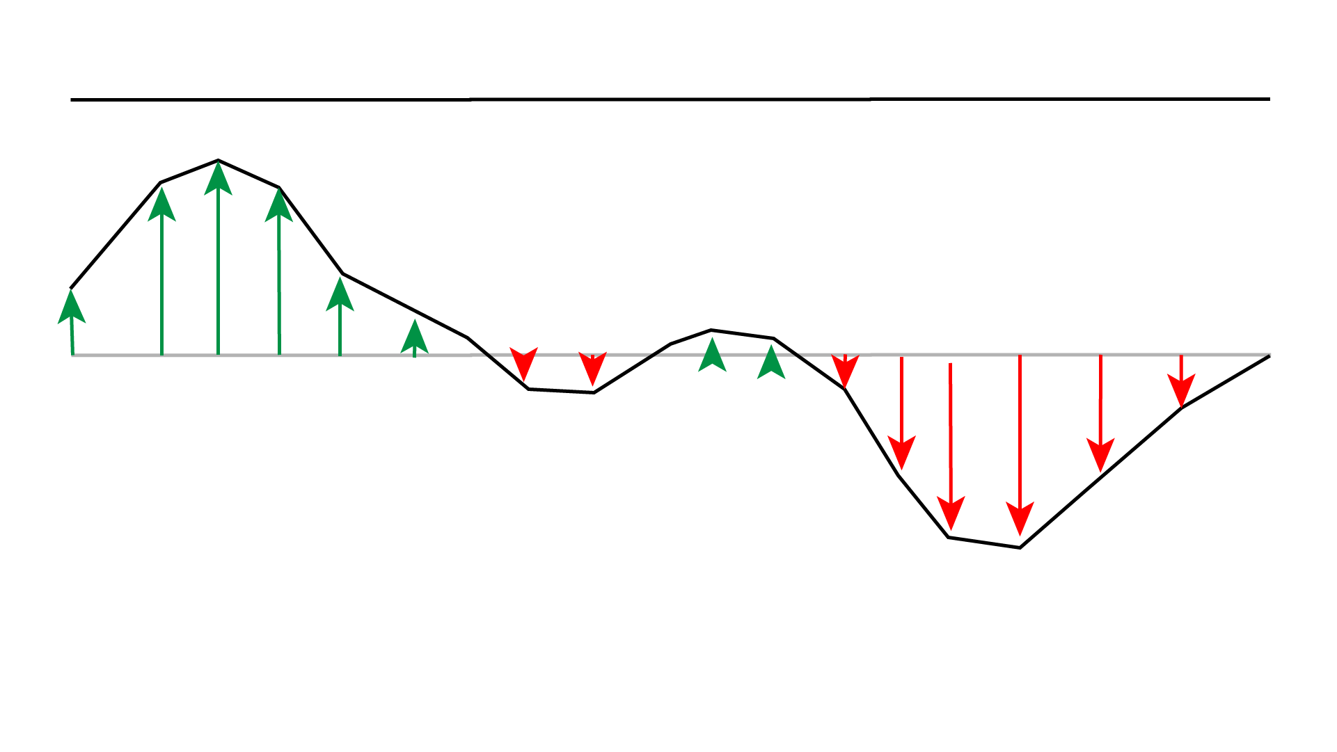
In the case of these waves, the loops are fine, but the random number isn't. I have a bunch of initially parallel lines made up of segments. I then want to move those segments up and down to make path not straight. If I just use random numbers, I get something like this.
Which sucks. This is where Perlin noise comes in. I'm sure you can read all about it on Wikipedia and find many videos about it on YouTube, but in case you don't want to click away, it kinda works like this.
📈📉 📈📉 📈📉
Instead of calling a Random() function, you call a Noise(x) function, where x
is for example the x
distance along the line. Instead of the very random numbers, you had before you end up with a number that is
similar
to nearby points, but randomly different from further away ones. If you then move each part of the line at x
distance along up or down, you end up with something like...
👋 👋 👋 👋
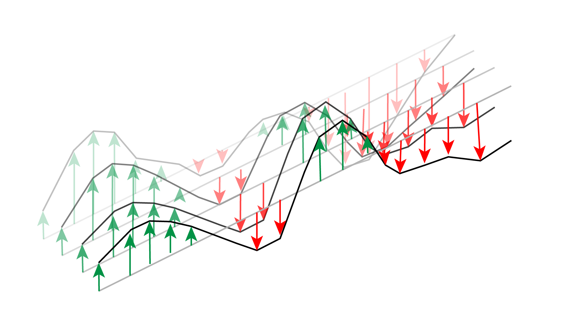
We have more than just one line though, while our line goes across, we have several lines, each one offset slightly from the other. Giving us a distance across (x) and a distance down (y) (assuming we're starting at the top/back and working down/forwards).
Plugging the x and y into the function Noise(x, y), gives us subtle changes in
both directions...
Finally, we can throw time (t) in as a third parameter to the function, giving us Noise(x, y, t) making the lines
slowly move up and down over time, which you've probably seen already.
In our tool, several sliders deal with how many lines we have, how many segments they're made up of, and where the
lines should start and end. Another group of numbers are dealing with how we use the Noise() function. How much
should we move the sections of the line up and down? How quickly should the values change? How much do we slide
them
about, and so on?
And that's what gives us our landscape/waves.
Hidden line removal
This is the tricky one, and also where my code is buggy so totally doesn't work. This sketch is probably a simple example of using one shape to cut into another shape.
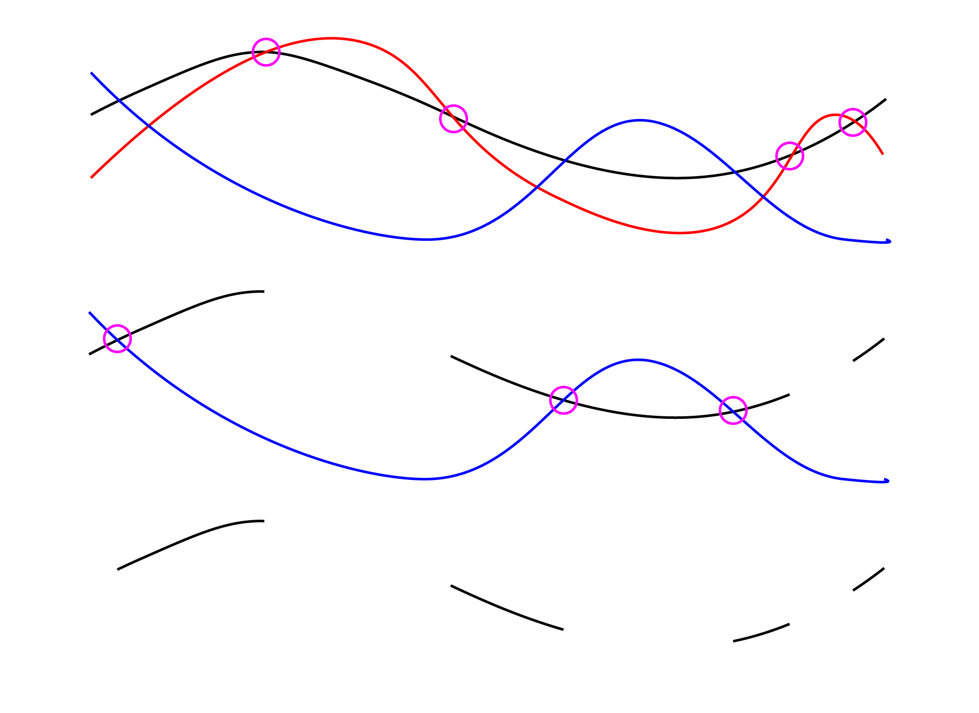
In non-code terms, it works something like this. We have a line, and that line may pass behind another shape, so we move along that line until we pass behind the shape, and cut the line at that point. We keep going until it moves back out from behind the shape, at which point we cut the line again. Once we've moved along the line to the end, we look at the resulting lines from the cuts we made. Those that are outside of the in-front shape are kept, the ones inside are thrown away.
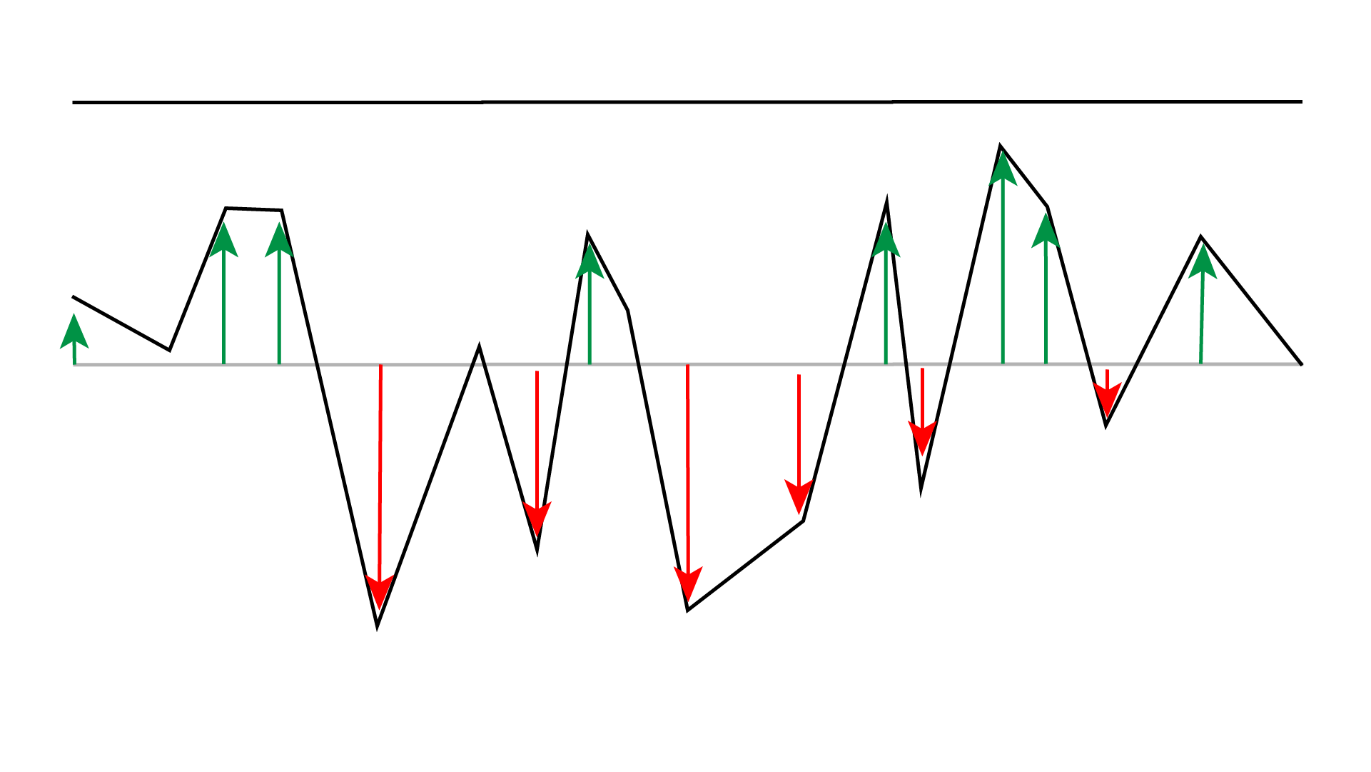
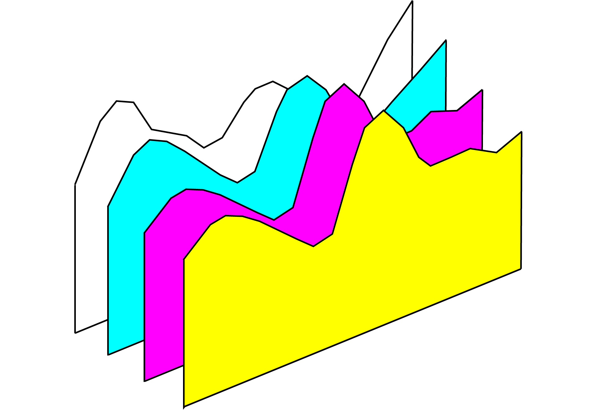
But our image is made up of lots of lines, and you can't work out if one line is in front or behind another line, because they're just lines. So what I'm doing in this sketch is I'm making the lines to be drawn, and then once those are calculated making a copy of them all. For each of those copied lines, I draw two lines, one down from each end. Then draw one final line across at the bottom to join them up. I end up with a solid shape like the diagram below.
Then starting from the top/back line, I take each closed line shape in front of it and see if it's being occluded. If so I cut it, remove the "inside" lines and carry on along the path. Once I've checked it against one shape, I move the next one towards the front and repeat the process until all the shapes have had a chance to cut and remove parts from the line.
I then move to the next line down, and check all the line shapes in front of it, starting from the back and working forwards again until I get to the lowest/front line, which has no shapes in front of it to cover it up.
Here's another diagram. We take the back most line, the black one, then apply the line-shapes, cutting the line until all the line-shapes have had a go. Then we move onto the next line and so on.
This way, you could have other shapes, or even 3D scenes, just as long as you start at the "back" and work your
way
forward. Each line in my code has a zIndex which can be used to work out and
sort the "z-order" of
the
shapes. There are many cases where that rather simple and CPU intensive process will fail, but for my needs, it
seems to be ok.
Phew, I think that wraps it all up.
As you've most likely noticed this sketch was #19, and I link to sketches #3 and #21, meaning there's a whole bunch of sketches I haven't written about yet. I was planning on writing them up from the first one until I caught up with where I'm currently at. But as people were asking questions, I figured this was an excellent time to get all these notes down.
You should probably follow me on Twitter to find out when I post the new write-ups, and Instagram to keep an eye on what I'm doing. Hit that like button, smash the subscri... oh wait, wrong medium.
Happy plotting!
🤖 🤖 🤖 🤖 🤖

