The Long Good Read Newspaper, an iteration and a mini analysis of 10 O'Clock Live
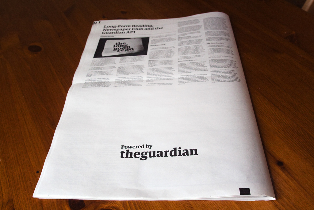
A couple of weeks ago I posted Long-Form Reading, Newspaper Club and the Guardian API my first attempt at doing a newspaper version of The Long Good Read website. In it I listed a few things I'd gotten wrong with the design and decisions, this is an iteration over that with a few changes.
A few notes about iteration in media
As an aside observation, it seems to take about 6-7 iterations for "amateurs" to plateau on a pretty decent profession looking result. I've seen this happen quickly with zines, the first issue is often hastily put together, photocopied and stapled up (this is going back a fair few years mind). The person doing it very quickly notices the mistakes of the first one, and corrects them by the second iteration. They miss a few things, which they fix in the 3rd and 4th at which point they start taking cues from existing "successful" products.
At around the 6th iteration things get into a groove, and by the 7th either a format is set or playfulness with the format emerges.
Or maybe most people give up before then so we don't often see the ones that didn't make it.
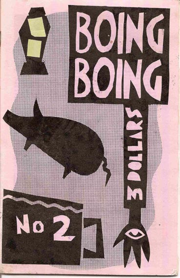
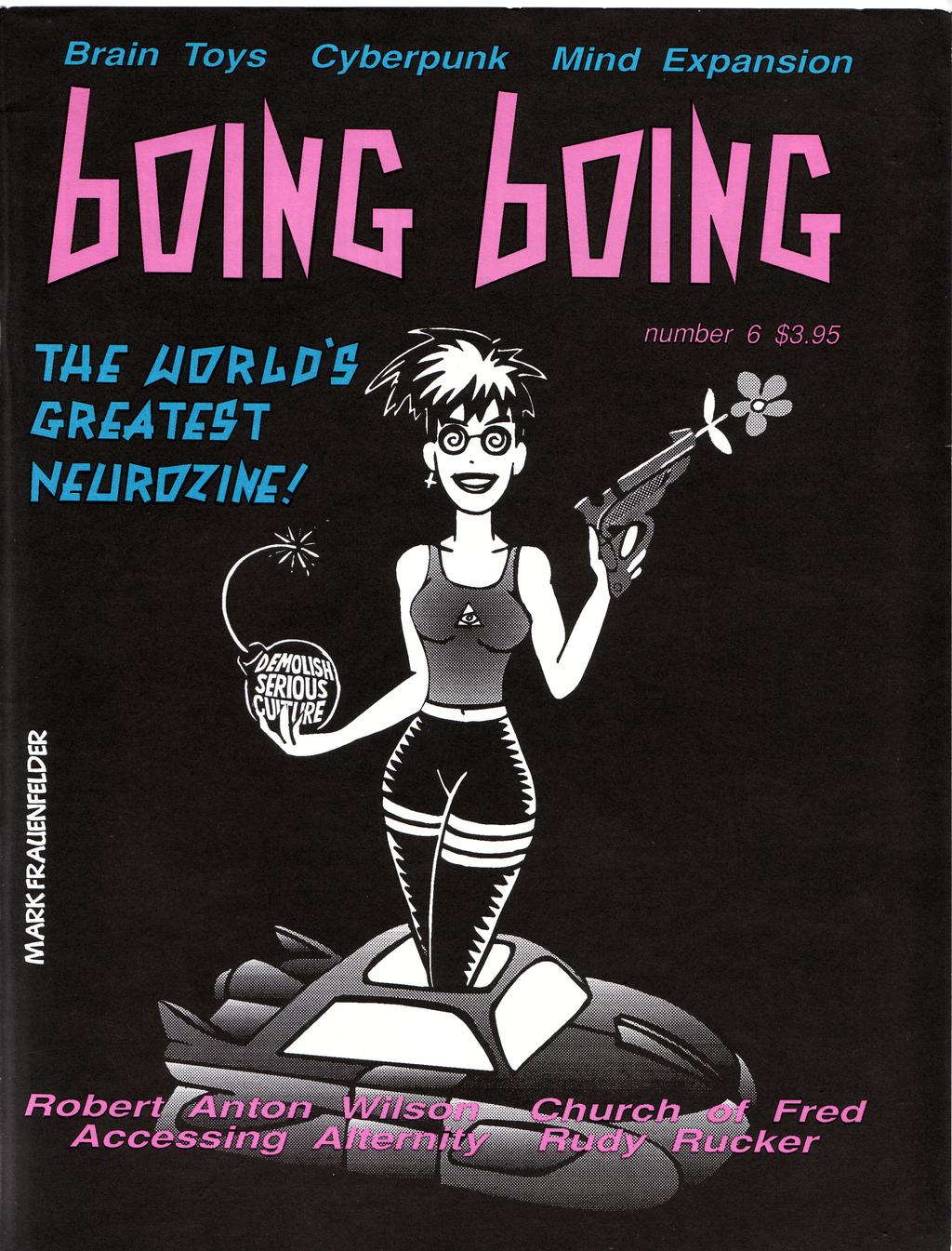
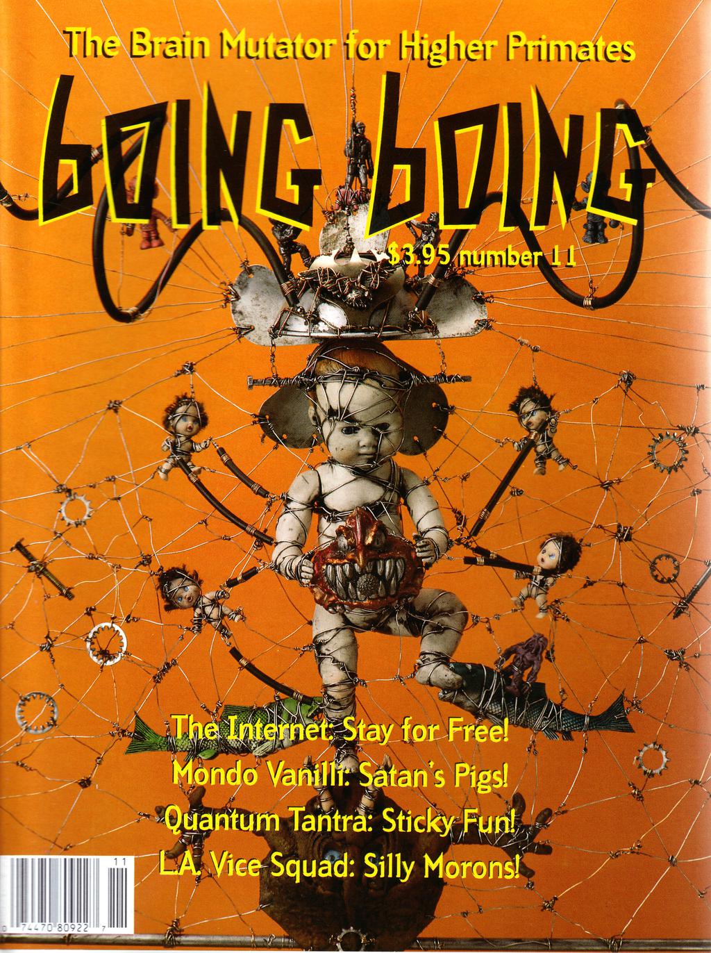
You can kind of see it with the BoingBoing zine below, Issues 2, 6 and 11. Issue 2 is pretty much as you'd expect, by #6 most of the design elements are in, #11 has full on barcode and glossy cover, later issues start to play around with the cover design.
Of course it's not just about print media, you can hear the same thing happen with the Shift Run Stop Podcast, if you listen to the first 5 you can hear Leila and Roo pretty quickly get into their stride as the sound quality, format and structure for the rest of the series fall into place.
The more you start new things over and over again, the faster you can get up to speed. In the UK we all got to watch this play out in-front of us (if we wanted) with Channel 4s 10 O'Clock Live. The first episode, although well rehearsed had it's weak points, the second was much tighter, the 3rd was basically the template by which the rest of the series has run. A couple of episodes ago we got to the "play" stage with a scene involving Jimmy Carr acknowledging that he dresses up each week and toying with that construct.
Anyway the point being that pick anything; making a film, a TV program, a screencast, a magazine, book or newspaper, by the time you've got to the 6th iteration you're basically 90% as slick as the "professionals". Before you start, it all looks quite hard, then you discover it's quite easy... and then you discover the last 10% is very hard (at which point you either hire a professional or get very naturally talented).
Go make.
* * *
Back to the Newspaper
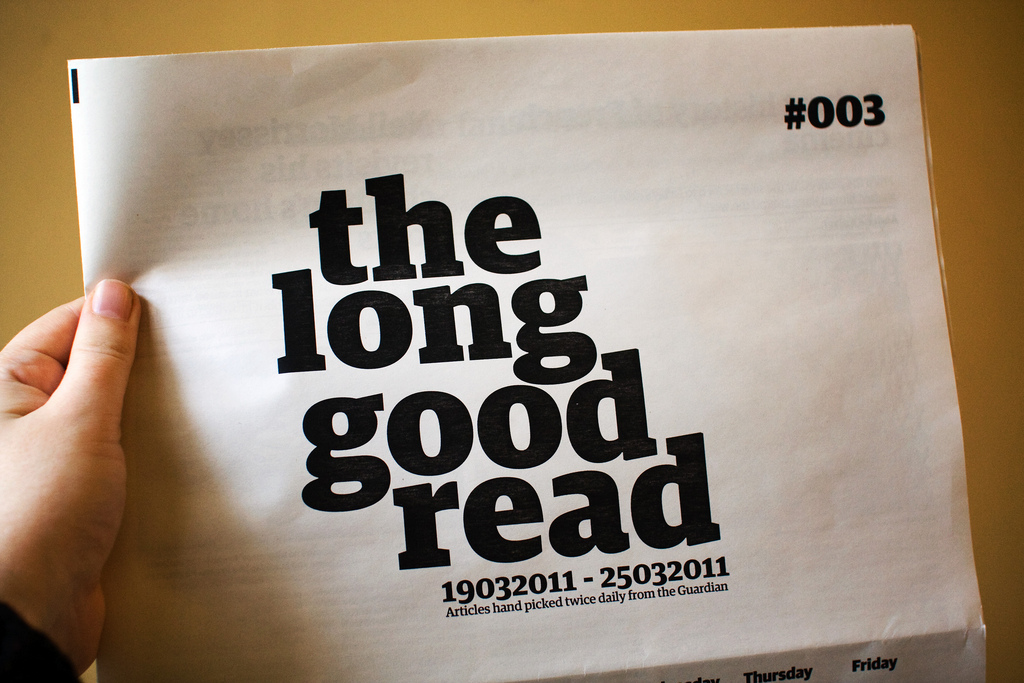
Ok, so what did my second iteration get me?
Well, on the trivial front I tweaked the position of the word "the" on the cover moving it down a little bit, probably a touch too far. A 3rd iteration would certainly see that moved up a couple of mm :) I also threw an issue number on there.
Inside is where most of the changes happened...
With the last issue I got the page dimensions wrong, I used the sizing for a colour newspaper, which is smaller in height than the B&W ones so I wasn't making full use of the page.
I pushed the font down to 9pt from 14pt. When working on the screen 14pt looked fine and 9pt way too small, but that's because I'm used to working on webpages which are tending towards larger and larger type anyway. And then there's a step up to 5 columns from 4.
I was surprised to find out that combined those changes took the pages down from 24 pages to just 12. While it looks much better the loss in weight is a shame. The 24 page paper felt like a good hefty chunk of reading, 12 is feeling a little on the light side.
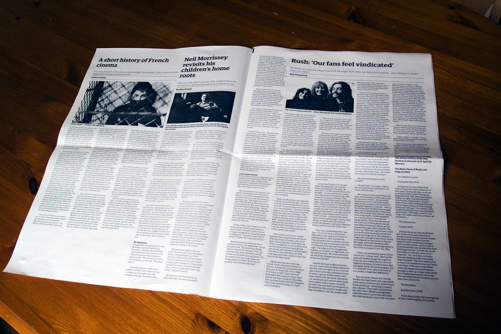
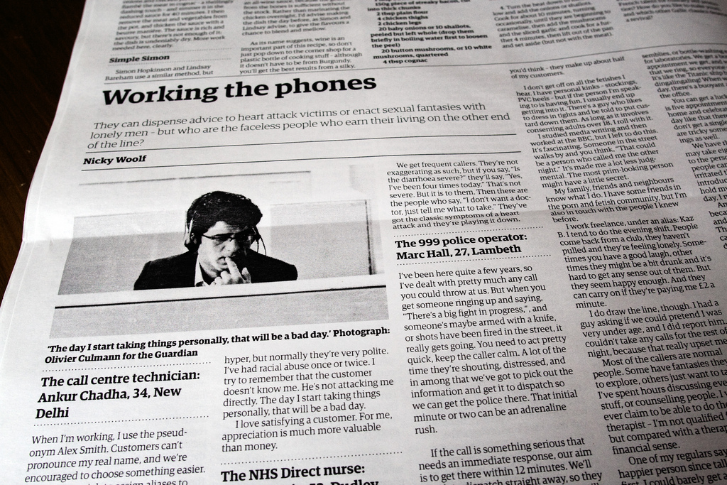
The other things added was bylines, captions and credits on photos and better design on mid-article headlines and the like...
I think it's those final additions that tip it towards looking more "professional" than amateur (for this type of newsy-newspaper anyway). There was more breathing space around the page elements, but the columns of text themselves were good and dense.
Heading towards that 5th iteration
From this point, given another 3 iterations for things like page numbers/headings, slightly better layout and maybe adverts to fill those empty space/pad pages ;) (and standard newspaper cover) I'm pretty sure it'd look indistinguishable at first or even second glance from a "real" newspaper.
But, because that's how I roll, I think it's really at the point where the next step is deconstruction of what a (weekly) newspaper is. As mentioned last time, these are articles that have had an online presence. Because of the print cycle these are things that have lived online for up-to a week already, gathering comments, links, responses, re-tweets, and context. Lets just skip straight to the play stage.
With digital presses getting cheaper and faster there's a convergence-a-coming, and so no better time for play.
Boing Boing Covers used under Creative Commons License from Mark Frauenfelder
* * *