Notes for artist friends looking to collaborate with a pen plotter
I often get asked if I can use my pen plotter to plot some work for an artist. Over time I've come to the same set of requirements to make the whole process a lot easier.
Also, I love getting asked to help with these things; it's one of my reasons for getting a second plotter. The first is for my own work, the second for experiments, packaging, or running projects for other people.
So to keep it brief-ish, here are my seven main points.
1. We love SVG files, plus exporting from Illustrator (or code)
For most pen plotter artists, the easiest way of getting a design to plot is with an SVG. Not all pen plotters use SVGs; some use a thing called gcode. People with those plotters generally have a way to convert SVGs to gcode, but if they say it's too tricky, believe them rather than me.
The most common tool used by artists who want to get involved with plotters is, in my experience, Adobe Illustrator; this is fine, but also see the points below.
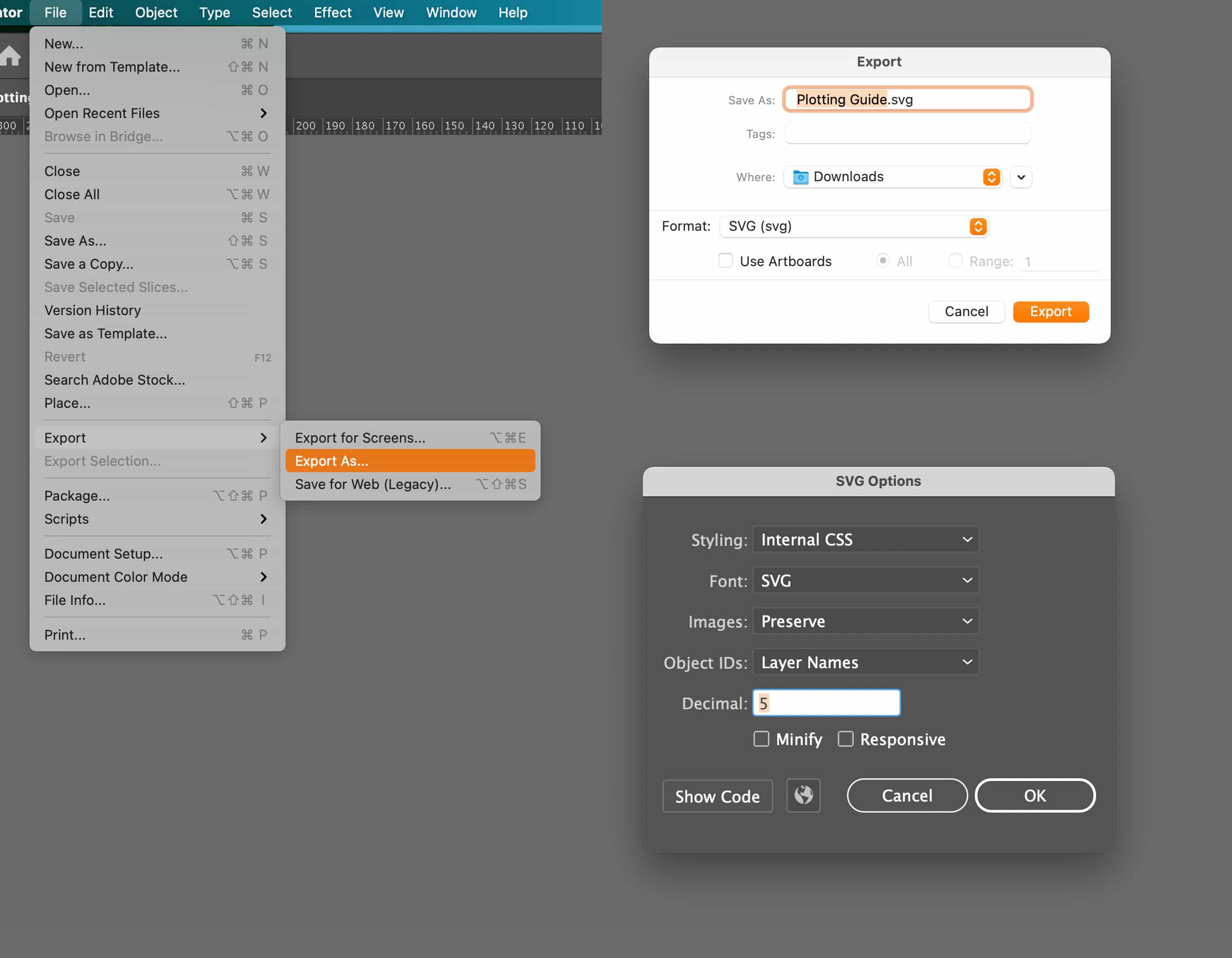
To export from Illustrator, pick File -> Export -> Export As...
Pick SVG (svg) from the Format dropdown, and click export.
Styling: Internal CSS
Font: SVG
Images: Preserve
Object IDs: Layer Names
Decimal: 5
Minify & Responsive both off.
If you write code create your SVG files, then we probably already love you.
2. Pens have a set width
And it's not always what it says on the pen.
The pen we use has a fixed width. If your design has lines of various thicknesses, then it's not going to work.
You get ONE STROKE THICKNESS, pick one and stick with it everywhere.
When a pen says it's 0.2mm or 0.8mm, it generally, most likely, probably isn't. Piter Pasma has an excellent way of working out the actual width but hasn't published it yet; go tell him to do so on Twitter or Instagram.
Exception: sometimes, a pen plotter (artist) will use several pens of the same type and ink colour but different thicknesses. Often when they do this, the pens are of slightly different widths themselves. Whenever you swap pens on a pen plotter machine, you risk screwing up the alignment, and this is especially hard to get right when the pens are different widths.
So while you may see some pen plotter art that uses different stroke thicknesses, it usually comes at the cost of several failed attempts. It can be done, but it's not easy.
3. Doing fills is hard
It's rather hard to get a pen plotting machine to fill in spaces because, well, you know, it's a pen with a thin nib of a single width.
STROKES ONLY, NO FILLS!
Note: when you do "trace outline" on something that looks like line art, perhaps from an old book or something, instead of getting single lines, you often get lines around the outside of the "line" you are tracing, which is then filled in in black.
When you plot this, you will get the outline but not the fill. So single lines that are traced will often turn into two very close together lines.
Remember: STROKES ONLY, NO FILLS!
Exception: you will see some pen plotter (artists) do plots with "fills". This is done by making a line or series of lines go back and forth over an area with lines set apart by roughly half the width of the pen nib. For this to work, you need to know the width of the pen nib, which you probably don't (even if you think you do).
When you get this wrong, what you see instead of a fill is a series of very tightly packed lines going back and forth.
So while you may see some pen plotter art that uses fills, it usually comes at the cost of several failed attempts. It can be done, but it's not easy.
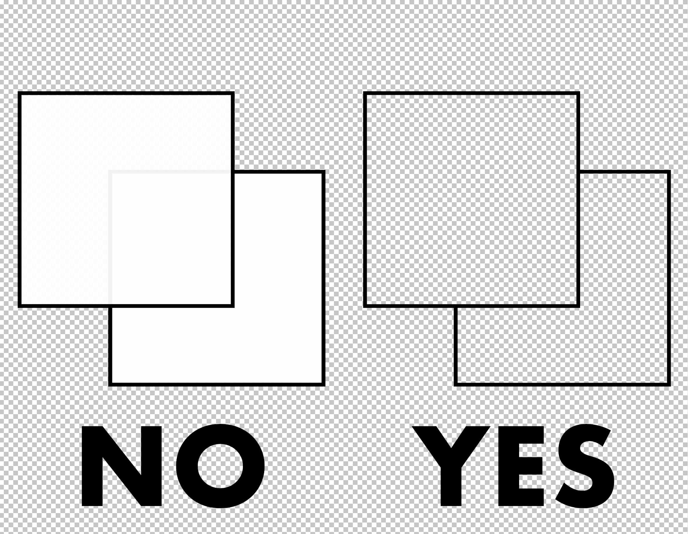
4. You can't hide stuff
You can't hide things behind other things.
Take this design of two squares in Illustrator, one over the other, partially hiding the lines of the one underneath. This will look fine no matter how you want to get it printed unless that way is pen plotting.
The pen plotter will ignore the fill and draw the strokes; it doesn't care that one is "behind" the other.
If you want something to be not there, you have to make it not there. This is probably harder and more annoying than it looks.
5. Don't criss-cross
The more the pen crosses over its own path, the more ink it'll put down, the damper the paper will get, and the more likely it is to rip, shred or otherwise be destroyed.
This design will look fine no matter how you want to get it printed unless that way is pen plotting.
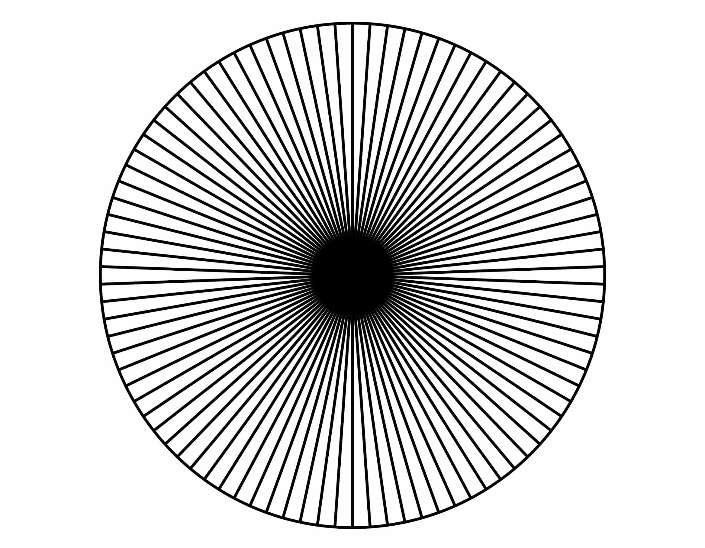
☝️ This will destroy paper ☝️
6. Put corner marks on your design
Please add tiny marks to each corner of your work. Often designs from artists kind of float around in the middle of the page. When they get exported as an SVG, all sense of scale gets thrown out of the window.
It just needs to be a tiny line (do not add a border).
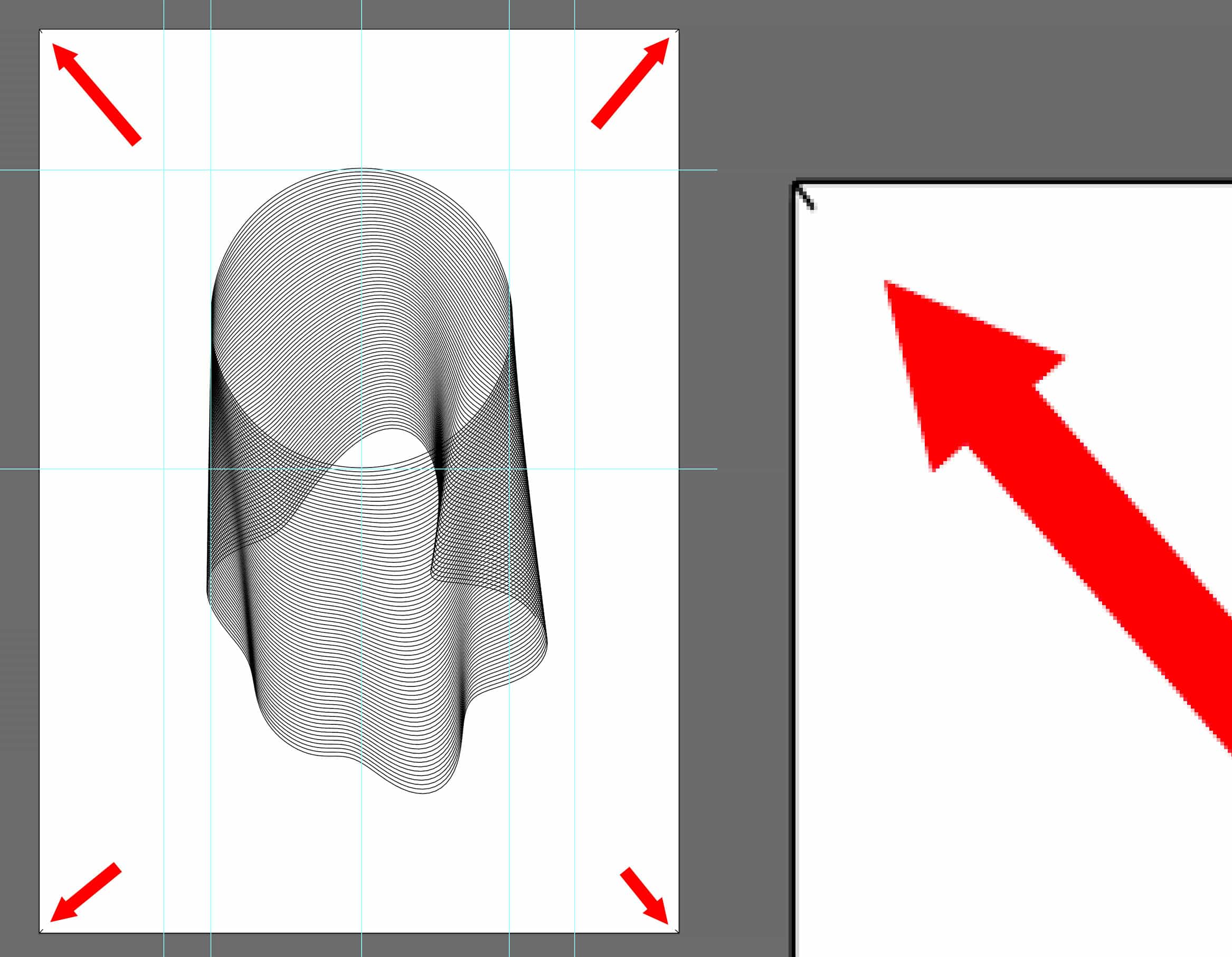
This will help the pen plotter artist align the plot how they need it. They will also stick a bit of tape over each corner (I use framers tape) so the paper doesn't get marked.
7. Fonts
If you use a font, you will get an outline.
All your words will be drawn not as solid letters but rather outlines that may or may not look good depending on the font's weight; your kerning will be ruined.
You can find out more about single stroke fonts here Summary of single-line fonts, but how you use them is a different matter.
🤖 🤖 🤖
There we have it, if you, an artist, follow the seven points above, then the chances of your plot being successful increase dramatically. Your pen plotter friend will thank you and not end up crying over an edge traced illustration from an out of copyright botany book that will take several hours to plot.
And once you've gotten the workflow down a whole new world of pens and inks and colours and techniques opens up to you. There's something magical about putting self-made ink into a fountain pen and seeing the artwork getting drawn or experimenting with brush pens on different papers.
Hopefully, this all makes that a lot smoother.
🤖 🤖 🤖